Category Archives: deliverables

Designs for Academic Departments and Faculty Profiles

Per Mike’s last post on the “glass wall” phase of feedback, we are offering links to design mock-ups for three academic departments and a faculty profile. A few notes on these:

These designs are not supposed to mirror actual content or the specific links and menu items that a department might use. White Whale did model it using real content, but making the specific content and menu decisions will be up to each department. Instead, the designs represent a range of options that a department/program might choose from, including different color palettes and navigational tools. Even the three departments used as samples might choose completely different options. And these are just flat images, not actively linking sites.

The three departments represent a range of possible design set-ups. The Chemistry site is the most bare-bones in terms of interactive tools – see the bottom of the page for an area called “the carousel,” a horizontally-scrolling content area that can be updated regularly with upcoming events, announcements, stories or links. The Economics page adds a top navigation nicknamed “the juice bar,” with tabs for updating content. The Film & Media Culture page uses both the top and bottom interactive navigation, and highlights how you might embed video into the pages. There are also various other boxes that can be used in all the designs for highlighting announcements, events, deadlines, or any other updates.

The faculty profile page (thanks to Nick Muller for being the prototype!) shows how faculty might display information. We’ll be adding areas for Recent Accomplishments (publications, awards, grants, etc.) and the ability to embed a feed from another site (like a faculty blog). We will also be basing a staff profile based on this template.

Please look these over and leave comments below – again, we’re not looking for “I love/hate it!” style comments, as much as hoping you might pose useful questions about what might be left out, what functionality you might want that’s not clearly here, etc. Every department and faculty/staff member will have some control on how their sites appear, but it will be based on the options here, so hopefully this will be useful as you work forward in adding content into Drupal and helping to build the site in the coming months!

Designing the next levels: Section Homepages

The following is White Whale’s live presentation during their visit, where they share the next round of designs for the Middlebury Web site.

[middmedia bmolberg bmolberg WWPresentation22.mp4]

Below are two moc-ups for Section Homepages that were presented in the video:

Section Page: Admissions
Section Page: Arts

Over the next few weeks, we will be sharing designs from White Whale that bring us further into the site. Please continue to share your comments here, on the blog.

Moving Forward with the Design Process

We’ve let White Whale Web Services know that they should proceed refining and improving upon the initial design concept that they presented to us earlier this month. While we share many of the concerns that were expressed via the blog, at the presentation, and in private conversations, we believe that the fundamental concept, once improved upon,  will allow us to accomplish the many, and at times competing, goals of our project.

Here are some of the core issues that we asked them to grapple with in their revision, and in building out designs for the rest of the site.

Quick Access to information

The web site is used by faculty, staff and students as a source of information for daily activities.  Information needs to be easy to find.  Quick links and personal web sites have been proposed as solutions, and as the working models and technologies for these features are being developed, we will need to have user testing to see that they meet the need. Stay tuned for chances to help us make sure that this goal is met.

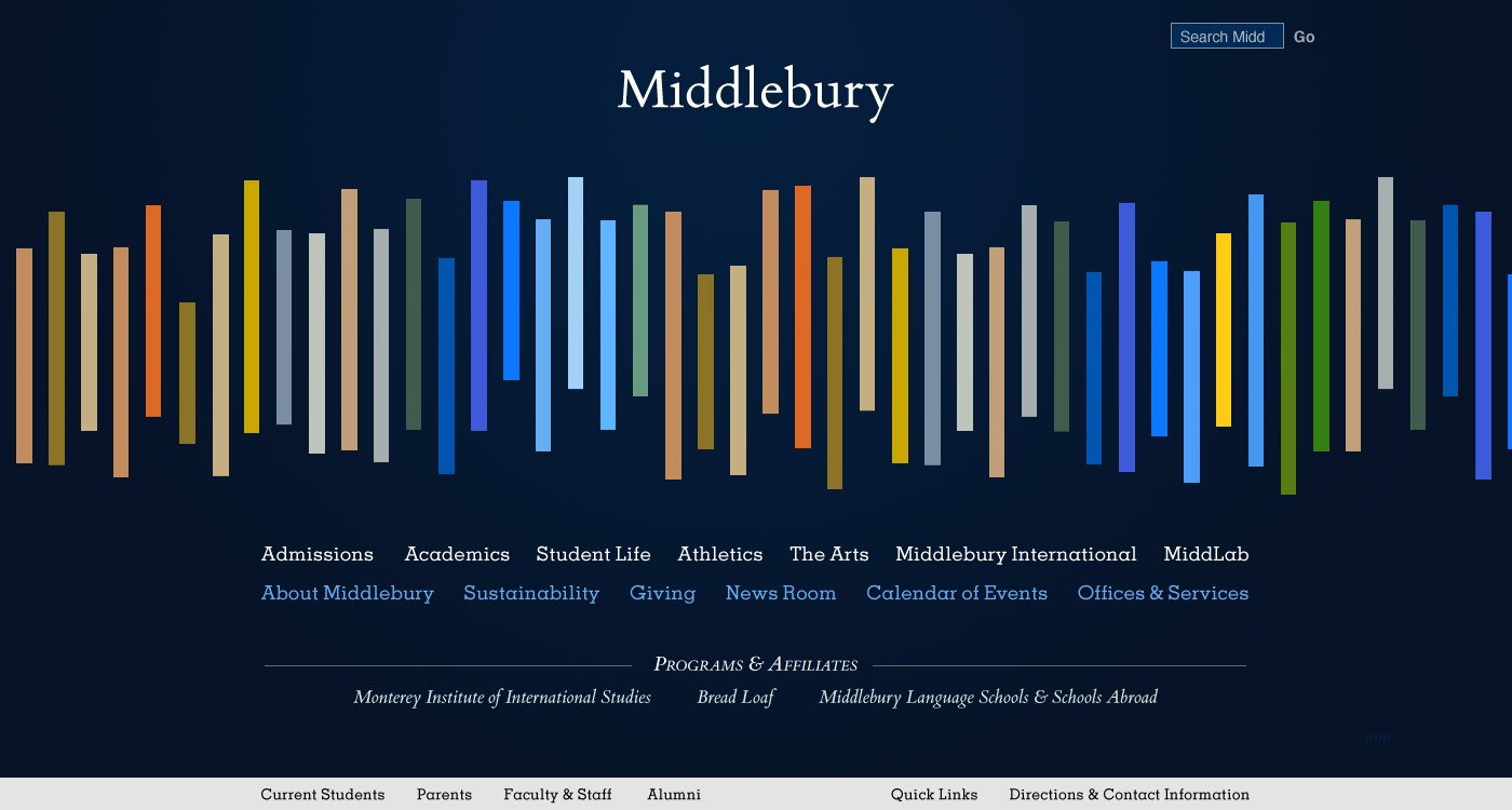
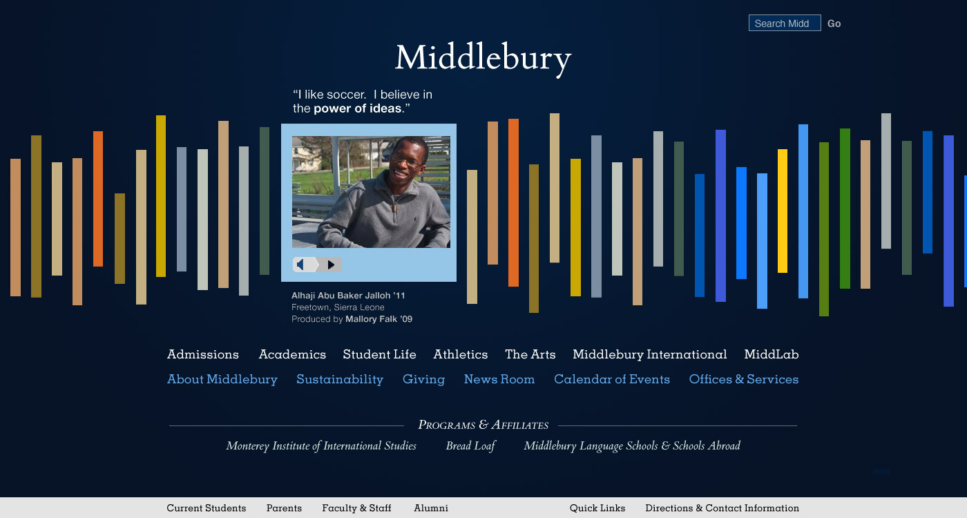
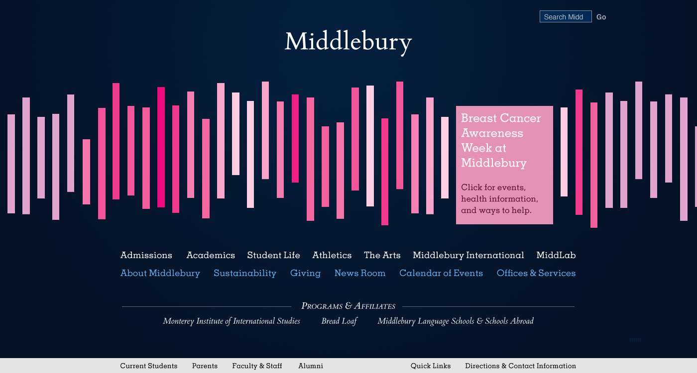
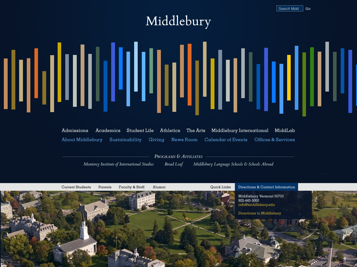
Pictures of Vermont and the Middlebury Campus

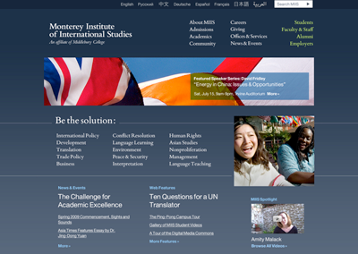
One of the features that attracts new students to Middlebury is the stunning landscape and beautiful campus.  The bookshelf, the multi-colored line design that dominates the home page (also known as the equalizer, or the sticks!) will allow for pictures of the landscape to be co-mingled with stories of academic and social activities, allowing the visitor to find images and other media that represent everything that makes Middlebury a wonderful environment to teach, study, and work. We have also been promised that photography of buildings, people, and landscapes will dominate the second level pages. In addition, we are considering a ‘Middlebury in pictures’ slideshow for those who really, really want images to convey the important sense of place.

The Design Does Not Represent Middlebury

When people see the design for the first time, there seems to be a collective “hunh?”. Is this a College website or the website of a design firm? Is it a college that focuses on design? Part of the problem is that the model that White Whale presented is not yet built using the sort of technology that will allow the visitor to more quickly understand where they have landed. Once built, we believe that as the stories open and a visitor begins to explore , she will warm to the design and understand how this interface can represent a snapshot of life at Middlebury.  What occupies our minds and hearts is expressed through the stories, and a visitor, over time, will understand what makes Middlebury such a wonderful place. The challenge, not unique to this design, is how to capture in a single image the richness and complexity of our multi-faceted institution. We should also note that many people have expressed concern that the home page says Middlebury and not Middlebury College. The decision to omit “College” from the website was made before the webmakeover project, and we won’t be adding it back at this moment in time.

Please note that this is not the end of the design process.  It is a point that commits us to a particular direction, but still affords many opportunities for refinement, enhancement, and improvement. We were thrilled to receive over 120 comments on our blog, dozens of private emails, and to have countless hallway conversations about these designs, and that there was a general although not by any means universal sense of enthusiasm for the direction we are taking. That said, in any open process, there are going to be disagreements and differences of opinion. We have and will continue to factor in a wide range of voices throughout this process. These voices include:

  1. feedback from the blog and feedback sent to us via email and via chat
  2. the professional judgment of our design and information architecture team, and of white whale
  3. the goals of the project as articulated in our RFP, the internet strategy taskforce report, and our analysis of the survey results
  4. feedback and guidance from the senior administration that understand the goals and directions of the College

In addition, we also have certain constraints that we are working under:

  1. our content management system and limited programming resources for customization
  2. the scope of our contract with White Whale
  3. the amount of time we have until we launch in January

As we enter this next phase, there will be ample opportunity for the community to remain engaged in the process. These include:

  1. providing feedback on the soon-to-be-released designs for the second level pages.
  2. providing feedback on the proposed information architecture
  3. helping to decide what should be included as Quick Links
  4. participating in usability testing and focus groups

We will be having another public presentation in late September, and as always, the blog and the facebook group are open for comments and questions.

Unveiled homepage mockups for middlebury.edu

White Whale has shared with us mockup pages of the first round home page design, a small number of examples are displayed here.  Within this explanation, there are many links that demonstrate how this design can be used, and we invite you to explore them all and offer feedback.  Please feel free to share your comments here, on the blog.

From White Whale

Our first round Middlebury home page design is based around a content presentation model that we’ve been calling an “equalizer” or “waveform” for its resemblance to the visual output of an oscilloscope, audio equalizer or seismograph.

Each of these vertical bars contains a Middlebury “story” — which might be a photo, a link to a blog, a short video or audio clip, or a teaser for a longer story inside the Middlebury Web site. These stories will come from the entire Middleverse — of course throughout Middlebury College, but also from Bread Loaf, the language schools and schools abroad, the Monterey Institute, and any other places where Middlebury’s story is being told. Some of the bars will contain campus photographs or inline photo slideshows.

When a user moves his or her mouse over the waveform, they’ll see titles above each vertical bar corresponding to the story the bar contains. When a bar is clicked, it will open horizontally to show the story; the user can either go from there into the site to read the story, or can close the bar and continue browsing stories in the waveform. The user can also scroll the waveform from left to right, up to the number of available stories. In this way, the new homepage can accommodate any number of stories comfortably.

Open stories will have permalinks; in other words, it’ll be easy to link directly to one of the stories in the waveform. So if there’s a feature story about you on the Middlebury homepage, you’ll be able to send your parents a link to the homepage with your box already open.

The color palette for the waveform will be chosen by Middlebury’s designers on an ongoing basis to correspond to the seasonal colors of Vermont. The palette might change four times a year, with the seasons; or Middlebury may choose to adjust the palette more frequently. Colors used in the homepage waveform will continue through the palette used throughout the rest of the site. The palette (and the shape of the waveform itself) can also be customized for special occasions or particular content needs (see below).

Although this waveform content presentation model will appear on the Middlebury home page only, we will produce a “widget” version of the same feature that can be used throughout the site to present feature content in any number of contexts.

There is an easter-egg style reveal of an aerial photograph of Middlebury’s campus, displayed after clicking “Quick Links” or “Directions & Contact Information” in the footer. See below for those links.

These are mockup images only, not functioning Web pages; the live version will be styled to ensure that the navigation links at the bottom are visible on the great majority of computer monitors. They’ll be fixed to the bottom of the screen (unlike here where the image cuts off after 750 pixels vertically).

For easy comparison, open in tabs.

basic

  • Expanded Vermont footer: after clicking “Quick Links”
  • Expanded Vermont footer: after clicking “Directions & Contact Information”
  • Middlebury Design Presentation by White Whale

    [middmedia jantonio jantonio Unveiling The New Website.mp4]

    Thank you Jason, Tonya and Janie for our first look at what the new Middlebury website will look like. I am personally excited about the possibilities that this flexible design will give us to represent Middlebury on the web.

    Also, thank you to David, Bob, Ben, Tara, Charlie, Adam, Scott and Howie for setting up and running the presentation. Great teamwork!

    And thank you to everyone who attended the presentation and have been providing feedback. Please keep it coming, we want to hear what the community has to say.

    Evolution of the MIIS site design

    I thought it was about time we shared some of the eye candy from White Whale that we’ve been working with here at MIIS over the last couple weeks. The homepage design is progressing nicely; we have also started work on the inside page designs and have seen a preliminary design for a themes landing page.

    Many of these designs will continue to be perfected before the MIIS site launch on September 1.

    Click on any of the images below to view a larger version.

    Homepage Design Round 2


    This homepage design attempts to incorporate the themes element into the original Horizon design. This design experiments with using a 2-column layout. We also chose a dark blue background over the original grey.

    Homepage Design Round 3


    Back to the original 3-column design, but experimenting with some slightly different colors.

    Inside Page Design 1


    The first stab at an inside page design.

    Inside Page Design 2


    A slightly different take on an inside page design that includes space for an interactive sidebar.

    Inside Page Design 3


    The current live version of an inside page design. In addition to the sidebar, it also includes a title card that displays the breadcrumbs, page title, and introductory paragraph.

    Theme Landing Page


    The first shot at what a theme landing page might look like.

    Unveiled homepage mockups for miis.edu

    Design Mockups

    Without further ado, I present the design mockups for the homepage of miis.edu. Click anywhere on the mockups to see multiple views (expanded navigation menus, etc.).

    Design 1: Horizon

    Horizon homepage mockup

    Features

    • Horizon line header image that rotates on a regular basis; creates a sense of place yet also implies that the work done at MIIS is global and transcends physical boundaries
    • Blowout navigation menus that serve up dynamic content and stories

    Design 2: Themes

    Themes homepage mockup

    Features

    • Thematic pages that aggregate content from across disciplines that is related to a common theme
    • Incorporation of the Institute’s tagline

    Things to Keep in Mind

    • These color palettes are not final; White Whale’s idea was to create an array of colors that aren’t used in flags.
    • Representing Middlebury on the site is both necessary and complicated; White Whale has suggested a few alternate names for OneMidd, but utilized the term OneMidd in both of these mockups.
    • We really like the aesthetics and dynamism of the first design and the thematic approach of the second design; the folks at White Whale are looking into creating a design that will combine the aesthetics of the first design with the themes from the second design.

    What Do You Think?

    Please take a look at both of the proposed designs and leave feedback in the comments. Be specific; we want to hear about elements you like or dislike and why.

    White Whale Unveils the new MIIS website design

    On Tuesday, June 9th, at 4pm (1pm PST), White Whale will be presenting a new design for the Monterey Institute of International Studies website.  People at Middlebury can participate in the unveiling in two ways.

    Join us in Library 201, where we will show the unveiling in the classroom.

    –or–

    Log into the Elluminate session using the instructions here: https://mediawiki.middlebury.edu/wiki/MIIS/Website_Unveiling

    Please join us as we take a look at the first design in the Web makeover process.

    What is Middlebury?

    … and in the context of the Web Makeover, how does Middlebury present itself to the rest of the world on a global platform, at a time where we are re-organizing and redefining ourselves?  Can the website’s homepage answer these questions?

    Dates through the summer

    Below are the milestone dates for the Web Makeover up until the launch of the Monterey site.  Plan your summer accordingly!

    May 13, White Whale delivers Monterey top-level IA recommendations
    May 21, Monterey accepts top-level IA
    May 18, White Whale delivers Strategic Recommendations
    May 28, White Whale delivers Monterey complete site map
    May 29, Middlebury acceptance of Strategic Recommendations
    June 1, DIY ‘workbook’ for Review & Revision of IA & Content
    June 3, White Whale delivers Graphic Standards
    June 7, Middlebury responds to Graphic Standards
    June 9, White Whale delivers Monterey design
    June 23, Monterey homepage design finalized
    June 30, White Whale delivers Monterey Content Recommendations
    July 15, Middlebury delivers 400 stories
    July 8, White Whale delivers designs for all Monterey templates
    July 17, White Whale delivers top-level IA Recommendations
    July 23, White Whale delivers Middlebury design
    August 15, Live beta-launch of Monterey site
    September 1, Middlebury finalizes homepage (+ top-tier) designs
    September 1, Monterey site launches