Author Archives: Kristen Byers

Evolution of the MIIS site design

I thought it was about time we shared some of the eye candy from White Whale that we’ve been working with here at MIIS over the last couple weeks. The homepage design is progressing nicely; we have also started work on the inside page designs and have seen a preliminary design for a themes landing page.

Many of these designs will continue to be perfected before the MIIS site launch on September 1.

Click on any of the images below to view a larger version.

Homepage Design Round 2


This homepage design attempts to incorporate the themes element into the original Horizon design. This design experiments with using a 2-column layout. We also chose a dark blue background over the original grey.

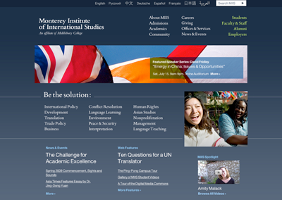
Homepage Design Round 3


Back to the original 3-column design, but experimenting with some slightly different colors.

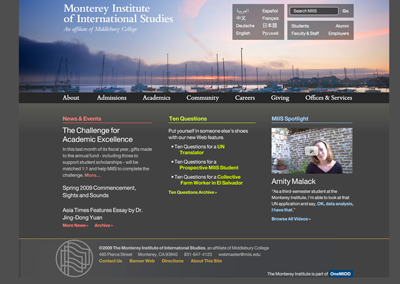
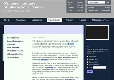
Inside Page Design 1


The first stab at an inside page design.

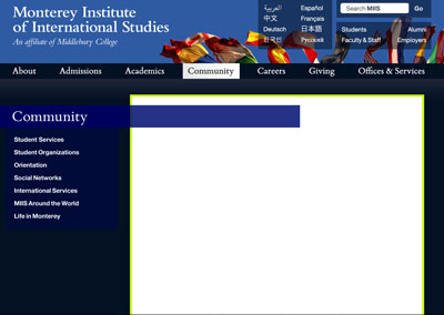
Inside Page Design 2


A slightly different take on an inside page design that includes space for an interactive sidebar.

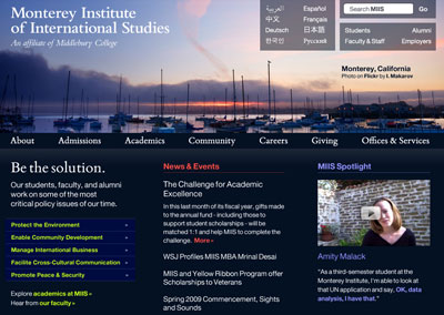
Inside Page Design 3


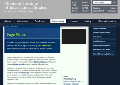
The current live version of an inside page design. In addition to the sidebar, it also includes a title card that displays the breadcrumbs, page title, and introductory paragraph.
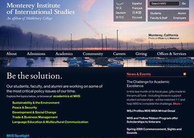
Theme Landing Page


The first shot at what a theme landing page might look like.

Unveiled homepage mockups for miis.edu

Design Mockups

Without further ado, I present the design mockups for the homepage of miis.edu. Click anywhere on the mockups to see multiple views (expanded navigation menus, etc.).

Design 1: Horizon

Horizon homepage mockup

Features

  • Horizon line header image that rotates on a regular basis; creates a sense of place yet also implies that the work done at MIIS is global and transcends physical boundaries
  • Blowout navigation menus that serve up dynamic content and stories

Design 2: Themes

Themes homepage mockup

Features

  • Thematic pages that aggregate content from across disciplines that is related to a common theme
  • Incorporation of the Institute’s tagline

Things to Keep in Mind

  • These color palettes are not final; White Whale’s idea was to create an array of colors that aren’t used in flags.
  • Representing Middlebury on the site is both necessary and complicated; White Whale has suggested a few alternate names for OneMidd, but utilized the term OneMidd in both of these mockups.
  • We really like the aesthetics and dynamism of the first design and the thematic approach of the second design; the folks at White Whale are looking into creating a design that will combine the aesthetics of the first design with the themes from the second design.

What Do You Think?

Please take a look at both of the proposed designs and leave feedback in the comments. Be specific; we want to hear about elements you like or dislike and why.