Design Mockups
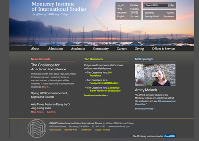
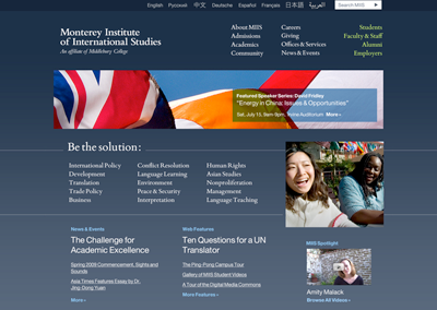
Without further ado, I present the design mockups for the homepage of miis.edu. Click anywhere on the mockups to see multiple views (expanded navigation menus, etc.).
Design 1: Horizon
Features
- Horizon line header image that rotates on a regular basis; creates a sense of place yet also implies that the work done at MIIS is global and transcends physical boundaries
- Blowout navigation menus that serve up dynamic content and stories
Design 2: Themes
Features
- Thematic pages that aggregate content from across disciplines that is related to a common theme
- Incorporation of the Institute’s tagline
Things to Keep in Mind
- These color palettes are not final; White Whale’s idea was to create an array of colors that aren’t used in flags.
- Representing Middlebury on the site is both necessary and complicated; White Whale has suggested a few alternate names for OneMidd, but utilized the term OneMidd in both of these mockups.
- We really like the aesthetics and dynamism of the first design and the thematic approach of the second design; the folks at White Whale are looking into creating a design that will combine the aesthetics of the first design with the themes from the second design.
What Do You Think?
Please take a look at both of the proposed designs and leave feedback in the comments. Be specific; we want to hear about elements you like or dislike and why.

