Results
The Results section is where you can finally present the findings of your work. You shouldn’t present every result of every experiment you did in your project, however. Results that proved inaccurate or experiments that didn’t end up being relevant to the goal of your project are rarely, if ever, included here. The Results section is about piecing together a coherent story of discovery that communicates to your reader what new information your project brought to the scientific world.
To accomplish this, you will probably need to arrange your data in such a way that, regardless of the order of your experiments, you can present meaningful sets of results that will logically lead to the conclusions of the paper. All the messiness of actually obtaining your results—like dead-ends, discovering new information that forces you to re-design and re-do old experiments, or deliberating over whether or not a result is meaningful—has to be omitted for the sake of a clear, concise scientific story.
[bg_faq_start]
Audience and purpose
The primary purpose of a Results section is to describe your findings, including both the big picture results as well as the critical details. Any interpretation of your data should be reserved exclusively for your Discussion section. Even in combined R&D sections, the difference between reported data and interpretations of that data should be distinct, such as in the following example.
| Adapted from Neubauer et al. (2015):
At low illumination intensities, R is highly nonlinear and the present device reaches a photoresponsivity of 106 V/W. This high value, compared to other hybrid sensors [11], is expected due to the narrow 1D-like high electron mobility transistor (HEMT) shallow-channel design, which generates a large gain mechanism. |
The first sentence reports the result: the device reached a photoresponsivity of 106 V/W. The second sentence evaluates this result: that it is higher than other hybrid sensors and why this is expected. This paper continues in this fashion–immediately interpreting a result once it is presented–throughout its R&D section. Other papers might organize their R&D section such that all results are presented first, followed by a few paragraphs exclusively reserved for interpretation. Either approach is perfectly acceptable as long as you maintain a distinction between description and interpretation.
Your audience in the Results section is almost universally other expert scientists. When you objectively describe your results separate from your own interpretation, other experts will be able to examine the data critically for their scientific merit and possibly start drawing their own conclusions from them.
[bg_faq_start]
Test yourselfRewrite each of the following sentences so that they objectively describe the data presented without providing any interpretation.
[bg_faq_start] Solutions
[bg_faq_end] [bg_faq_end] |
[bg_faq_end]
[bg_faq_start]
Style and conventions
Using visuals
Visuals are a critical part of telling your scientific story in the Results section. By guiding readers between text and graphics, you can most effectively show them how your discoveries unfolded. Without visuals, data can seem jumbled and confusing; without text, data won’t be easily situated in the context of your experiments.
Before you begin writing your results section, remember that conciseness is a critical part of scientific writing. For that reason, visuals are used only when text is insufficient. Second, remember that when you write, you are telling a story; figures and tables are two ways in which you can add to your story and make it more compelling by giving evidence to back up your claims.
Figures are best used to show trends in or relationships between data as well as pictorial representations of experimental components. Tables are for showing purely qualitative data, such as a relationship between organisms and their optimal habitat type, as well as data between which you are not attempting to show any trend or relationship. In rare cases, you can use both a figure and a table, such as if you want to provide all of the data in a table but highlight an important relationship among some of these data in a graph; however, you must never simply repeat all of the same information in 2 formats. Schemes are used to show a progression of steps, such as a chemical reaction. Depending on the discipline and publication, the information in a scheme may be presented in a figure or as an equation, instead.
Figures make up a large category of visuals that includes graphs, diagrams, photos, maps, and more.
|
Graphs and tables are most commonly used in the results section of a paper or poster, whereas diagrams and pictures are more likely to appear in your methods section. However, any table or type of figure can be used anywhere in a paper as long as it is relevant and useful to the reader.
[bg_faq_start]
Pro-3: Test yourself
In each of the following instances, decide if it would be most appropriate to present the data using a figure, a scheme, a table, or words alone.
[bg_faq_start] Solutions
[bg_faq_end] |
Each figure, table, and/or scheme should be numbered separately from one another starting from “1” as they appear throughout your paper. That means that after Figure 1 and Figure 2 you might have Table 1 followed by Figure 3.
In a journal article, every figure, table, and scheme must be referred to in the text before the visual itself appears. Following are some examples of what this might look like:
This nucleotide was often a conserved G (Figure 1).
The symmetry varies gradually from a symmetric bar to an asymmetric oval (Fig. 3A).
Higher yields were obtained using compounds B and F (Table 1).
The general procedure for alkylating these products is shown in Scheme 4.
In general, it is better to parenthetically refer to a visual, such as in the first 3 examples, rather than use a whole sentence just to mention the visual. Notice how when referred to in the text, “Figure” is sometimes abbreviated to “Fig.”
After you’ve directed your reader to the visual, you have to make sure that the visual itself is properly constructed. Every figure and table in a paper must be able to stand alone (without your results section or intro or any other explanation!) and be understandable. That means that it needs a legend and possibly footnotes, if it’s a table.
In addition to a good legend, be sure that your visual is as simple as possible while still conveying all the necessary information, which will help your reader avoid distractions and better understand your meaning. In general, this means that extra lines, symbols, colors, and words in your visual that don’t need to be there shouldn’t be there. For more information on how to achieve this, see our page on using visuals.
If you have constructed a complete visual, you don’t need to repeat everything from the figure or table in your text. In fact, its a waste of space! Tables should replace text, not duplicate it; figures should highlight trends in data, which can be summarized in your text.
Data don’t tell their own story–that’s your job as the expert on your project. So, after you refer audience to your visual, highlight for your audience what is novel or particularly interesting or surprising about your data. But remember–steer clear of redundancy!
Below are some examples of figures and tables, accompanied by the text the authors used to describe them. The section of the paper from which the visual was taken is also provided for comparison.
| Visual | Text | Reference |
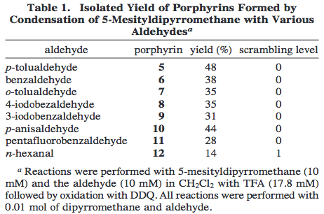 |
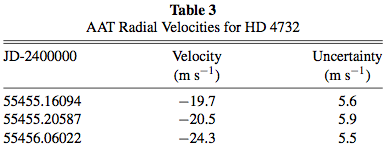
“The scope of this procedure for preparing gram batches of trans-porphyrins from 5-mesityldipyrromethane was examined by condensation with the eight aldehydes shown in Table 1. No scrambling was observed in the syntheses with aryl aldehydes, so this procedure offers a general and simple gram-scale preparation of 5,15-dimesityl-10,20-diarylporphyrins. The only modification to the procedure was required for the reaction with pentafluorobenzaldehyde because the porphyrin was contaminated with non-porphyrin pigments, but these were readily removed by triturating with hexanes. Such pigments were also observed in the condensation with n-hexanal and were also easily removed by trituration with hexanes, however LD-MS showed a peak consistent with Level 1 scrambling in this condensation.”
|
Littler, Ciringh, and Lindsey (1999) |
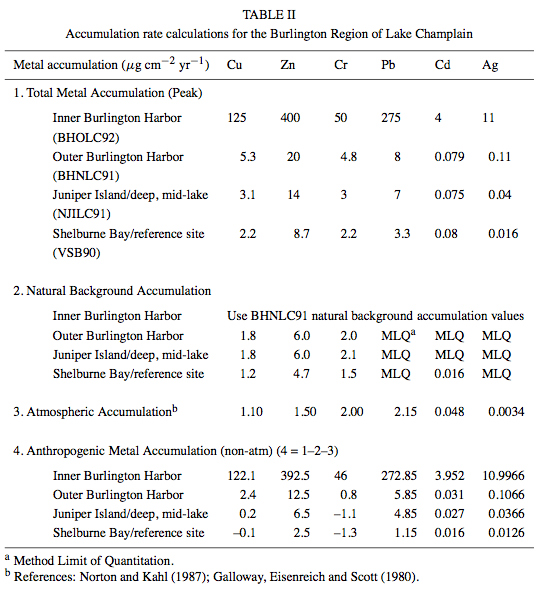 |
“Further estimation subtracted the average atmospheric contribution for each of the metals [51] to derive the relative metal accumulation from point sources (Table II). The results indicate that the relative accumulations of the metals decrease with distance from Burlington Harbor. The cores from the Burlington Harbor Oil Dock site had the highest concentration of each of the metals measured in this study. The cores from the Burlington (North) site recorded the second highest metal accumulation followed by Juniper Island and Shelburne Bay respectively. The magnitude of metal accumulation, corrected for natural and atmospheric deposition, indicates that the majority of the contaminants in the Burlington region are derived from local point sources. Accelerated metal accumulation from the 1950s, documented in the Burlington Harbor (North) core, corresponds to the local sewage treatment plant along with the effects of combined sewage overflows (CSOs), and runoff from the city of Burlington.”
|
Mecray et al. (2001) |
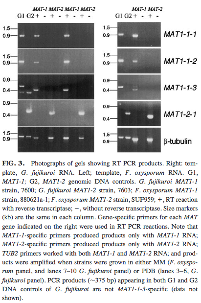 |
“Sequencing of RT-PCR products (Fig. 3) confirmed that all predicted introns in the four F. oxysporum MAT genes are removed, including the third intron in MAT1-1-3, which has an atypical 3′ splice signal (gag instead of cag or tag, Fig. 4). Note that RT-PCR confirms that the MAT genes from asexual F. oxysporum are transcribed.”
|
Yun et al. (2000) |
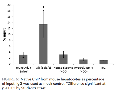 |
“Diabetic animals did not show any difference in DNA methylation in the 18S rDNA region as compared with normoglycemic animals (Figure 6). Old normoglycemic BALB/c mice, however, showed a significant increase in this epigenetic mark in comparison to young-adult normoglycemic mice.”
|
Ghiraldini, Crispim, and Mello (2013) |
Distinguishing between animate and inanimate capabilities
It is very common for students to refer to instruments or other inanimate objects as having the ability to perform the functions of a scientist–that is, to analyze data. But in reality, the most they can do is collect data. This is a very important distinction! Do not attribute limitations, capabilities, or errors to inanimate objects. A limitation might be a quality of an object, but that doesn’t mean that the object actively limits the experiment. For example, compare the following two statements (adapted from an example in Write like a Chemist):
a. The GC/MS was unable to detect estrogen in the stream water.
b. Estrogen in the stream water was below detection limits.
In statement A, the GC/MS is given the ability (or inability) to detect something. GC/MS is used to detect substances, but it doesn’t have the willpower to do it on its own. As another example:
a. The oscilloscope determined the frequency to be 12 Hz.
b. Using an oscilloscope, the frequency was determined to be 12 Hz.
The oscilloscope provides a measurement of frequency, but only you can determine which value to accept.
This may seem like a nit-picky distinction, but to personify an instrument is simply inaccurate, thus detracting from the scientific authenticity and professionalism of your writing. When in doubt, ask yourself: “Is a human using this object to do something?” If so, make sure that the object isn’t ascribed an action verb.
Test yourselfWhich of the following statements are inaccurately ascribing animate qualities to inanimate objects? Re-write any such statements to avoid this error.
[bg_faq_start] Solutions
[bg_faq_end] |
Reporting data of scientific and statistical significance
In science, numbers matter. For example, by knowing not only that the concentration of product A was higher than of product B but also that it was 23.2% higher, we can compare a reaction resulting in A and B to other such reactions to help determine which might be most useful to future experiments.
You should report a quantitative result over a qualitative description of the result whenever it is appropriate. An example of when it might be inappropriate is if a quantity has no scientific significance, such as,
“The value was 3.4% below the limit of detection (LOD).”
If a value is below a limit of detection (or quantification), it cannot, by definition, be quantified and should therefore be reported as,
“The value was below LOD.”
When you can report exact values, only do so to the correct level of confidence. This means that you need to know how to correct calculate significant figures–the number of digits in a number that carry meaning. Reporting a datum to the correct number of significant figures is important because it conveys the amount of precision of that value and is the only way to accurately report the value. On our page about professionalism we provide a cursory review of significant figures; for a more detailed resource, try this guide from Rice University.
It is also important that you are able to communicate statistical significance appropriately. Once you have conducted a statistical analysis of your data, you must be able effectively translate it into your report. Usually, statistics are reported both in a figure or table as well as in the body of your Results section text, when the data themselves are described.
| Reporting statistics |
|
Unless your paper is focused on mathematical or statistical operations and manipulations of data, you should keep discussion of statistics to a minimum. Statistical values are useful because they convey the amount of confidence you can have in your data often in a single number. In general, standard statistical analyses do not require explanation for how you performed them or what they mean. Here we provide examples of how statistics are discussed in the context of a results section.
| Results with error and/or significance reporting | Reference |
| Sato et al. (2013) | |
|
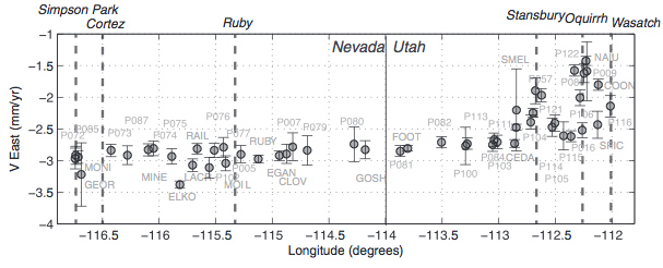
The velocities with respect to North America have gradients that vary across eastern Nevada and western Utah (Figure 3). In western Utah, the velocity gradient across the Wasatch, Oquirrh, and Stansbury ranges is similar to that previously reported in several GPS studies [22-24], achieving a mean of 2.8 mm yr-1 west at the Nevada border and mean south rate for Utah stations west of -112° longitude of 0.8 mm yr-1…. West of the NV/UT state line, the velocity gradients change character, with a near-zero increase in east component and an increase of ~1 mm yr-1 when moving west from -114° to -117° longitude. A component of this gradient west of -114° describes clockwise rotation and not deformation.
|
Hammond, Blewitt, and Kreemer (2014) |
A xylitol-dependent glucose 6-phosphate accumulation through the pentose phosphate pathway and gluconeogenesis was detectable only for much higher xylitol concentrations (Table I).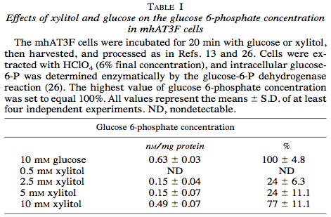 |
Doiron et al. (1996) |
|
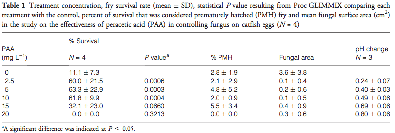
Table 1 displays results from each treatment of the present study. The hatch rates of each replicate (indicated by SD) clearly show the variability within individual spawns; such variability is common in commercial hatcheries. |
Straus et al. (2012) |
There were no detectable differences between the populations originating in Georgia or North Carolina at the Georgia location; therefore, data were combined for analysis (Figure 2). 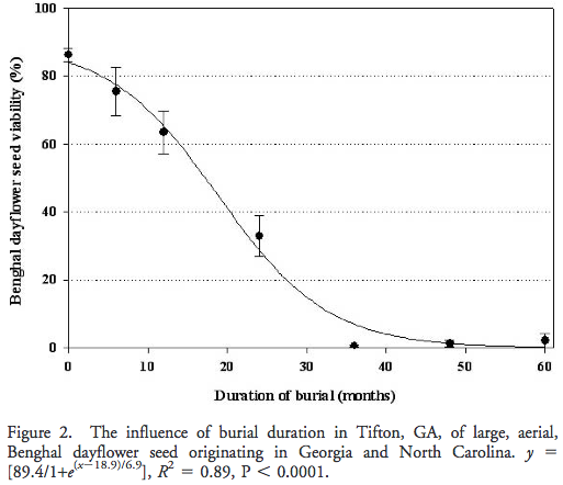 At initiation of the study, seed viability averaged 86%, declining to 63 and 33% at 12 and 24 mo, respectively. Burial of 36 mo or longer reduced seed viability to, 2%. The relationship between Benghal dayflower seed viability and burial time was described by a sigmoidal regression model (R2 = 0.89, P < 0.0001). At initiation of the study, seed viability averaged 86%, declining to 63 and 33% at 12 and 24 mo, respectively. Burial of 36 mo or longer reduced seed viability to, 2%. The relationship between Benghal dayflower seed viability and burial time was described by a sigmoidal regression model (R2 = 0.89, P < 0.0001). |
Riar et al. (2012) |
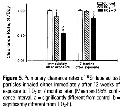 Subchronic inhalation of ultrafine and fine TiO2 particles resulted in a significant impairment of AM-mediated test particle clearance (Figure 5). Control animals had a clearance rate of the test particles of approximately 1% per day, for the animals exposed to the fine particles, the clearance rate was reduced to 0.6% per day; and for those exposed to the ultrafine particles, it was even further reduced, to 0.13% per day. Subchronic inhalation of ultrafine and fine TiO2 particles resulted in a significant impairment of AM-mediated test particle clearance (Figure 5). Control animals had a clearance rate of the test particles of approximately 1% per day, for the animals exposed to the fine particles, the clearance rate was reduced to 0.6% per day; and for those exposed to the ultrafine particles, it was even further reduced, to 0.13% per day. |
Oberdörster, Ferin, and Lehnert (1994) |
[bg_faq_end]
[bg_faq_start]
Organization
The Results section is the third major section in the standard IMRD format. It is one of the narrowest parts of your paper’s hourglass shape because the information in it is very specific. In some types of papers, the Results might come before your Methods and/or be combined with your Discussion to make a combined R&D section. These organizational decisions will always be dictated by the journal you wish to publish in. For a class, if your professor has no preference, use the style that works best for your material. Reading other similar types of papers can give you a good idea of the organizational style you might want to choose.
As you saw in Style and Conventions, referring to figures, tables, and other visuals is a key part of most Results sections. According to Robinson et al. (2008):
A well-written Results section guides the reader’s attention back and forth between text and graphics while highlighting important features of the data and telling the story of scientific discovery.
Although this may sound like a lot to accomplish in one section, breaking it down move by move will help keep the task manageable and ensures that you cover all aspects of reporting your results.
Move structure
One of the most easy-to-understand ways to group information in the results section is to group results into smaller chunks. That way, instead of having to absorb results all at once, your audience can be introduced to and consider your results in manageable and sensible chunks. So if, for example, you collected two different types of data, you might want to introduce and discuss one set of data before doing so with the other.
Although it isn’t related to organization, it is worth mentioning here anyway: remember that the results section is for presenting data, not to draw conclusions from it! You can combine these techniques only if you use a “Results and Discussion” section or similar broad organization pattern. Double check that you never discuss the implications of your data unless you are supposed to.
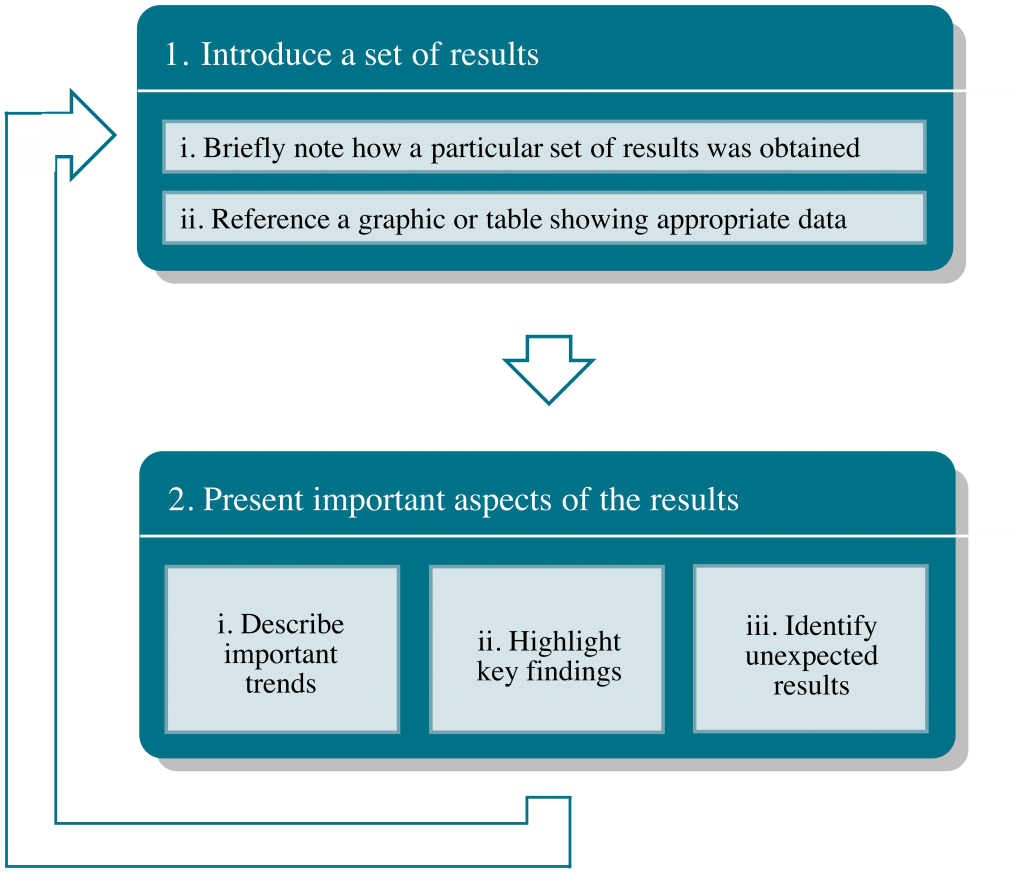
1. Introduce a set of results. This move transitions your reader from your methods to your results. It is helpful to briefly (no more than a sentence or two) remind your reader how you obtained a set of results so that someone could read your results section out of context and still be able to understand them. Below is an example of how part of a Methods section can be condensed into a summary sentence in the Results section.
| An excerpt adapted from the Methods section of Costanza-Robinson and Brusseau (2002):
The media was uniformly mixed with the desired amount of water and packed wet into the column. The porous medium was tamped in the column at small increments, typically 1-cm, to minimize the formation of particle-size layering in the column. Aliquots of the wet porous medium were collected before and after packing to gravimetrically determine initial water contents. After the experiment, the column was unpacked and a small (<20 g) aliquot was taken from near the column inlet, three points along the axis of flow, and near the column outlet for gravimetric water content measurement. Move 1(i) of Results: Miscible displacement experiments were conducted at nine water contents ranging between 2% and 20%. |
In submove (ii), you should refer your reader to a figure or table, if you are using one, that presents the data from this part of the experiment, such as the following excerpt from Weill et al. (2014):
Figure 6 shows the evolution of the cumulated erosion and deposition (in millimeters) during Exp_10 (Fig. 2, Table 2).
For conciseness, however, it is often preferable to combine submoves (i) and (ii). Here we provide a few examples of all of Move 1 accomplished in a single sentence.
| Adapted from Campos et al. (2015):
The results of the flexural modulus and flexural strength of previously-photopolymerized and irradiated groups are presented in Table 3. Adapted from Caputo et al. (2012): Thin layer chromatography (TLC) analysis of uninoculated medium containing L-phenylalanine (0.05%) revealed an optimal separation of the amino acid with a retention coefficient (Rf = 0.57±0.01) comparable to that obtained by the L-phenylalanine standard (Figure 2). Adapted from Costa, Robertson, and Quilliam (2015): The profile of PSTs in a cultured strain of Gymnodinium catenatum isolated from Cascais Bay in 2007 and a seawater sample collected during a bloom of G. catenatum off Aveiro also in 2007 was characterized via HILIC-MS/MS (Figure 4). |
2. Present important aspects of the results. In this move, you are using the results you introduced in Move 1 to tell a scientific story. What are the trends in the data? What data stand out (either because they confirm previous suspicions or refute them)? The order in which you describe each important part of your results is up to you, but you should do it in a way that makes sense with the graphics you present and the importance of the data. Consistent with the “broad-to-narrow” approach (see our section on broad organization), authors will often present an entire section of results and then describe in more detail only those that turned out to be most interesting.
| Examples of complete Results move structures (Move 1 is underlined in the following excerpts; Move 2 is left unstyled) |
| Adapted from Katti et al. (2015):
Molecular dynamics simulations were performed on a double stranded rice plant DNA in the absence and presence of single walled carbon nanotube. Fig. 1(b) and (d) show the conformation of DNA in model-1 and model-2 after 10 ns of simulation. The presence of SWCNT strongly influenced and altered the conformation of DNA in model-2. The conformational changes in DNA were observed within few ps of simulation; however, wrapping of DNA onto the SWCNT started after 1 ns. Fig. 2(a)–(c) show the wrapping of DNA onto SWCNT at the time period of 1, 5 and 10 ns, respectively. As seen in these figures, DNA wrapping onto the SWCNT begins from the one end and moves towards the other end. It was observed that the fourteen base pairs in solvated DNA–SWCNT model have unzipped after 10 ns. Fig.1(d) shows that the unzipping mechanism of the DNA base pairs is more prevalent closer to the SWCNT. Adapted from Ledda-Columbano, Columbano, and Pani (1983): Preliminary studies carried out in our laboratory indicate that a single dose of 5 Mmol/100 g body weight of lead nitrate is able to induce DNA synthesis, as measured by the incorporation of labeled thymidine into hepatic DNA. Maximal activity of DNA was reached 30-36 hours after lead treatment; an increase in liver mass and total hepatic content of DNA at 2-3 days after treatment, with a return to normal values at 7-8 days after the administration of the metal, was also observed (data not shown). Adapted from Hou et al. (2007): In response to picture stimulus (mining accident related pictures versus neutral pictures), the PTSD group showed significant activations in the left posterior cingulate gyrus, the bilateral caudate and the right thalamus and significant deactivations in the right cingulate gyrus and the bilateral middle frontal gyrus. Control subjects showed significant activations in many brain areas (Table 1). |
[bg_faq_start]
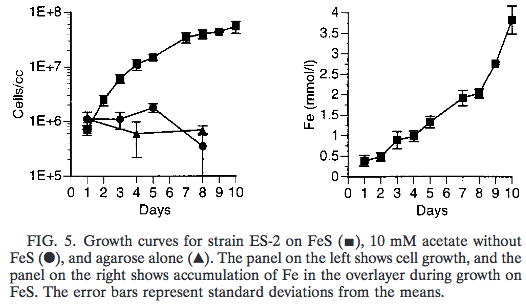
Org-6: Practice exerciseIn a paper by Emerson and Moyer (1997), the authors describe an experiment in which they attempt to grow two different iron-oxidizing bacterial strains, ES-1 and ES-2, on various mediums . Below is an excerpt from this paper with an accompanying figure. Read the excerpt and answer the following questions:
The growth curves of strains ES-1 and ES-2 are shown in Fig. 4 and 5, respectively. ES-1 grew on FeS with a doubling time of approximately 8 h. The addition of acetate to the growth medium did not appear to stimulate the growth of ES-1 above that of Fe2+ alone. When ES-1 was grown in the presence of agarose alone it did not show any sign of growth (Fig. 4). When it was grown in the presence of acetate, pyruvate, or glucose without added iron, there was no visible sign of growth. Strain ES-2 grew on FeS with a Both strains required vitamins for growth; when the vitamins were omitted their growth diminished markedly after two or three transfers. If bicarbonate was omitted from the medium and 10 mM HEPES buffer was substituted as a buffer at pH 6.5, it also appeared that the growth of the strains was diminished, as judged by the slower than normal formation of a growth band. [bg_faq_start] Possible solutions
[bg_faq_end] [bg_faq_end] |
[bg_faq_start]
Org-7: Test yourselfEach of the following sentences are taken out of context from journal article Results sections. Identify the move associated with each statement. Also try to identify the sub-move, if you can!
[bg_faq_start] Solutions
[bg_faq_end] |
In combined Results & Discussion sections, the move structures can often look very much the same as those described above, with the addition of an interpretive statement(s) as a “Move 3.” For example, here is the first part of a combined section adapted from Neubauer et al. (2015):
The measurements were taken under a constant current of 0.23 mA using a 980 nm wavelength laser. Fig. 3 displays the light intensity dependence on the photovoltage on a log–log scale. At the measured intensities the photovoltage increases linearly with the light intensity. The experimental results could be fitted to a simple power law equation, Pαpβ, where P is the photovoltage, p the light intensity, and the β the power law index. Our best fit for the β value is β = 0.72.
Note how the first sentence accomplishes Move 1(i), the second Move 1(ii), and the following sentences Move 2. At the end of this paragraph, the authors added the following:
We believe that the surface effects of the GaAs are the major reason for the deviation from the ideal slope value, 1.
This final statement attempts to interpret the results they just presented.
