Although posters might be a less familiar scientific medium to scientific writers prior to college, it soon becomes a very important one. At symposia, at conferences, and in the hallways of research facilities, posters allow researchers to provide their audience with a snapshot of an entire scientific project in a relatively short amount of time.
The average person will only view your poster for a few minutes. At a conference, people viewing your poster can ask you for more details or for clarification as needed, so not every parameter, result, or consequence needs to be written down. For example, you usually won’t want to include every one of the samples tested but just the most notable ones or ones that are representative of the trends in your data.
There is no one universal way to approach designing a poster. However, the main goals to keep in mind throughout the process are:
-
Focus on the science. Although it might be tempting to design an elaborate or artistic poster, remember that your poster is there to communicate a scientific story. Anything that detracts from the science brings your poster farther from that goal.
- Be clear and concise. More critical than in any other medium, conciseness will allow you to convey the most information in the smallest amount of space without intimidating or confusing your audience.
[bg_faq_start]
Audience and purpose
The audience for your poster will depend heavily on the conference or symposium at which you are presenting. Is it at your college science symposium? Then your audience will likely be mostly comprised of other students and professors outside of your specific discipline. Are you presenting at the Meeting about Exoplanets in the Era of Extremely Large Telescopes? Then your poster about an extremely large telescope will probably be viewed by other planetary experts.
If unsure or if the audience will be varied, it is best to assume that your audience knows little about your topic. Your target audience will generally be a scientific audience comprised of others in your discipline (but not your specialized field). This is markedly different from the audience of most journal articles, so if you are created your poster using a paper you’ve written, you will likely need some brand-new material that conveys information similar to that in your article but communicated to a less specialized audience.
One important thing to always keep in mind about your audience, regardless of where you’re presenting, is that they are standing in front of you and your poster and that its content and your dialogue need to compliment one another. Presentation skills are not something that we cover on this website, but we will say this: Your poster needs to be both self-explanatory so that it can be understood without you, but you will need to be able to guide viewers through it and elaborate on its contents.
All posters at any conference share similar purposes: to summarize your project at its current stage and, like in a journal article, give viewers an overview of how it is situated in your field. However, throughout your scientific career, you will likely often present on projects that are only partly completed. Plus, a scientific project is never considered truly complete, since scientific investigation is an ongoing process of revision and progress. An additional purpose of a poster is therefore often to summarize the intended future directions of the project. For this reason, posters will often contain a “Future Directions” section or a bulleted list of these ideas within a Discussion or Conclusions section.
[bg_faq_end]
[bg_faq_start]
Style and conventions
Referencing the literature
Literature references may be used in a poster, but because the sections are relatively short, most posters will end up with only a few total references. Avoid using many more than 4 or 5 literature references. Most of these will occur in the Introduction section, but a few may be used in your discussion as well.
Two reference approaches are acceptable:
Do not use both of these methods in a single poster so as to avoid redundancy. |
Effectively using visuals
Visuals are critically important in a poster. Not only do they provide interesting graphics to help hold viewers’ interest but they also have the advantage of summarizing large amounts of information in fewer words so that an audience can grasp concepts more quickly. Moreover, graphs and other figures allow viewers to see data from a greater distance than with text.
Try to make poster graphics simple and bold. Although probably all of your data is relevant and interesting, consider what are the most important relationships or trends for accomplishing the goals of your poster. This means that you may need to simplify existing figures you used in a journal article and edit them down to only the necessary details. The general guidelines for using visuals apply for posters with a few exceptions:
| Some unique features of poster figures |
|
Consider using a schematic, diagram, or other visual in or as your Methods section. This will help non-experts understand and be interested in the more technical information on your poster. Remember that even an expert doesn’t need to know every precise detail of your methods, since for their own experiments they would refer to a peer-reviewed paper instead.
The flow of your figures is also very important. A set thoroughly thought-out figures can help viewers transition logically between ideas. The text accompanying your figure will further help guide your viewer through the data; this is a caption’s primary purpose in a poster, so they need not be as descriptive as those in journal articles. Your audience can ask you about more technical details during the poster session if they are interested. Ask yourself:
- Is there a way to graphically represent my data? What type of graphic is most useful?
- What does my audience need to know to understand my figure?
- How can I show how my figures are connected together as parts of one scientific story?
Boosting conciseness
In addition to standard techniques for achieving conciseness (which you should absolutely become familiar with before writing your poster text), much of the content of you poster must be simplified in order to fit onto your limited space. You may want to try to limit yourself to about 500 words total on your poster, although this number will vary depending on your project and audience.
In just a few sentences, your introduction should introduce your area of research and show why it is important. Background information should be kept to a minimum. Here we provide an example comparison of introduction sections in a paper and in a poster based on Zhang, Dawes, and Walker (2001).
| Journal article Introduction | Poster Introduction |
|
The massive land use change in Australia associated with agricultural development has caused an imbalance in catchment hydrological regime, leading to increased land and water salinization over large areas. It is estimated that each year the total cost of salinization to the nation is about $270 million including cost of lost production, damaged infrastructure, and degraded environmental assets (Ref. 1). By 2020, the plantation area in Australia will increase to over 3 million ha and will have significant impacts on catchment water yield and salinity. The impacts of such plantations on the trade-offs between economic viability, environmental sustainability, and water resource security will depend on the spatial distribution of the plantations. It is important to be able to predict the water balance-vegetation relationships at regional scales to determine these trade-offs. For the relationships to be useful, the must be dependent only on data that is generally available at those scales. The research on the hydrological role of vegetation has extended over several decades (Refs. 2-7). “Paired-catchment” experimental techniques have shown that a reduction in forest cover increases water yield by decreasing evapotranspiration. “Single-catchment water balance studies represent catchments with diverse climate, vegetation, and soil, providing useful information about the hydrological role of vegetation in catchment water balance. On the basis of these studies a few empirical relationships have been developed linking evapotranspiration to vegetation types for specific sites (Ref. 2 and 7). The applicability of these empirical equations to other catchments needs to be evaluated. Although multiple numerical models have been proposed to date, their applications are limited in scope and practicality. The purpose of this paper is to quantify the long-term impact of vegetation changes on mean annual evapotranspiration at catchment scales based on data and parameters that are easily measurable at a regional scale. This study uses a “top-down” approach that links the catchment response to our understanding of processes at finer scales. By reviewing and collating many water balance studies from around the world, we seek to develop generic relationships for assessing the impact of vegetation changes on evapotranspiration. |
Massive Australian agricultural development has caused increased land and water salinizaiton, resulting in a national cost of about $270 million in lost production, damaged infrastructure, and degraded environmental assets (Ref. 1). The impacts of future plantation expansion and the trade-offs between economic viability, sustainability, and water security can be determined through regional water balance-vegetation relationships. Many relationship models developed to date are reasonably accurate but are limited in scope and practicality. Research Objectives
|
As another example, instead of a thorough description of all your experimental methods, a poster Methods section should give a rough overview of the experimental design. Details aren’t particularly useful at a poster presentation since no expert would actually be able to refer to them on such a medium for their own experiments.
The following chart provides rough guidelines for considering what types of materials to list on your poster. This chart is not exhaustive and will apply differently to different types of projects and symposiums.
| Materials likely appropriate to omit from a poster |
Likely appropriate to keep |
|
|
Here are some examples of how a plethora of technical information in a journal article might be condensed for a poster Methods section:
| In a journal article Methods section | In a poster Methods section | Adapted from |
|
The vertical reflection profile was collected at a 0.10 m vertical step size from surface to the bottom of the borehole. All GPR data were recorded using a manual trigger mode and measuring tapes with manufacturer-recommended settings for temporal sampling interval and minimum antenna separation. A trace stack of 64 was used for all surveys.
|
VRP parameters: Verticle step size = 10 m; trace stack = 64 | Steelman, Kennedy, and Parker (2015) |
|
A schematic diagram of the experimental setup is shown in Fig. 1. The time projection chamber (TPC) with a volume of 13 m3 is mounted inside a magnet 5.5 m in diameter with a magnetic field strength of 0.525 kG and a heterogeneity of <2%. The source of 2β decay is 136Xe, placed in the central part of the detector. The latter is separated from the other two volumes, which are filled with СН4, by Mylar films 50 μm thick. The detector operates at atmospheric pressure and has two drift gaps, so that the high-voltage electrodes are attached to the upper and lower planes of the detector.
|
[The schematic alone] | Belov et al. (2012) |
|
The pH of the sample was adjusted by adding concentrated HNO3 and measured with a digital pH meter (Model-DP 215M, Dongwoo, Medical System, Korea). All standard stock solutions (1000 ppm) were obtained from Kanto Chemical Co. Inc., Japan. A known amount of standard solution was used to prepare a series of concentrations of working solutions. Deionized water obtained from an Elgastat (Model UHQOS, England) purifier was used for this analysis.
|
|
Mottaleb, Woo, and Kim (2001) |
|
Each egg mass was gently divided into six similar weight portions (91 g), placed into mesh baskets held in individual compartments of a single trough and acclimatized for 1 h. Following the acclimatization period, treatments were applied to each compartment by pouring the contents of the respective aliquot into the water column. Treatments were administered each day at ~0830 and ~1530 until embryos developed eyes. Eggs were exposed to an untreated control and 2.5, 5, 10, 15 and 20 mg L-1 PAA in each trough (N = 4); PAA treatments were applied nominally from the stock solution, which was confirmed to be 35 g L-1 PAA using a Peracetic Acid Vacu-vials Kit (CHEMetrics). Individual treatment concentrations were verified as above 45 s (chosen in preliminary assays) after treatments were applied.
|
|
Straus et al. (2012) |
Abbreviations and other shortcuts
Bulleted lists are a great way to conserve space on a poster.
- Bullet points preclude the need for transitional phrases among sentences and paragraphs..
- Sentence fragments, short phrases, or single items can often be used in place of full sentences.
- As a bonus, bullets break up the monotony of full paragraphs of text, helping hold viewers’ attentions.
Most abbreviations should be defined at first use, just as in other types of scientific communication (see: “Group information wisely” on this page). However, a few unconventional abbreviations are sometimes acceptable in posters for the sake of saving space. Examples follow:
- contractions like “can’t”
- “temp” for “temperature”
- “wk” for “week”
- “exp” for “experiment”
- “sat’d” for “saturated”
- “&” for “and”
- “Fig” for “Figure”
Abbreviations for long words that are not necessary for understanding your poster may be omitted (e.g., PBS, the common chemical solution phosphate buffered saline). But remember not to use popular shorthand like “FYI” even in a poster. In addition, be sure to also keep all abbreviations consistent throughout your poster (e.g., don’t use “eq” for both “equation” and “eqivalent”).
For posters, some conventions for numbers and units can also be relaxed to the interest of conciseness.
- Spaces between numbers and units or symbols can be omitted (e.g. “3.1×10²³mM”).
- While sentences in more formal documents cannot start with a numeral (e.g. “4”), this is acceptable in posters. Numbers less than 10 can also be written as numerals.
- However, leading zeros cannot be omitted (e.g. the zero in 0.335).
Aiding readability
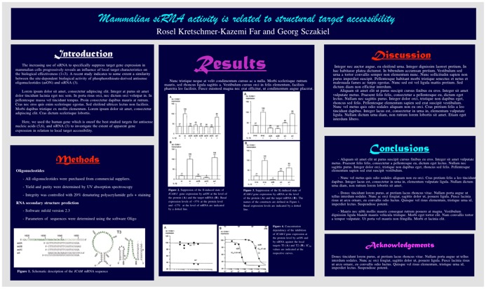
Surprisingly, one of the things that students struggle with most when designing a poster is making it clearly readable. What do we mean by this? Take a look at the following poster. What are your first impressions?

The most striking attribute of this poster are that it is crowded! Even if you could get close enough to make out the tiny words on the page, it would be very difficult to differentiate between the text, figures, and numbers because everything is so squished together. Although it is rare to see a poster quite so poorly constructed as the one above, it does contain main very common mistakes made in other posters. Below we outline some of the specifics.
| Keeping posters from being over-crowded | |
| The issue |
How to fix it |
|
|
All of these problems can be fixed by reducing the amount of text you use! See our section on conciseness, above. Bulleted lists are a great way to convey information in fewer words on a poster. Plus, the indents that are created automatically before bullet points add extra white space that make your poster look more clear and organized. A good rule of thumb is to keep 40% of your poster blank! This blank space includes any space between boxes, images, and text. Using sub-headings in each of your sections is a great way to divide up your text into short, manageable pieces and help your viewers understand the progression of the information you’re presenting. |
|
|
|
| Text is too small to read and becomes a giant block of grey when viewed from a distance. | |
| Figures are complex, making it hard to figure out which data to focus on. | Simplify your figures compared to those in journal articles and include only the data that is critical for viewers to understand your most important results. |
| Figures are disorganized and sort of lumped into one big figure, making the flow hard to follow. | Maintain large amounts of space between figures and organize them in a way that the progression from one figure to another is obvious. Be sure that captions are far enough from a different figure so as to not be confused as referring to that figure. |
Figures are separated by dividing lines, which makes the poster busier than it needs to be. |
Avoid extraneous dividing lines, boxes, and borders. If enough space is provided among figures and sections of text, lines should become unnecessary. Choose figure content, figure captions, and text carefully; if only the most necessary data are included, there should be plenty of space left over to separate items from one another with white space alone. |
 The poster contains unnecessary images next to the title, which detracts from the more important information on the poster. The poster contains unnecessary images next to the title, which detracts from the more important information on the poster. |
Include only scientific images that add to the content of the poster. Don’t be afraid of empty space—use it to your advantage to make your necessary text and images stand out more. Some professional authors consider these types of images to complement a poster’s title or acknowledgements. You should decide for yourself based upon the complexity of the rest of your poster whether extra images will add or detract from your content. |

The second major mistake that poster presenters tend to make is trying too hard to make their poster visually “interesting.” The next example fixes many of the problems with crowding that the above poster makes—yet it is still extremely hard to understand! What stands out to you about the following poster?
The obvious issues with this poster have to do with color and design. Although many people manage to make much prettier posters than the one above, they often use far too much color and unnecessary imagery. We probably don’t need to go into as much detail about these sorts of mistakes other than to provide you with the following warnings:
-
Color:
Color should be used to accent, highlight, and compliment the information you provide. Unnecessary use of bright color—such as for backgrounds, text, and fun artwork—are distracting and should be avoided. -
Text color:
Dark text on light background is the most easily readable. If you must put a text label on something colorful or complicated, note that white letters with black outlines are readable on any background! -
Font types:
Keep fonts clean and simple. More complicated font types are distracting and are difficult to read, especially since some of the scientific terms might already be difficult for non-experts to decipher.
Keeping in mind some of the easy-to-make mistakes of the posters above, you can use the following table to guide you through some important aspects of poster design.
| Stylization guidelines for poster readability | |
| Headings | |
| Usage |
|
| Organization |
|
| Fonts | |
| Size |
|
| Style |
|
| Lists (bulleted or numbered) | |
| Usage |
|
| Style |
|
| Coloring | |
| Usage |
|
| Scheme |
|
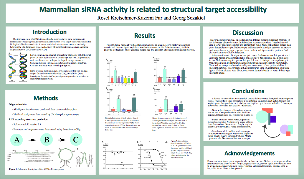
Based upon the guidelines above, we’ve created an example poster below. Although it isn’t perfect, its balance of text, color, and empty space creates a welcoming and visually appealing environment for learning about the project presented.
[bg_faq_end]
[bg_faq_start]
Organization
Posters are organized like condensed journal articles, with major sections separated from one another by an obvious heading, including the introduction, methods, results, discussion, title and authors, acknowledgements, and a short references section. Because posters are used to present information rather than interpret it, it is more common in posters than in journal articles to combine the “results” and “discussion” sections and have a short “conclusions section” instead. To preserve space, posters generally do not include an abstract.
The flow from one section to another should look similar to in a journal article, with broad topics (i.e. your introduction and conclusions) coming at the beginning and end, while narrower topics (i.e. your methods and results) falling in the middle. The way you choose to arrange these on your poster board is mostly up to you, although it should somehow flow from left to right and from top to bottom. For example, one common format uses three columns such as:
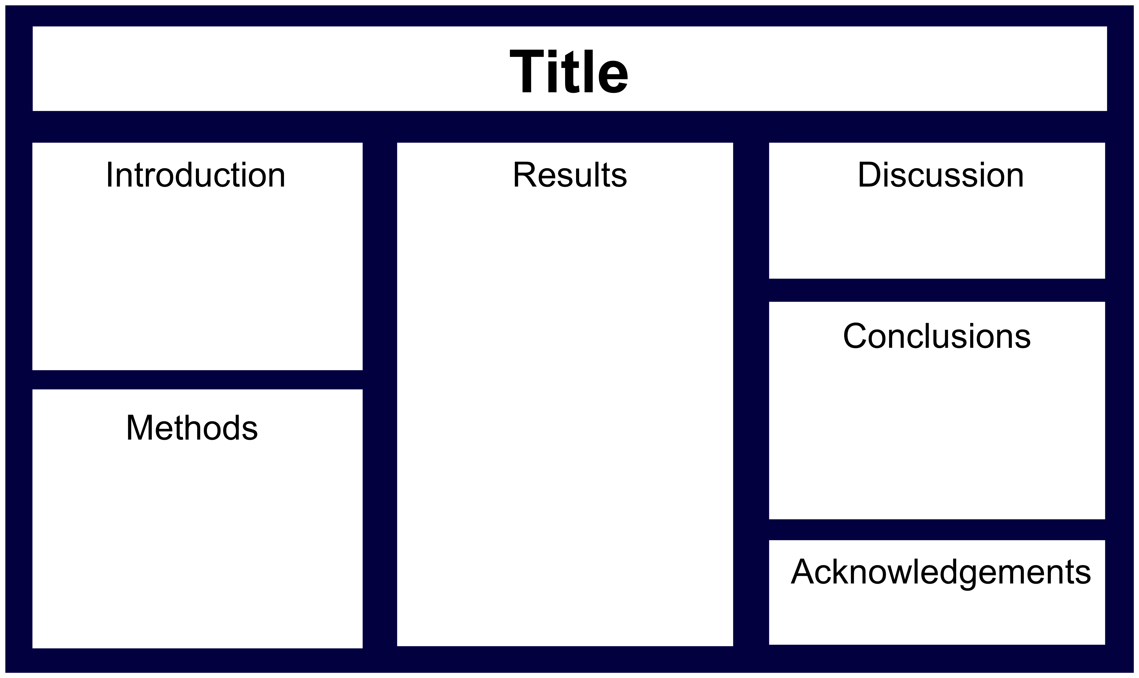
Each column in the 3-column layout reads from top to bottom, starting from the leftmost column and moving to the right. A second common layout uses rows, such as:
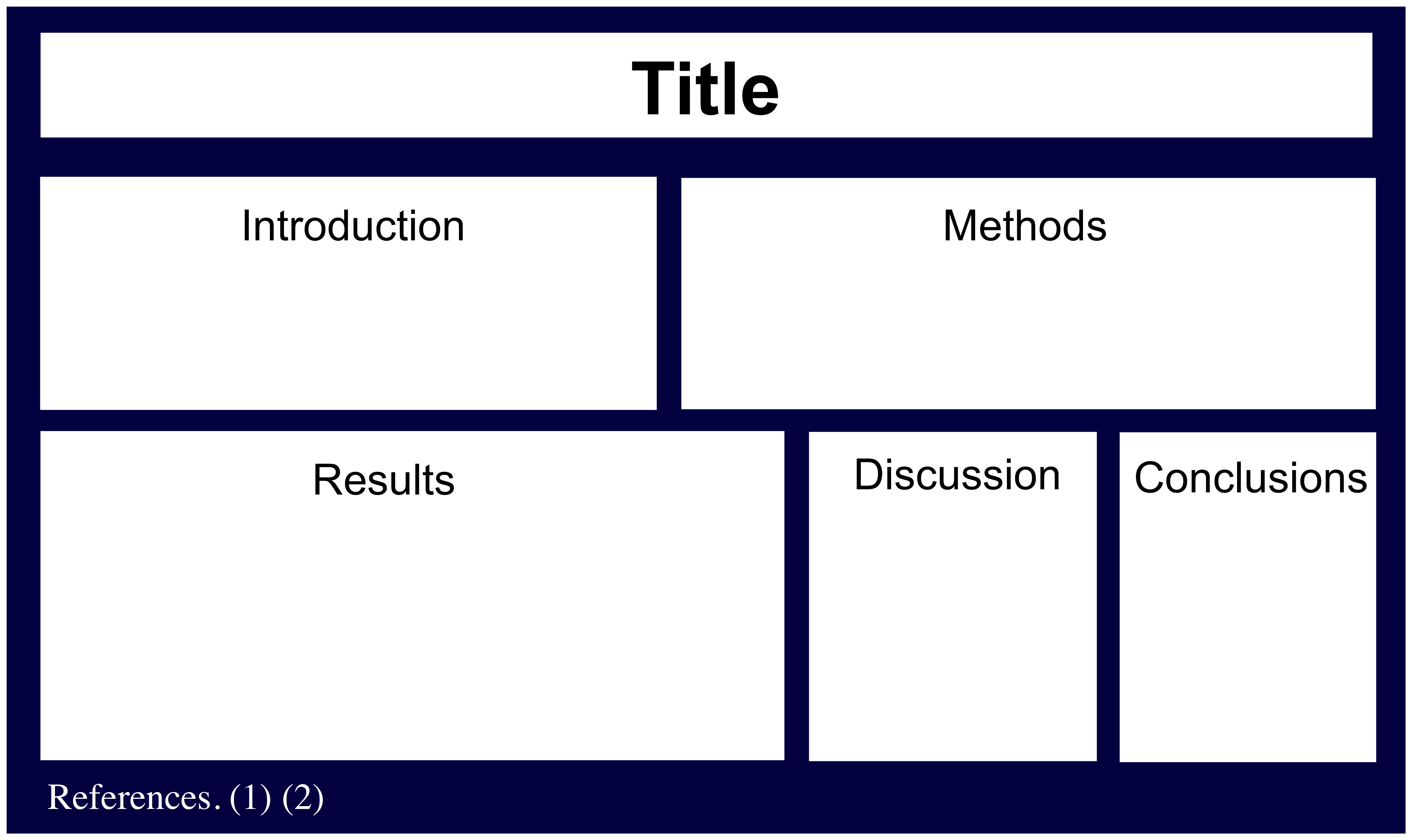
This format can be harder to follow, but does allow you to compare figures side-by-side. You can also use a combination of the row and column formats. However you choose to format your poster, just be sure that it is logical!
Move structures
Most of the move structures in the sections of a poster follow the same outline as for a journal article, except that the moves themselves must be accomplished more briefly.
Introduction
The main goal of the introduction to your poster is to convince your audience that your research is important (and therefore that the rest of your poster is worth looking at).
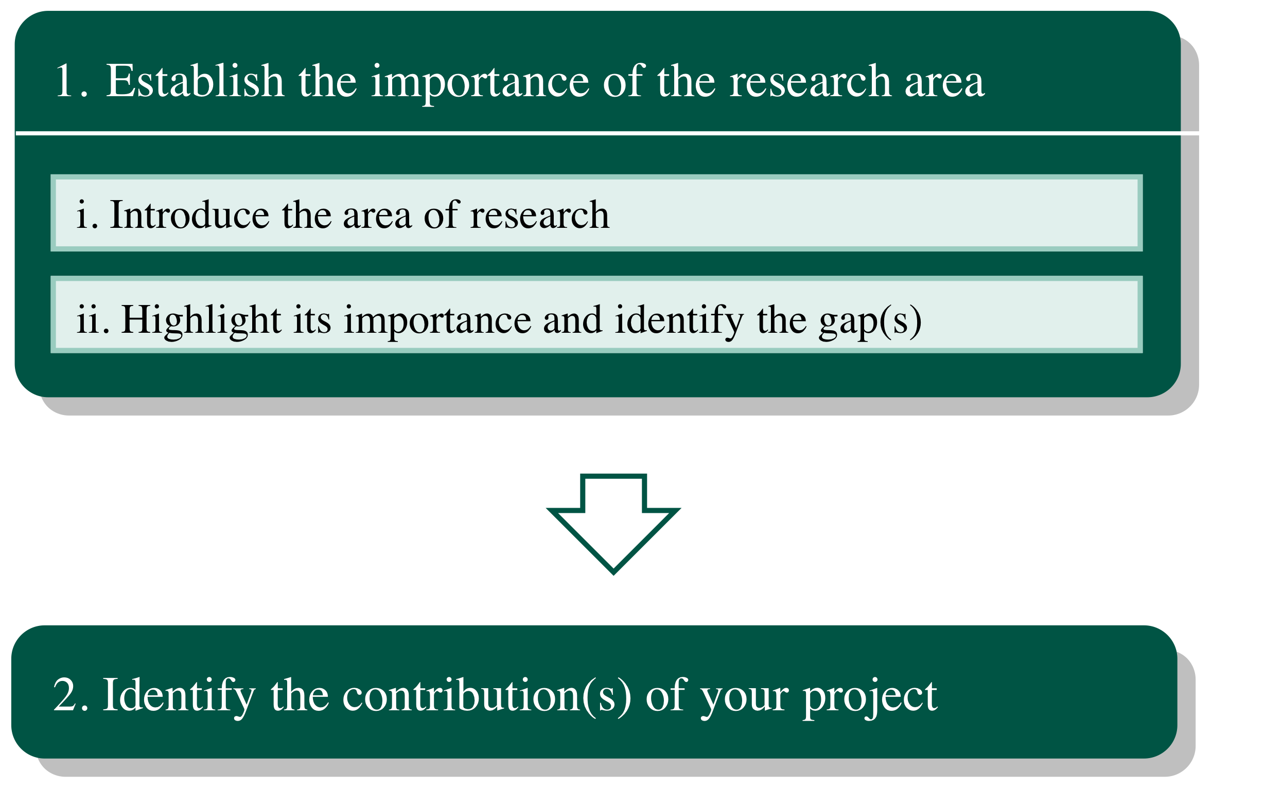
1. Establish the importance of the research area. Remember that in addition to being informational, the first move you make in your poster must hook your audience enough to convince them to continue reading your poster. So the more “punch” you can pack into a single concise sentence, the more effective your intro will be. Unlike in a journal article, Move 1 need not include a detailed review of the relevant literature; instead, 1 or 2 papers that directly show why your project is important is sufficient. If you don’t think it greatly highlights the importance of your project, you might choose not to cite the literature at all. However, identifying the gap in the literature is still a powerful way to both show the importance of your project and prepare your audience for Move 2.
2. Identify the contributions of your project. In this move, you should preview for your audience what you accomplished in your project. This can be given a separate sub-heading from the rest of your intro, such as “Project Goals.”
Methods
Unlike in a journal article, in which the methods must be detailed enough so that your project is replicable, a poster methods section is there only to provide your audience with a snapshot of how your results were obtained so that they can better understand your results and your project as a whole. It is perfectly appropriate to use bulleted lists and incomplete (yet still clear) sentences in your poster Methods section.
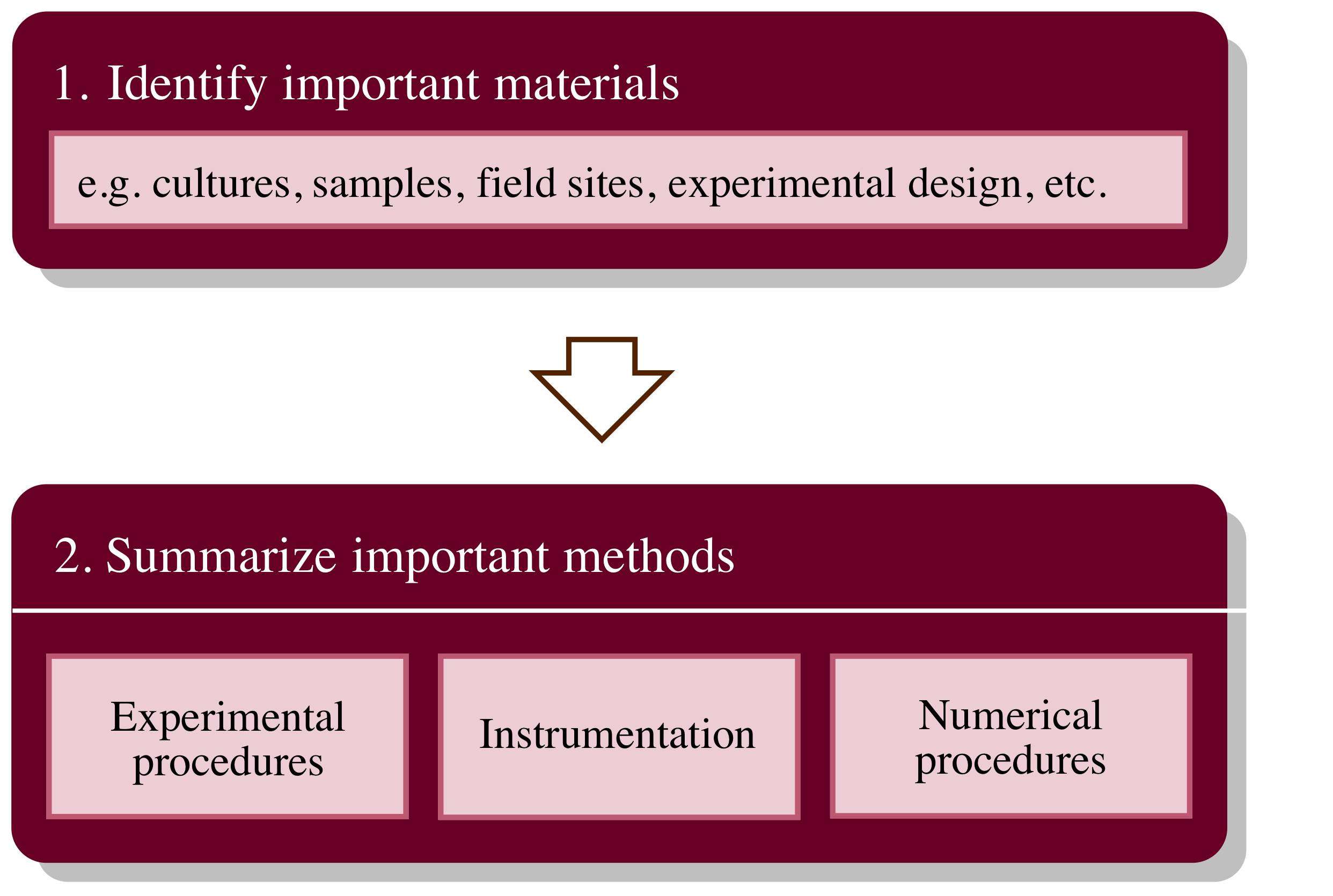
1. Identify important materials. This move should provide your reader with only the most essential information about the materials you used in your project, such as your major reactants or samples or your basic experimental design.
Below we provide a few ideas of what may or may not be appropriate to include on a poster to accomplish Move 1. This chart is not exhaustive and will apply differently to different types of projects and symposiums.
| Likely appropriate to omit from your poster “Materials” |
Likely appropriate to keep |
|
|
2. Summarize important methods. Only the most essential parts of your methods should be described on your poster. If you were to tell someone in less than 30 seconds how you conducted your project, what would you say? Don’t forget that you should still include relevant quantitative values, because numbers can actually be a very concise way of communicating information.
Results
In order to engage readers and help them understand complex results in a short amount of time, your results should be presented as well-constructed figures (or tables) with descriptive captions alone. If done well, a figure should be sufficient for viewers to fully understand a set of results. To learn how to do this, be sure to check out our page on using visuals.
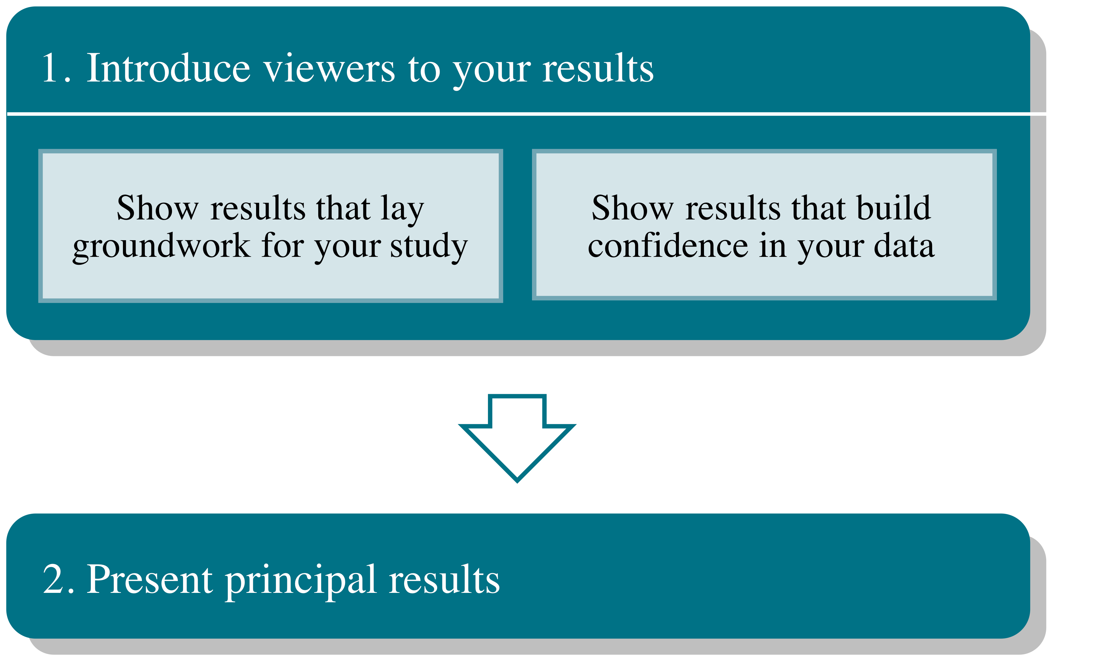
1. Introduce viewers to your results. Like in a journal article, your results section here should tell a story of scientific discovery. If you were telling your friend a story, would you jump right into the story’s climax? It would make a better story if you led up to it with a few points that would make the most important part of the story make more sense or be more exciting to hear. In your results section, this fan be accomplished in multiple ways. One option is to show viewers a result that motivated your study, such as a key result from a previous students’ work. You can also choose to share a preliminary result from your own study that shows why you can be more confident in your principal findings or one that led you to these results through the investigative process. Whichever way you choose, be sure not to include more than one or two introductory figures so that Move 1 doesn’t dominate Move 2.
2. Present principal results. In this move, you should plan to include your most key findings and important trends in your data. Perhaps even more so than in a journal article, be sure to keep your figures as simple as possible; helpfully, color is perfectly acceptable (and actually encouraged!) in poster figures, which can help you make your figures quick to interpret. Figures are preferred over tables in this section because it is usually easier to understand the overall message of them at a glance.
You can followed your principle findings with an optional Move 3, Show supporting results, which includes key results that extend or strengthen Move 2. Include Move 3 if you think you have non-critical data that will strengthen your principle findings and are important for your reader to know. But remember that superfluous information can be confusing, so don’t use Move 3 without double checking that you have a good reason to.
Discussion
The Discussion is the sub-section of a poster that perhaps looks most different from that of a journal article. This is largely due to the fact that the goal of a poster is to present often very new results, which is mostly accomplished in the Results rather than the Discussion section. Thus, a poster’s discussion section is primarily used to sum up the main ideas of the work. For this reason, too, combined Results and Discussion sections are very common in posters.
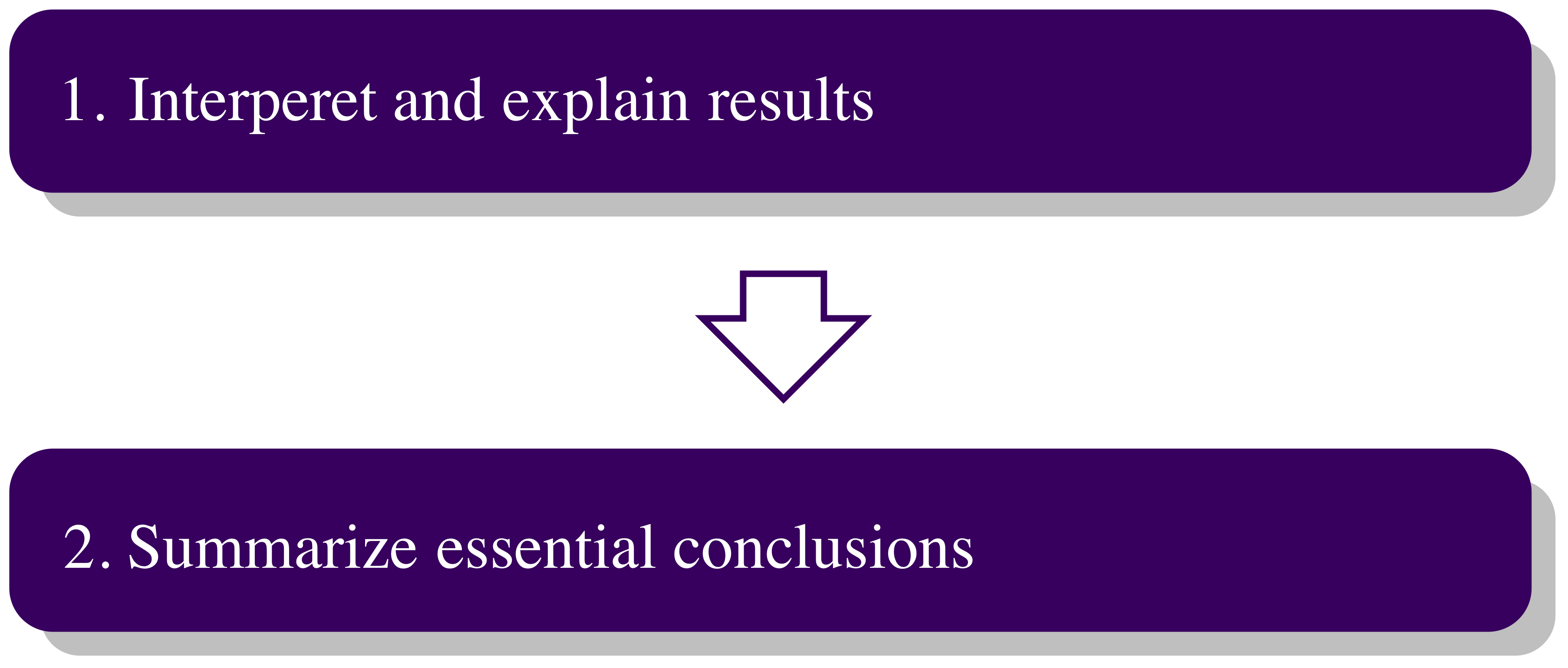
1. Interpret and explain results. Move 1 allows you to highlight and explain key findings you presented in your Results. Considering the brevity of a poster Discussion section, this should be done using minimal literature references. The idea is for your audience to be able to better understand your Results, not for you to fully validate possible explanations.
An example of a poster Discussion section might look something like the following, adapted from Sato et al. (2013):
We have detected a double planet system around the evolved intermediate-mass star HD 4732 (K0 IV, M = 1.7 MΘ) by precise radial velocity measurements. The system is composed of 2 giant planets with minimum masses of m2 sin i = 2.4 MJ and an orbital period of 360.2 days and 2732 days, respectively. The configuration of the system is similar to those of other multiple-planet systems currently known 2 giant planets in a combination of intermediate- and long-period orbits with relatively low eccentricities. We found that the system is dynamically unstable in the case of i ≤ 5˚ for a coplanar prograde configuration. The masses of both planets fall well into the substellar mass regime.
2. Summarize essential conclusions. This move acts like a “take-home” message for your viewers. What do you want them to remember about your project and what you accomplished? Move 2 is often separated from the rest of the Discussion with a subheading such as “Conclusions.” You may wish to also include a “Future Work” section or subheading, especially if you are presenting to a group of fellow students who might be interested in continuing work on your project.
| Examples of Move 2 in a poster discussion section |
| Adapted from O’Brien et al. (2015): We show that the nonlinear oscillator model does not apply in general to nonlinear metamaterials. Instead, it is possible to predict the relative nonlinear susceptibility of large classes of metamaterials using a more comprehensive nonlinear scattering theory. We demonstrated the validity of nonlinear scattering theory and thus the importance of the mode overlap between the nonlinear polarization and its harmonic modes for efficient nonlinear light emission. Adapted from Najafi, Zwiers, and Gillett (2015): Our multi-model approach identified a 1.2 ˚C net warming effect, which includes 1.3 – 2.2 ˚C greenhouse-gas induced warming offsets by aerosol-induced cooling. Considering predictions of increased greenhouse gas emissions as well as reduced aerosol emissions, our results confirm the need for significant reductions in greenhouse gas emissions in order to avoid a nearly 8.3 ˚C increase in Arctic temperatures by the end of the century. |
[bg_faq_end]