Make room on the fridge – I’ve got something to post! Today I felt like I finally had success working on an infographic workflow. This has been a hot topic with the digital media tutors and one I’ve been trying to figure out through a variety of methods. My goals were:
- Locate a design component that was relatively easy to use and did not require a steep learning curve.
- Being able to output the result in a format that students could take with them. (One of my goals with everything digital!)
- Integrating data sets from Excel
- Being able to interact with the data would be frosting on the cupcake – but I wasn’t counting on that one. (Spoiler alert – I got FROSTING!)
So what did I do/try?
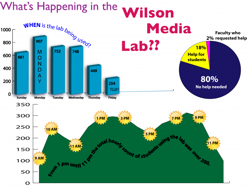
Thanks to one of our super librarians (thanks Brenda!!) I was notified that Lynda.com had a group of tutorials on infographics. I set to work watching and settled on “Creating Infographics with Illustrator”. Using the graphing function within Illustrator I was able to come up with the primitive version below….
Did I mention that I’m not a designer? Ok – good, just checking. 😉 So although I found this quasi-functional, it seemed to require a higher level of design expertise to incorporate multiple infographic elements. (As a side note I thought it would be a cool idea to try to make the graph at the bottom of the page mimic the Green Moutains with the time starbursts starting as sun in the morning and moving to a moon at night. However, I quickly determined that was going to take more time that I feasibly could devote to trying to figure something out. It did sound like fun though.)
My next stop? Piktochart! I noticed this tool being used in the lab this semester by a few students and it was already on my radar from a few posts here and here. (Thank you Edudemic!)
I had already crunched the numbers by exporting the data collected on a Google SS via a Google form to an Excel spreadsheet, so I had segregated and totaled the data that I was targeting. Piktochart offers a few free templates, however I decided to go with a blank template to see how difficult it was to start from scratch. By adding blocks I was able to create different sections of data and a header for the chart. Since my main focus was data manipulation my end product is very chart heavy b/c I wanted to see how the different types of charts displayed on the screen. Curious what this non-designer, multi-color loving, tech-tinkerer created? Check it out below. BONUS – I was able to embed it in my WordPress blog using iframes…although I’m not sure how stable this method is. (Functions on hosted WordPress NOT on WordPress.com.) :’-)
It’s not perfect – I know, but it does represent what I think is a workable workflow that does not require a learning curve the size of the Grand Canyon…or even Middlebury gap for that matter. It’s do-able, interactive (5 stars there) and web based; which are all items that I think will be seen as beneficial. But I’m still curious.
Are you helping students to create infographics? What tips do you have to share?
