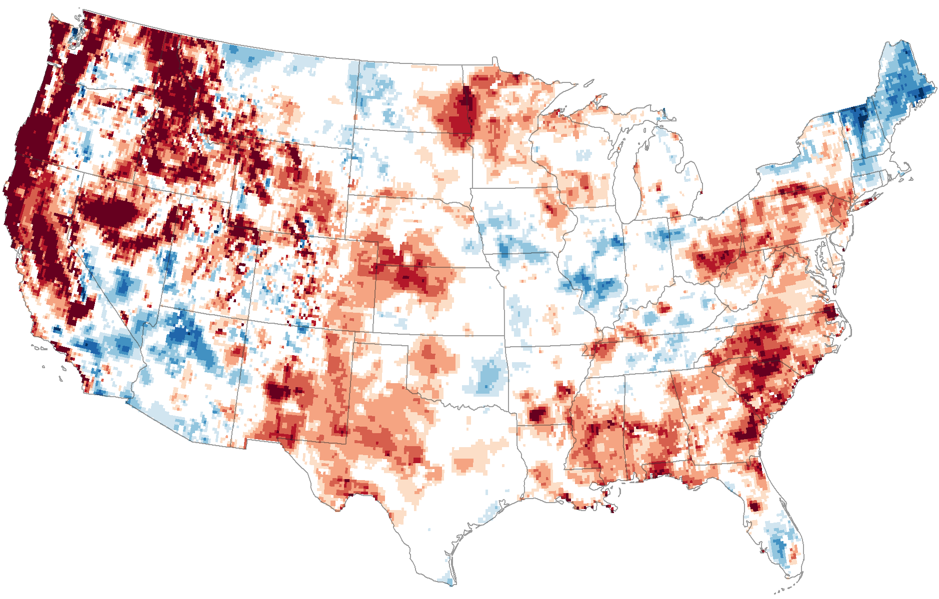
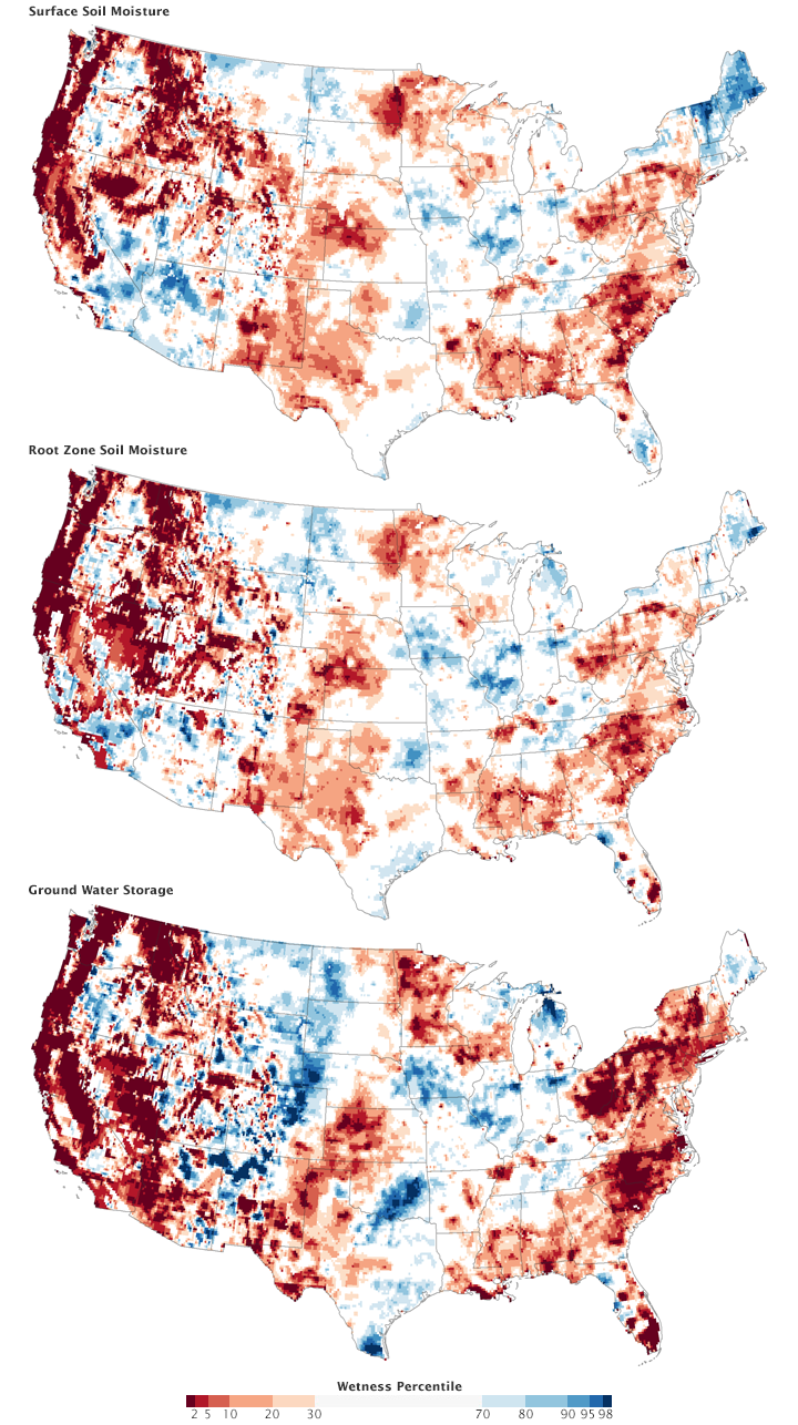
I forget where I found them (probably Lifehacker), but some recent pictures of the US taken by the Gravity Recovery and Climate Experiment satellites show in stark maps the bubble of drought we seem to find ourselves in right now. The first map shows soil surface moisture, moisture in the first centimeter of soil. Look for the little dark red blob right on top of Middlebury. (click on maps for larger view)
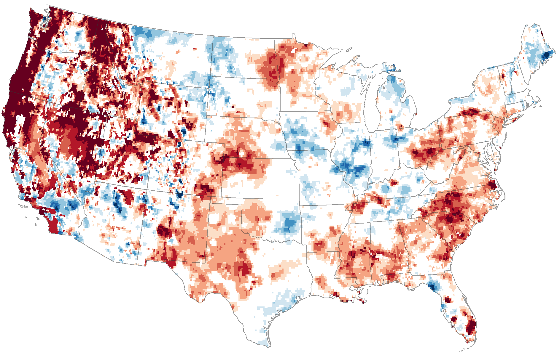
The next shows root zone soil moisture, the top meter (39″) of soil.
This final map shows ground water in shallow aquifers (like the well at my house!).
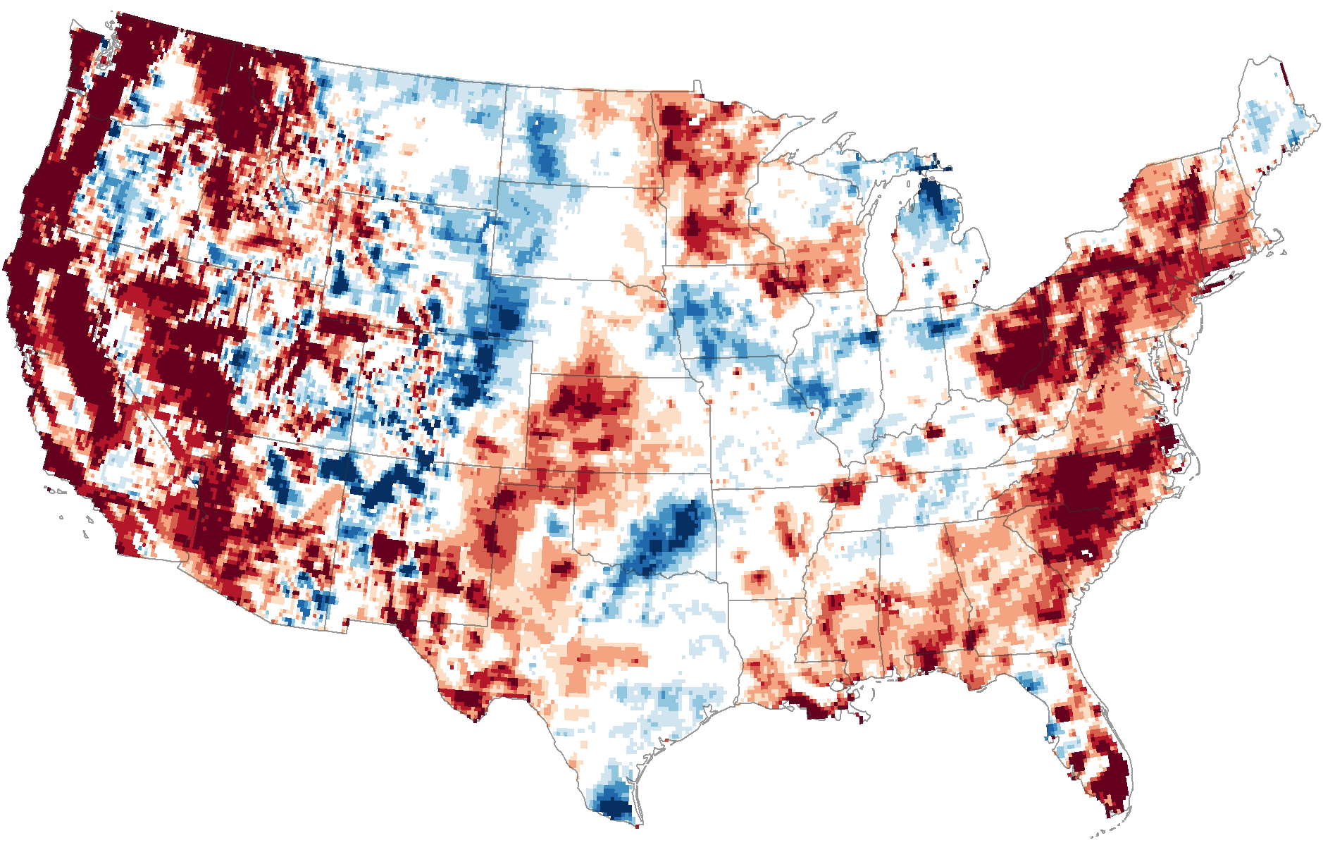
I’ll include the overall map of all three maps, which give a legend to the colors. The explanation is as follows (and is quite scary!)-“The maps do not show an absolute measure of wetness, or water content. Instead they show how water content in mid-September 2015 compares to the average for the same time of year between 1948 and 2012. Dark red represents areas where dry conditions have reached levels that historically occur less than 2 percent of the time (once every 50 or more years).” Note how we are in the dark red in all three maps.
If you have a little bit of time, by all means read how gravity sensing satellites can figure out how much water is in the earth. In a nutshell, it’s two satellites seperated by 139 miles, and sensing how much they move towards or away from each other as they orbit minute changes in gravity from earth can be measured. The complete explaination is at http://earthobservatory.nasa.gov/Features/GRACE/ .
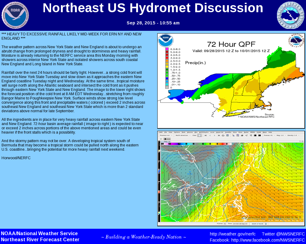
Hope is on the way, though. We’re looking at a pattern change, with a cold front moving into the area and drawing moisture into the region, possibly an inch of rain or more. That’s a good start. Here’s a good rundown from the Northeast River Forecast Center.