By Erin Wolcott, Assistant Professor of Economics, Middlebury College
Earlier this month, I invited a long-time friend, Quoctrung Bui, to campus. Bui and I know each from working our first job after college crunching data as research assistants at the Federal Reserve Board in Washington, DC. These days Bui is a graphics editor at the New York Times, where he covers social science and policy for The Upshot. He specializes in writing stories accompanied with data visualizations that help readers process the numbers.
At a workshop sponsored by the CTLR and DLA, Bui discussed with faculty what it’s like to be a graphics editor, how faculty can get their research picked up by the media, and what Middlebury students can do to prepare themselves for potential careers in data journalism. The conversation also turned to helpful coding and publication tools (see below for Bui’s recommendations).

To publish an Upshot article, Bui generally works with a team. He used the word “barnacle-ing” to describe how these teams are formed. If one editor comes up with an idea, other editors “barnacle” on to the project because they find it interesting, and together they can publish better journalism than working against each other. Initial ideas often come from sifting through academic research (often on Twitter feeds of scholars, policy makers, and other journalists) in search of new data and compelling stories. From there, editors interview experts in the field and work with researchers to create The Upshot’s data visualizations. Success of a story is partly measured by the number of reader “clicks” and other online analytics.
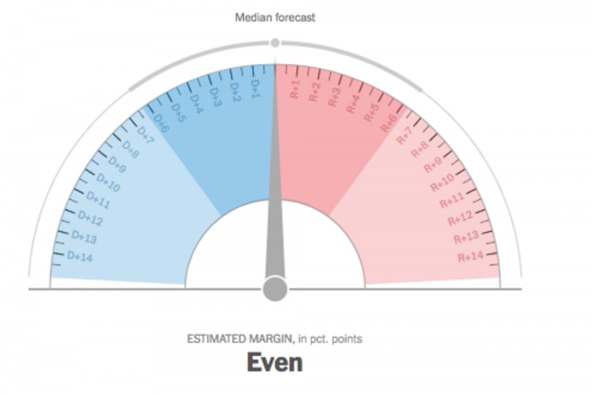
One data graphic that sparked much conversation during Bui’s workshop was the New York Times‘s election forecast “needles,” which both catch some of the excitement of elections and compress all sorts of factors in ways that might be hiding the data feeding these meters, particular around margins of error (also the needle has inspired a number of Internet memes and commentary).

For students interested in a career in data journalism, the New York Times sponsors fall and spring semester internships in graphics. Bui recommends proficiency in R and other programming languages, but most of all a keen sense of journalistic curiosity about how data can suggest stories relevant to the Times’s readership.
Bui’s Quick Guide to Helpful Data Visualization Tools
- In my opinion, the best model out for how publications should look like is Distill.
- A chart/mapmaking tool I like for the web is Datawrapper.
- I find Mapshaper does most of what you might want to do in QGIS or ArcGIS, but is free, web-based, and much faster.