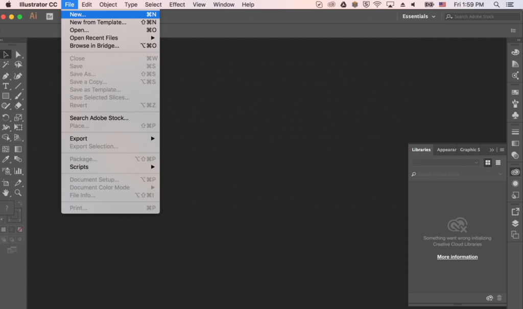
Professor Lopez-Barrera of the Architectural Studies Program proposed this project for the summer of 2017. It entailed editing a map depicting the social and spatial transformations of rural communities in western Uruguay between 2000 and 2016. The purpose of this project was both aesthetic and practical, as its goal was to make the map more visually appealing and the changes observed in the research more apparent. To that end, I used Adobe Illustrator software. This project was challenging in large part because its goal was very subjective, and there were many ways I could have gone about fulfilling it. Though I paid careful attention to components of the map such as object size and transparency, my main focus for this project was on color. The map essentially included 27 layers on top of an aerial image, and the map features divided into roughly three categories, and again into two time periods. Thus, I had to select color schemes that would convey a layer’s category, and at the same time show whether it referred to the year 2003 or 2015. For example, I assigned “cooler” colors like greens (“housing”) and blues (“infrastructure”) to layers pertaining to the year 2003. I also later designed and added a key to the map in order to communicate the scheme I had devised.
This project was unlike any others I’d worked on in the summer of 2017, due to its emphasis on rather inexact qualities like appearance and readability. This made effective communication critical for the project’s success, as there wasn’t a clear set of instructions at the start.
