Tag Archives: midterm election

Fenno’s Paradox, or Why You Should Ignore That Poll That Says We Hate Our Member of Congress

This WashingtonPost/ABC poll finds that, “for the first time ever”, a majority of those surveyed disapprove not just of Congress, but of their own member of Congress.  What does this portend for the fall midterm election?  As I write in my latest U.S. News post here, it probably means a lot less than some pundits would have us believe.  A rough back-of-the-envelope statistical guesstimate based on past results to this question suggests roughly 87% of incumbents will still win reelection this fall.  If you want to know why, Richard Fenno explained it all back in 1972.


Why Did Political Scientists Miss the Midterm Wave?

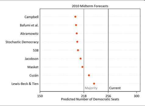
After a period of post-midterm decompression, it’s time to return to the blogging salt mines. Picking up where I left off in my last post, let me start with a simple question: why did every political science forecast of the midterm election of which I am aware underestimate the size of the Republican wave that hit the House (the few that predicted Senate results were off as well)?  To be sure, the results did fall within the confidence interval of some of the models, and most political scientists foresaw the Republican House takeover, but none of the predicted point estimates came very close to the final results. As of today, it looks like Republicans picked up about 62 House seats (four races are still pending) and 6 Senate seats.  To refresh your memory, here’s John Sides’ chart with the Labor Day political science projections.

So, the most  pessimistic forecast from the Democrats’ perspective – Campbell’s – still had Democrats holding more than 200 seats, or a dozen more than the actual 190 they now possess (with four races pending). Note that even with the advantage of several additional weeks of data, I didn’t fare much better; my “tweaking” of the projection models led me to forecast a 49-seat Republican pickup, considerably short of their actual gain.

In addition to the thrill of giving out Presidential Power t-shirts (yes, I will announce the contest winners in a separate post), the reason why I am interested in these forecasts is because they are a measure of how well political scientists understand midterm elections.  Unlike someone like Nate Silver, we aren’t only interested in getting the final numbers right – instead, we want to understand what explains those results.  (By the way, Silver’s prediction – he’s “538” in the chart – as of Labor Day fell, as you can see, in the middle of the pack.  That’s not too shabby – for an economist!)

What most interests me about this last midterm is not that the forecast models were off – it’s that they were all off in the same direction.  Political scientists systematically underestimated the Republican seat gain.  In one respect, of course, this is perhaps not surprising; as I noted in several of my pre-election posts, political scientists are inherently conservative folk. They tend to assume that future iterations of an event will unfold much as it did previously, so prior patterns should be a reasonably reliable predictor of what’s to come. Evidently, this assumption did not hold true for this latest midterm. But why not?  I can think of four related answers: the unprecedented depth of the economic recession, the nationalization of midterm elections, the role of the Tea Party and the collective impact of the controversial legislation – particularly TARP, the stimulus bill and health insurance – passed by the Democratically-controlled Congress during the last four years.  Let me start by exploring a couple of these factors: the economy and the nationalization of elections.  I’ll deal with the Tea Party and the controversial votes issues in a separate post.

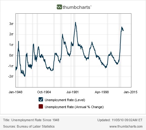
As I’ve explained in previous posts, most forecast models incorporate some measure of the economy, such as quarterly growth in GDP or disposable income, or changes in the unemployment rate.  As my colleague Bert Johnson surmised during our election night coverage, it is possible that forecast models constructed from previous years’ economic data may have underestimated the relative importance of the current economic downturn to voters.  In other words, models based on “normal” economic conditions may not do particularly well when the economy is an historical outlier, as this one certainly is.  Consider that during the last six decades, as this charts shows, monthly unemployment levels have only approached the current rate once before, during Reagan’s first term.

During the 1982 midterm, of course, Reagan’s Republican Party only controlled the Senate, not the House; the divided government may have prevented voters from holding Reagan and the Republicans solely accountable for the dismal economy in that election which may partly explain why Republicans only lost 26 House seats. (Note that they also had fewer House seats to lose.) In 2010, by contrast, Democrats controlled all three branches and thus were more likely to suffer retribution from voters concerned about persistently high unemployment.

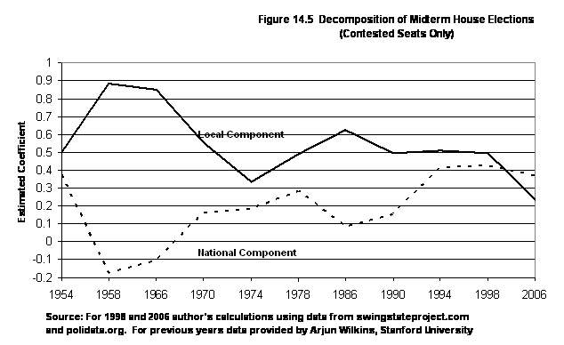
Of  course, unemployment is only one facet of how voters’ assess the economy, and the economy is not all they assess during midterms.  Nonetheless, it is an important component – perhaps the most important component that goes into a voter’s calculus. Now add to the mix concern over record post-war budget deficits, spending on TARP and the stimulus, uncertainly about health care costs and you have the setting for a midterm election driven to a much greater degree than in previous years by economic worries.   Moreover, as I’ve noted in previous posts and as this table shows, House elections have become increasingly nationalized since the mid-1980’s.

This means individual House races are more likely to be influenced by factors outside each district – factors less amenable to individual candidate’s control.  I’m currently putting together the numbers for the 2010 midterm, but I have no reason to believe it was any less nationalized than recent midterms.   That means the impact of economic factors was likely even greater during this last election cycle.

My point is not that the forecast models totally ignored economic factors – it’s that economic factors weighed more heavily in midterm voters’ minds this time around than is typically the case.  With Democrats viewed as the party in charge, and with Democrats holding more vulnerable seats, they were extremely susceptible to getting washed out of office in a “wave” election.  To capitalize on these conditions, Republicans needed to both run good candidates and to get voters to show up at the polls. As it happened, the Tea Party stepped in to assist with both conditions. I’ll address that topic in the next post.

Addendum:  The initial post showed the wrong unemployment data – I’ve corrected it above.

Can We Trust the Gallup Generic Ballot Results?

At this stage in the electoral cycle, the fundamentals that drive the midterm vote – unemployment, real disposable income, attitudes toward Obama – are for the most part fixed, barring a major event. The key question now becomes who will show up at the polls?  As the latest Gallup generic ballot results indicate, turnout is the key to whether on Nov. 2 Democrats lose an average number of seats for the post-World War II era – say about 30 – but retain control of the House, or lose 40 seats or more and are swept out of power in a tidal wave of voter anger.

Let’s look at the latest generic ballot results from Gallup.

If we look only at the generic ballot results of registered voters, we see Republicans ahead by 5%.  That translates into a projected Republican gain of perhaps 40-45 seats (depending on the forecast model), enough to regain the House if everything goes right.  But now look at the results of a survey of likely voters, as opposed to registered voters.  Assuming 40% turnout, which is about par for the course for midterm elections in the post-World War II era, Republicans have a whopping 17% lead on the generic ballot.  That translates into a wave election come Nov. 2, with Republicans picking up 65 or more seats, according to some forecast models. This would be a stunning repudiation of Democratic control of Congress. (Note that Gallup estimates whether one is a “likely voter” based on answers to seven questions that have proved reliable predictors in the past.) If Gallup’s likely voter numbers are correct, it’s 1994 all over again – or worse – for Democrats.  The question is: can we believe Gallup’s numbers? Alan Abramowitz, for one, does not. To begin, Abramowitz believes Gallup’s proportion of Republican to Democrats (55% to 40%, including leaners) in their likely voter, low turnout model, overstates likely Republican turnout. He is equally critical of the predicted proportion of turnout among those age 65 or older (27%) and the proportion of young voters under age 30 (only 7%).  He also questions Gallup’s results for nonwhites: “Among nonwhites other than blacks, a group that comprises about 13% of likely voters, a generic Republican is leading a generic Democrat by 10 points, 52% to 42%. That’s a group that voted Democratic by a 2-1 margin in the 2006 midterm election. Moreover, it’s a group that has never given a majority of its vote to Republican candidates for Congress in any election since the advent of exit polling. According to the 2006 exit poll results, about two-thirds of these “other nonwhite” voters are Latinos. How plausible is it that at a time when the Republican Party is closely associated with stridently anti-immigrant policies that Latino voters are moving in droves toward Republican candidates? Not plausible at all… .”

Abramowitz implies that the only value of putting out these numbers is to change the campaign narrative and, presumably, dampen Democratic turnout – a serious charge.  In his words: “But what is the value of putting out results that defy logic but which can influence perceptions of the current electoral climate among political elites as well as the public?”

What are we to make of Abramowitz’ criticisms?  To begin, Gallup is not suggesting Latinos are moving in droves to Republicans – only that turnout will be heavier among Republican-leaning voters.  More generally, note that political scientists (including myself) are an inherently conservative lot – we tend to believe that future events will unfold largely as past events did.  When they don’t – and 1994 is a case in point – we tend to get caught flat-footed.  No political scientist that I know of predicted the Republican sweep in 1994.  In this vein, Abramowitz discounts Gallup’s results because they are inconsistent with turnout among subgroups in previous elections.  But what if this election is in fact a “wave” election, in which turnout disproportionately favors one group?  Gallup, relying on its likely voter model, is suggesting precisely that – the enthusiasm gap between Republican and Democrats is going to skew turnout in ways that will produce unusual voting patterns.

Note also that the margin of error for Gallup’s results increases when we focus on subgroups within the sample.  If we keep this in mind, Gallup’s likely voter model for subgroups – while historically unusual – is not as outlandish as Abramowitz suggests.  For example, the demographic profile of the 2010 electorate as posited by Gallup is not much different from previous midterm profiles; it is slightly less white, slightly older and slightly more educated than a comparable profile of the 1994 electorate which was the last “wave” election.  The proportion of Republicans, Democrats, and Independents in the 2010 survey is almost identical to 1994’s partisan breakdown.  The big difference is that Gallup sees today’s likely voters as more conservative than in 1994 (54-40%) but also – and Abramowitz doesn’t mention this – more liberal than in 1994 (18% to 12%).  In other words, the big difference between 1994 and today is a drop in the number of likely voters who call themselves “moderates” from 48% to only 27%.

I understand Abramowitz’s concern with Gallup’s number.  But I do not believe they “defy logic” – in fact, they are plausible if we are on the brink of another wave election in which turnout is disproportionately greater among older, better educated and conservative voters (Tea Party anyone?), even accounting for the growth of nonwhites in the electorate as a whole since 1994.  Gallup’s likely voter model could be wrong.  But we need to be careful about jettisoning a methodology that has proved reliable in the past just because this time around it is provided results that seem historically atypical (or because we don’t like the outcome!)

A final thought. Gallup’s generic ballot numbers have been stable for three weeks, but that does not mean they can’t change in the remaining two weeks. Gallup estimates that there is still a block of voters – about 5% – who remain undecided. If we look at previous midterm election cycles dating back to 1994, there have been instances in which the results changed considerably in the last two weeks.  For example, in 2002, Republicans were trailing the Democrats in the Oct. 20 generic ballot results by 3%, but in the final poll they led by 6%, a net pick up of 9% points. They ended up gaining 6 seats in the House that fall.  In 2006, Democrats’ lead in the poll dropped 6%, from 13% to 7%, in the same time period, but they still gained 30 House seats.

In the end, it’s going to come down to turnout.  If Gallup’s likely voter numbers hold, it will be 1994 all over again.

Is the Public Stupid? When A Chart Is Not Worth A Thousand Words

This item from yesterday’s Washington Post caught my eye as a useful teaching moment.  Ezra Klein posted this graph, based on this most recent Washington Post/ABC Poll,  under the label “A chart is worth a thousand words”:
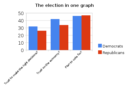
It’s not clear what Klein’s point is, but presumably he means to point out just how illogical voters are, since they trust Democrats more than Republicans on handling the economy and to make the “right decisions”, and yet a plurality (by a slim percentage) are planning to vote Republicans into office.

There’s only one problem with this graph. If you actually go to the data in the poll from which Klein constructed it, you’ll see that the first two bars are based on a sample of all adults, while the last bar, which graphs the partisan breakdown of responses to the question “who do you plan to vote for?” is based on a sample of only registered voters.

Longtime readers have heard this refrain before, but it bears repeating for those who have just tuned in:  samples based on registered voters tend to skew slightly more Republican than do samples based on all adults.  The basic reason is that samples of all adults include more Democrat supporters who are less likely to vote. Or, to put it another way, Klein is comparing apples to oranges.

How big is the difference? It varies, of course, from poll to poll depending on sampling procedures, etc. Ideally, of course, we’d test the premise by having polling outfits conduct split sample surveys that compare response rates of both likely and registered voters to all adults.   That’s expensive, however, so most polling outfits do one or the other.  (Presumably WaPo switched to registered voters from all adults on the “who are you planning to vote for?” question because for this question they wanted to sample those most likely to vote, rather than all adults.)

However, we can get some leverage on the issue by looking at past Washington Post polls that have polled both groups in close temporal proximity, if not at the same time.   Here’s an example.

18. (ASKED OF REGISTERED VOTERS) If the election for the U.S.
House of Representatives in November were being held today,
would you vote for (the Democratic candidate) or (the Republican
candidate) in your congressional district? (IF OTHER, NEITHER,
DK, REF) Would you lean toward the (Democratic candidate) or
toward the (Republican candidate)?
NET LEANED VOTE PREFERENCE
               Dem     Rep     Other    Neither    Will not       No
               cand.   cand.   (vol.)    (vol.)   vote (vol.)   opinion
7/11/10  RV     46      47       *         2           *           5
6/6/10   RV     47      44       2         2           1           4
4/25/10  RV     48      43       1         2           1           6
3/26/10  RV     48      44       1         2           *           4
2/8/10   RV     45      48       *         3           *           4
10/18/09 All    51      39       1         3           2           5

Note the big difference when WaPo switches from sampling all voters, in October, 2009 versus a sample of registered voters in February, 2010.  Democrats go from being preferred by 12% to being behind by 3% – a net shift of 15%.  Yes, the polls were four months apart, so it’s possible voters’ preferences simply shifted that much in the intervening time.  Note that we don’t see any comparable shift in subsequent months, however.

Next, let’s look at previous WaPo/ABC polls that asked respondents which party they trusted more to handle the economy.  Fortunately, in September, 2002 WaPo asked a sample of all adults “Which political party, the (Democrats) or the (Republicans), do you trust to do a better job handling the economy?”  In the following month, they asked this of likely voters and then two months later of all adults again. Note that likely voters tend to skew Republican even more than registered voters. In September, the random sample of all adults indicated that they trusted the Democrats more, by 8%. The next month, when WaPo sampled only likely voters, the country changed its mind and now trusted Republicans more by 5%. That is, Republicans picked up 9% while Democrats dropped 4% in the switch from sampling all adults to sampling likely voters – a net switch of 13%.  Two months later, WaPo went back to sampling all adults, and Democrats closed the trust gap, essentially matching Republicans’ support.  The following table summarizes the results:

Date Democrat Republican Both Neither No Opinion
12/15/02 44 45 4 6 1
10/27/02  LV 43 48 3 3 2
9/26/02 47 39 3 6 5

Again, it’s possible that the public’s view toward the two parties’ ability to handle the economy changed from September to October, and then shifted back from October to December.  But it is more like, in my view, that the change reflects the difference response one receives when sampling all adults versus sampling likely voters.

This difference in partisan response rates for survey of all adults, registered voters, and likely voters, permeates all polls.  As evidence, look at this recent Times poll asking

“There will be an election for U.S. Congress in November. If you had to decide today, would you vote for the Democratic candidate in your district or the Republican candidate?”

Fortunately, the Times asked this of both likely voters and registered voters at the same time.  Here are the responses:

Population Sampled Democrat Republican Tea Party Other Unsure
Likely Voters 43 42 1 2 12
Registered Voters 47 43 1 3 6

Even when considering registered and likely voters, we see a slight Republican bias in the likely voter response.  Of course, the differences are small and close to the poll’s margin of error, so we can’t be sure the difference is driven by the different population samples.  But we can’t dismiss it either.  More generally, if you look at the dozens of polls that have asked versions of this “who will you vote for?” question this year, Republicans do better in surveys of likely voters versus registered voters, and better among registered voters than among all adults.  You can see for yourself here, by looking at the specific polls under the  2010 midterm section.

Now, let’s return to the original numbers on which Klein based his graph. The first table has the results for the question “who do you trust to make the right decision” asked of all adults.

Date Democrat Republican Both Neither No Opinion
7/11/10 42 34 3 17 5

And here are the percentages of the responses to “who do you trust to handle the economy?” again asked of all adults. (Respondents favoring Democrats in the first column, those favoring Republicans in the second.  I’ve omitted the “just some” and “not at all” categories to be consistent with Klein’s chart.)

7/11/10 32 26

What happens if you shift the net results to these two questions, say, about 5% toward the Republicans, which is consistent with the likely impact of surveying registered voters, as opposed to all adults?  Suddenly, given the 4% margin of error, Republicans are virtually tied with Democrats in terms of which party is preferred by voters for handling the economy, and for making the right decisions.  That is, the findings Klein cites in his chart that shows Republicans and Democrats in a dead heat in terms of registered voters’ preferences in the 2010 midterms seems quite consistent with the survey results for these two questions.

My point isn’t that Klein is wrong.  In fact, the public could be acting illogically by voting for the party they trust least to handle the economy or to make the right decisions.  However, the difference he cites might just be a function of sampling different populations. We can’t be sure.  If I’m Klein, I would likely point this out rather than present a chart in a way that implies the public is, as one person commenting put it, “Stupid.”

I should be clear: I’m not accusing Klein of any chicanery here.  It’s possible he didn’t notice that his first two survey responses were based on samples of all adults, while the third was based on a sample of registered voters.  More likely, in my view, is that he saw the chance to flag an “Aha!” moment, which makes for a good column, and simply didn’t bother checking the underlying data. Whatever  the explanation, it is a reminder (yes, I know, you’ve heard it from me a thousand times) that you can’t simply take a columnist’s word about how to interpret polling results.  You have to look at the poll itself.

Bottom line?  A chart may be worth a thousand words – but sometimes it doesn’t say anything at all.