Jack Goodman, consumer of all things political and purveyor of great blog post ideas, recently sent me the link to this entertaining exercise hosted by the Washingtonian magazine that attempts to determine where you should live based on your politics. If you click the link, you’ll come across a series of eight agree/disagree questions pertaining to a variety of lifestyle choice and beliefs. Based on your responses, the program’s algorithm purports to tell you where you should live, within a particular state, according to your political views.
The exercise brings to mind Bill Bishop and Robert Cushing’s widely publicized 2008 book The Big Sort. In it the authors argue that during the previous three decades Americans were increasingly sorting themselves into politically like-minded communities. They did so not on the basis of overt partisan calculations, but due to life-style choices that produced, as a byproduct, more politically homogenous communities. As evidence, the authors note that in 1976 only about a quarter of American voters lived in a county in which a presidential candidate won by a “landslide” margin, that is, with 60% or more of the vote – an indication of a dominant political perspective. By 2004, however, the number of landslide counties had swelled to nearly half of all counties. The trend toward a more uniform political outlook within communities, they believe, has contributed to the growth in political polarization that has again become such a hot topic thanks in part to the recently released Pew report I’ve discussed in previous posts.
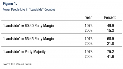
Somewhat puckishly, I immediately emailed Jack with a challenge: to name one individual who is actually living where the website said she should be living based on her political views. My challenge was based in part on political science research that has cast doubt on the Big Sort thesis that, in effect, home is where our political heart is. As it turns out, other indicators suggest Americans are not sorting into like-minded communities. Thus, professors Morris Fiorina and Sam Abrams show that if you examine party registration levels in counties, instead of vote choice in presidential elections, the trend is quite different than what the authors of the Big Sort would have one believe. Based on this alternative measure, they find a decrease in Democratic “landslide” counties, but an uptick in counties dominated by independents and Republicans. More generally, in their words, “If we define landslide counties according to their voter registration rather than their presidential vote, the proportion of the American population living in landslide counties has fallen significantly, from about 50 to 15 percent.”

Fiorina and Abrams do not claim to have the last word on this topic. But they do point to the need for a more fine-grained analysis that digs deeper than county-level analyses. In this vein, other research has shown that in 2008, the Democratic share of the presidential vote in most precincts was close to 50%, suggesting that by this measure at least our communities are more politically competitive than the Big Sort suggests. (This graph is by Yale political scientist Eitan Hersh via the MonkeyCage blog):
 More importantly, questions like those in the Washingtonian exercise, or in the recently released Pew survey on political polarization, that ask where we prefer to live based, in part, on political preferences, aren’t very good at telling us where we actually live. That is because as Clayton Nall and Jonathan Mummolo show in this paper people’s residential choices are constrained by more fundamental concerns with factors such as crime rates, the quality of the schools and proximity to one’s job. In this regard, people may express a partisan preference on surveys in terms of where they would like to live, but that preference is rarely going to determine their actual choice of a home. So we should be wary of using respondents’ answers to survey questions regarding where they would prefer to live as evidence of increasing political polarization.
Note also that survey results based on dichotomous choices, such as the agree/disagree option in the Washingtonian exercise, don’t do a very good job at capturing the complexity of individuals’ political views. Thus, asking whether one agrees or disagrees with the statement “Abortion should be legal and accessible to all women” won’t come close to capturing what most Americans think about this issue, based on other survey data that gives respondents more options.
For all these reasons, I’m willing to buy Jack lunch if the Washingtonian Capital Comment algorithm actually places more than, say, 5% of those Vermonters who respond into the community in which they actually live. (Full disclosure – Jack has bought the last 23 lunches we have enjoyed together so this is a low-risk wager.)
And we can start with me – the algorithm didn’t come close to getting my residence location correct. And that is because I live here in God’s Green Hills not because of any affinity with my neighbors’ political views – indeed, I have very few neighbors in my very rural community to bother me. Instead, I have an abundance of swimming holes, hiking trails, woodchucks and, not least, stones. And stone walls, after all, make good neighbors. And woodchucks never question my political views. They just eat my garden.
UPDATE 12:47: The Fix’s Chris Cillizza chimes in, citing some of the same research: http://www.washingtonpost.com/blogs/the-fix/wp/2014/06/20/no-polarization-isnt-causing-us-to-change-where-we-live/


 More importantly, questions like those in the Washingtonian exercise, or in the recently released Pew survey on political polarization, that ask where we prefer to live based, in part, on political preferences, aren’t very good at telling us where we actually live. That is because as Clayton Nall and Jonathan Mummolo