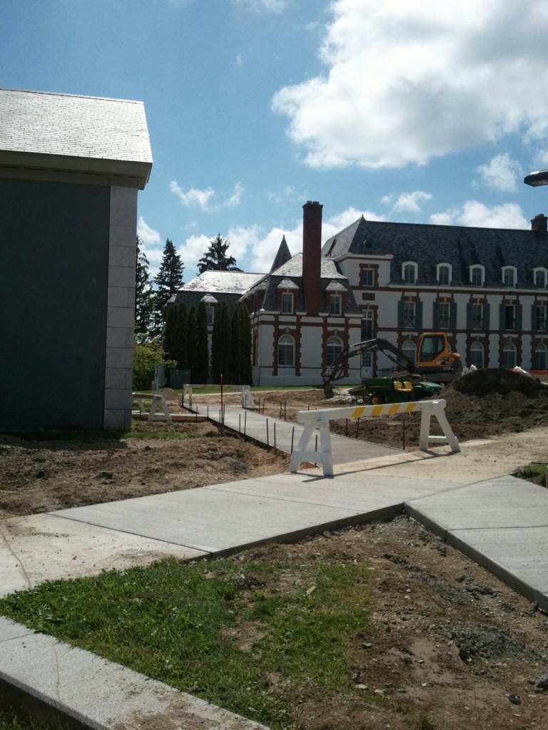
We’re declaring a truce on Turf Battle, taking a break until next summer. Left for next year will be the planting around the northern retention pond, and the sidewalk removal and re-configuration south of Allen Hall, and completing the wall next to the patio.
This was my fifth growing season at Middlebury, and Turf Battle was the largest landscape project I’ve been involved with here. Feedback on all of the projects I’ve worked on is familiar and welcome, (first thing I learned here? Everybody has an opinion, many of them opposing each other), but I’ve never gotten so much positive feedback from a job than this one. Students smiling at me, thanking the crew, saying how much better the area looks.
So I feel the need to let you know of the immense amount of people that helped this project come together. I’m the one with the loud mouth, but many more people behind the scenes at Middlebury deserve much more credit than I. Let’s start with Tim Spears, the driving force behind the Turf Battle contest, and Sarah Franco, his partner in crime. Also Dave Berthiaume, the crew chief in the landscape department for that area of campus, who listened to me talk through a lot of the nitty gritty design work on the plantings, and told me when I was losing my mind.
Most important, though, is Luther Tenny, an Assistant Director of Facilities, and our resident civil engineer. The landscapers get all the glory work-we come into a job site that essentially looks like well-placed piles of dirt, and when we’re done, the area is gorgeous. The devil is in the engineering, though. Drain placement, sidewalk and ADA ramp layout, handrail construction, job scheduling, budgeting, timing, and talking me out of crazy ideas, yeah, that’s the idea. Atwater would be a big hot mess were it not for Luther.
I’ll attempt a photo tour, and explain some of the changes we made during construction to the actual plan. As always, click on the picture for a larger view. Let’s start at the Atwater Dining plaza.
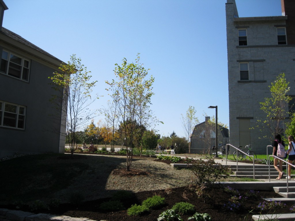
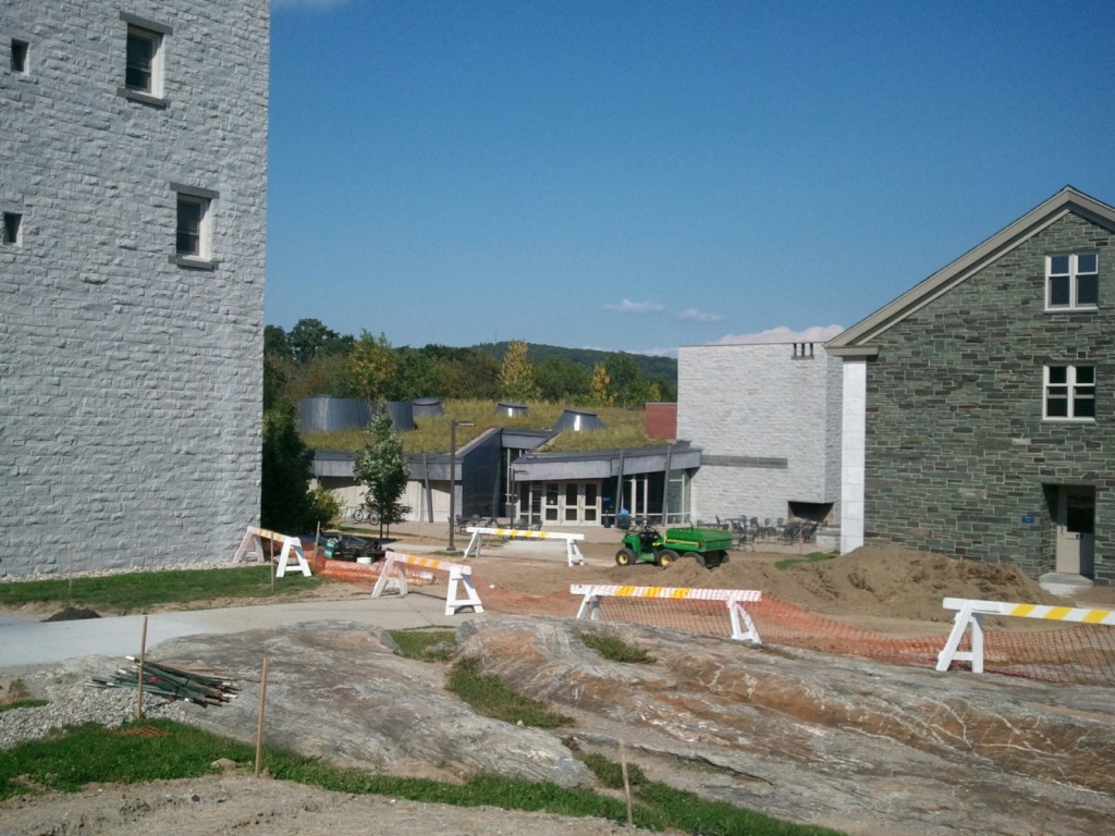
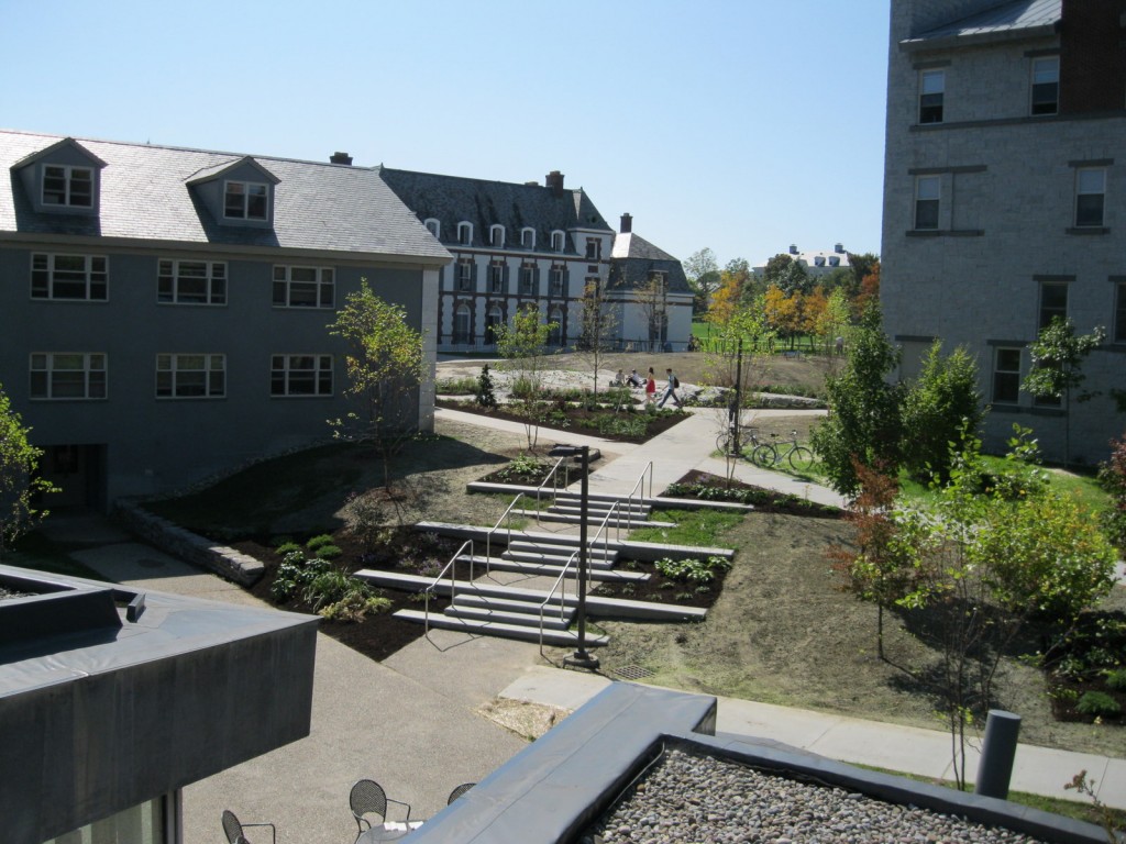 This is an overall view, from the Atwater Dining hall roof. (In all these pictures, you’ll have to imagine the dirt patches as grass. It’s up now, but not when I took the pictures) The new handrails show on either side of the stairway, with the brown mulched beds on either side. Originally, the landscape architect’s plan called for the entire area from Allen Hall to the stairs and the island formed by the ADA ramp to the right of the stairs to all be one giant planted bed, with shrubs and some flowers. In talking it over with Dave and his landscape crew, we decided this would be far too much to take care of, too much weeding and maintenance until the beds get established.
This is in line with much of our landscaping we perform at Middlebury now. With less crew and more areas to maintain, the old style landscaping of large planted beds are no more. Instead, we prefer to have small focused beds in high traffic areas, and take very good care of those. In this spot, though, we were having troubles designing how these smaller beds should look. No matter how we laid the shapes out, it all seemed a jumbled mess. After fussing for a while, we stumbled across the brilliance of the Wagner plan. His layout of the beds to either sides of the stairs were in straight lines off of the stairs. The problem we were having was the multitude of lines in the tight area; the curving roof line, the arch of the ADA ramp, the columns on dining hall. How did we mesh all of that together in the landscape? Simply put, we didn’t. Straight lines off the stairs relate the importance of that feature in the landscape, making the passage the dominant feature. The confusion of the curve of the ramp fades in significance.
Alternating these beds on either side of the stairs with grass gives the walk down a sense of rhythm, and simplifies the landscape. These beds are followed through across the area formed by the ADA ramp, blocking a shortcut we didn’t want to turn into a grass path.
 We also carried one more bed to the dining hall side of the ramp, matching both the parallel sides and the size. This should help in making the plaza area feel more enclosed in a garden space.
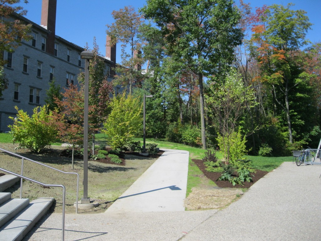 River birch trees (Betula nigra) were planted throughout the dining plaza area, much like the grove at Ross Dining. We modified the locations of many of them, in part to enhance the garden feel, but also to provide screening from the area above. We’re hoping for an intimate feel down on the plaza, and limiting the views of the upper areas, and of Battell Beach.
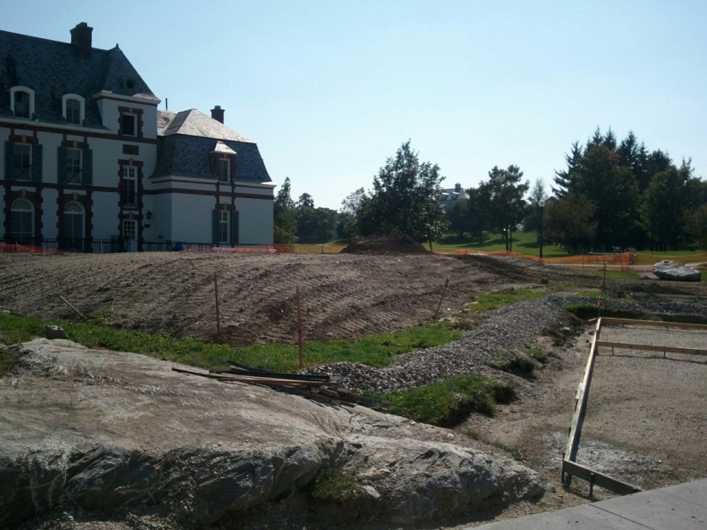
 Admittably, the least popular bit of landscaping we did is right next to Allen Hall, blocking the dirt path that leads down to the Johnson Parking lot. While we would have liked to have put a sidewalk here, the topography made it impossible, and for a variety of reasons, including erosion, dorm window privacy, and accessibility, the area was planted in native White pine and Red Twig Dogwood, and will blend with the native retention pond below.
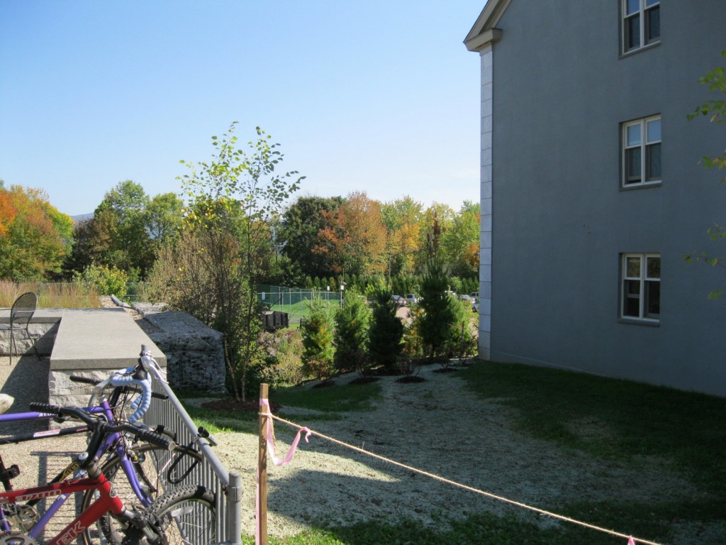 Moving up the stairs, I once again had the pleasure of working with Brad Lambert, our stone mason at Middlebury. A flaw in the sidewalk layout with no graceful way of fixing means people cut the corner across the grass as they turn to descend the stairs. Pouring a triangle of concrete would have wrecked the graceful lines, and while some were advocating for a well-placed BFR, Brad and I instead did a simple little Panton stone wall, to limit the area of dead grass. The stone used is a match to the ledge behind, and is recycled from a stone wall that surrounded the Proctor deck before its renovation several years ago.
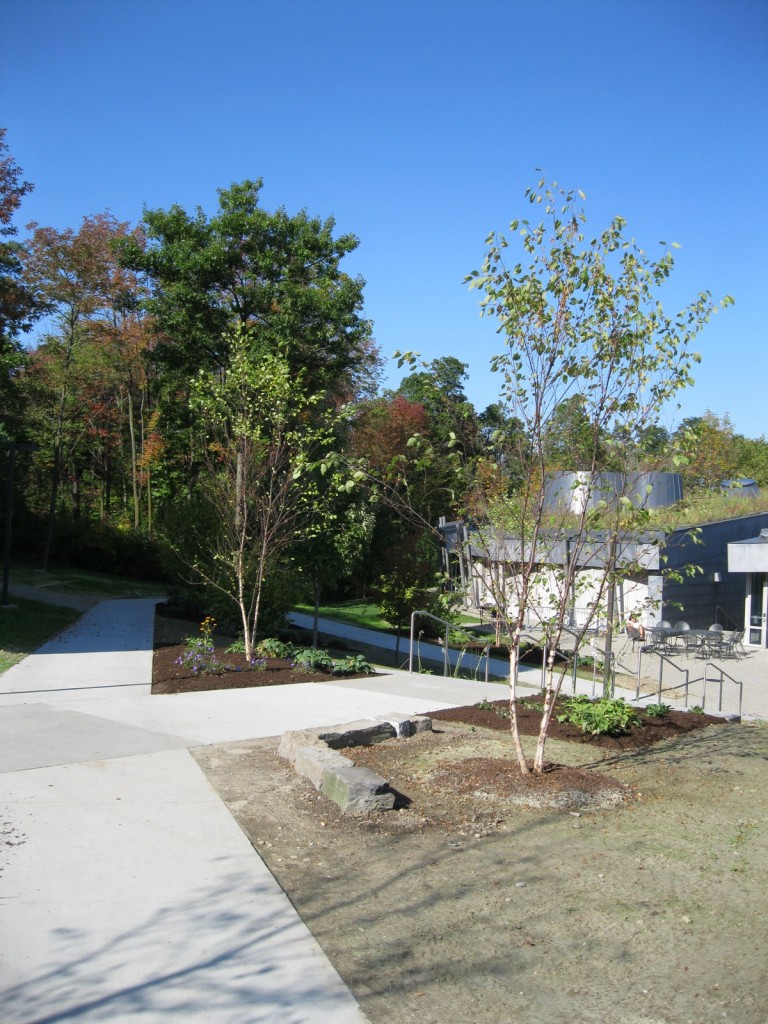 I became fixated on approaches and entrances. Notice above how the two flower beds to either side of the first stairs are placed. The further one comes all the way out, while the closer one with the birch is placed further away from the main walk, subtly leading you into the stairs, implying the inevitable turn.
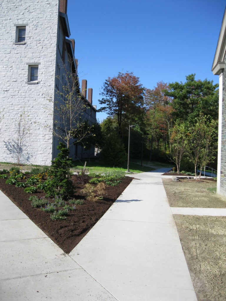
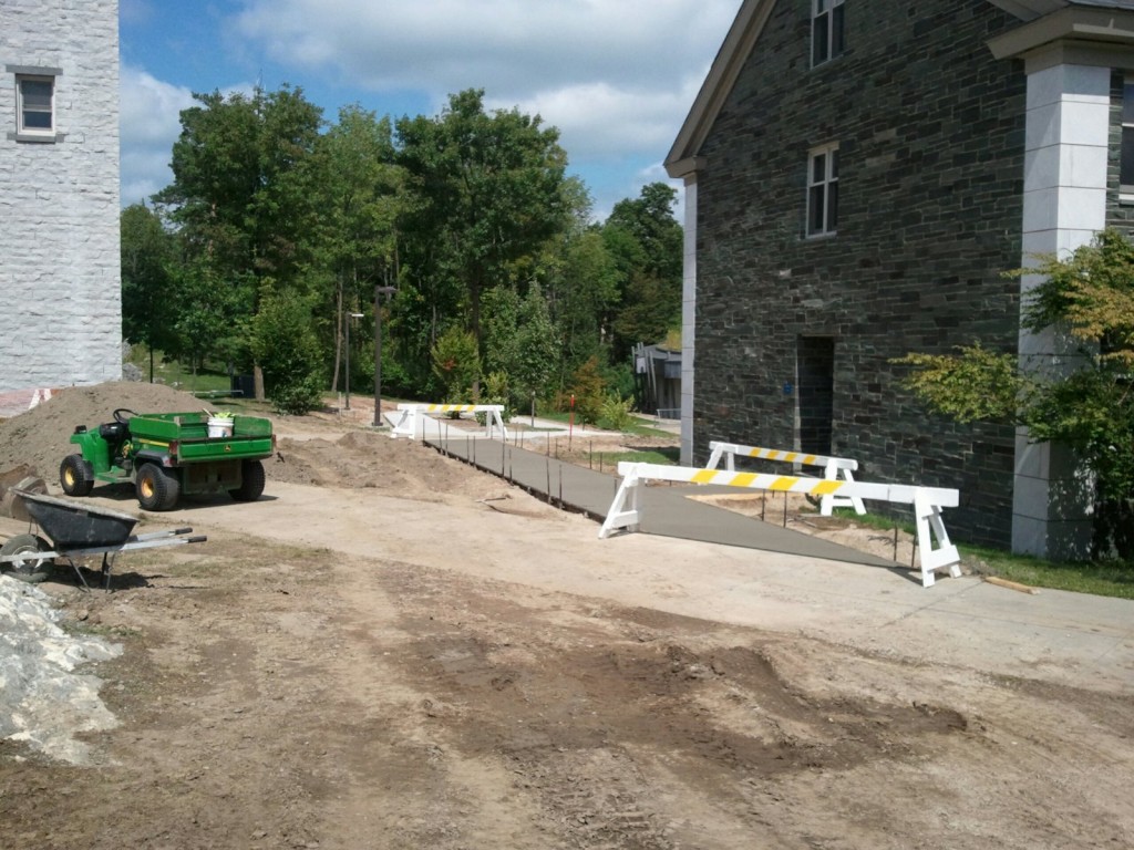
Above is the new sidewalk across the west side of Allen Hall. It’s one of those “aha” moments you have, when you can’t believe this sidewalk wasn’t always there. The large bed on the left has a disease resistant ‘Accolade’ elm in the center, and the contrasting focal point in front is a Dwarf Hinooki Cypress, as I’m a fool for dwarf conifers. This is a fairly large bed by our standards, but the space deserves it.
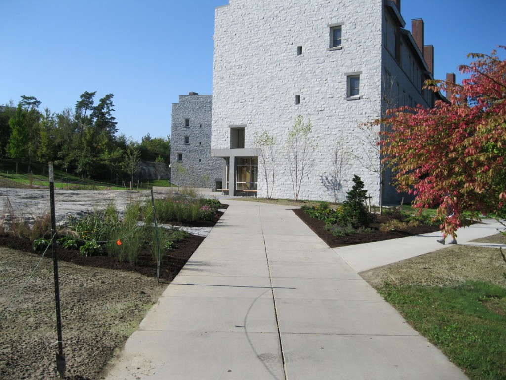
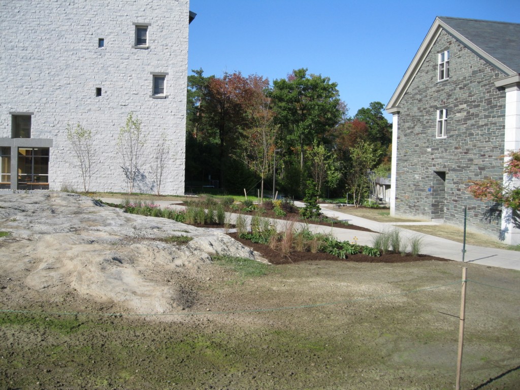
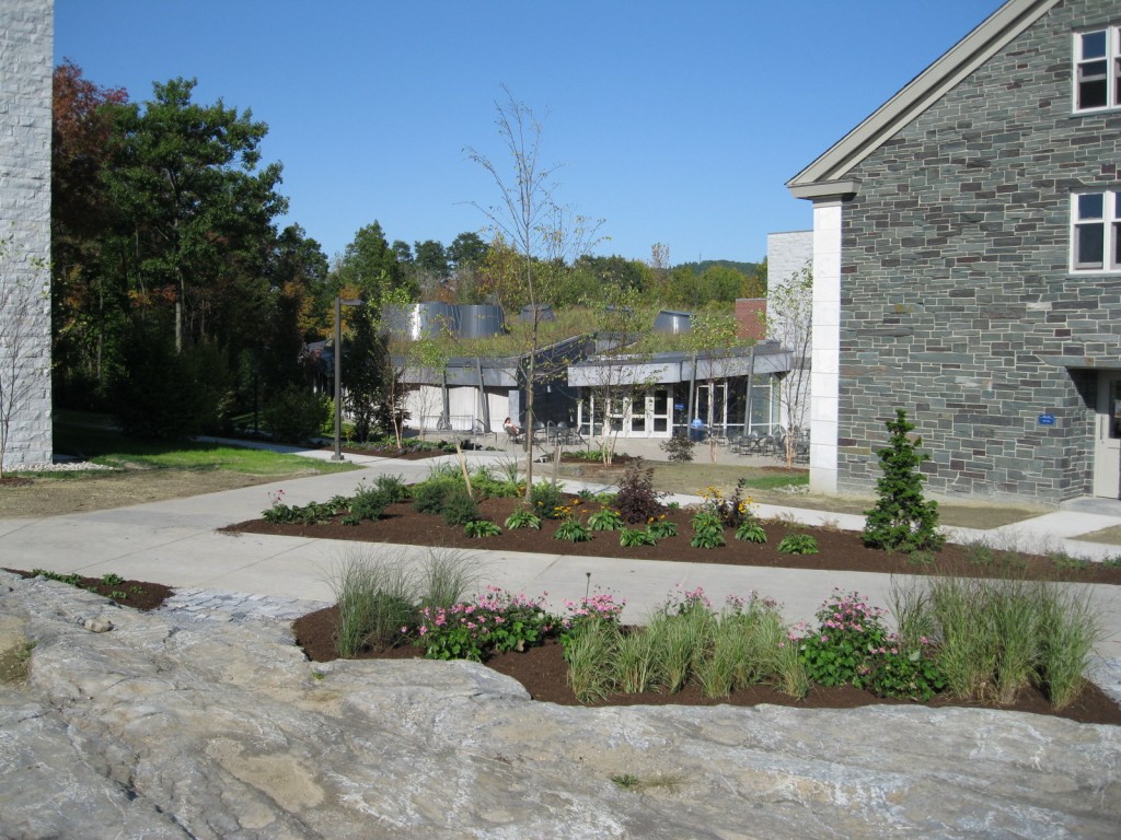
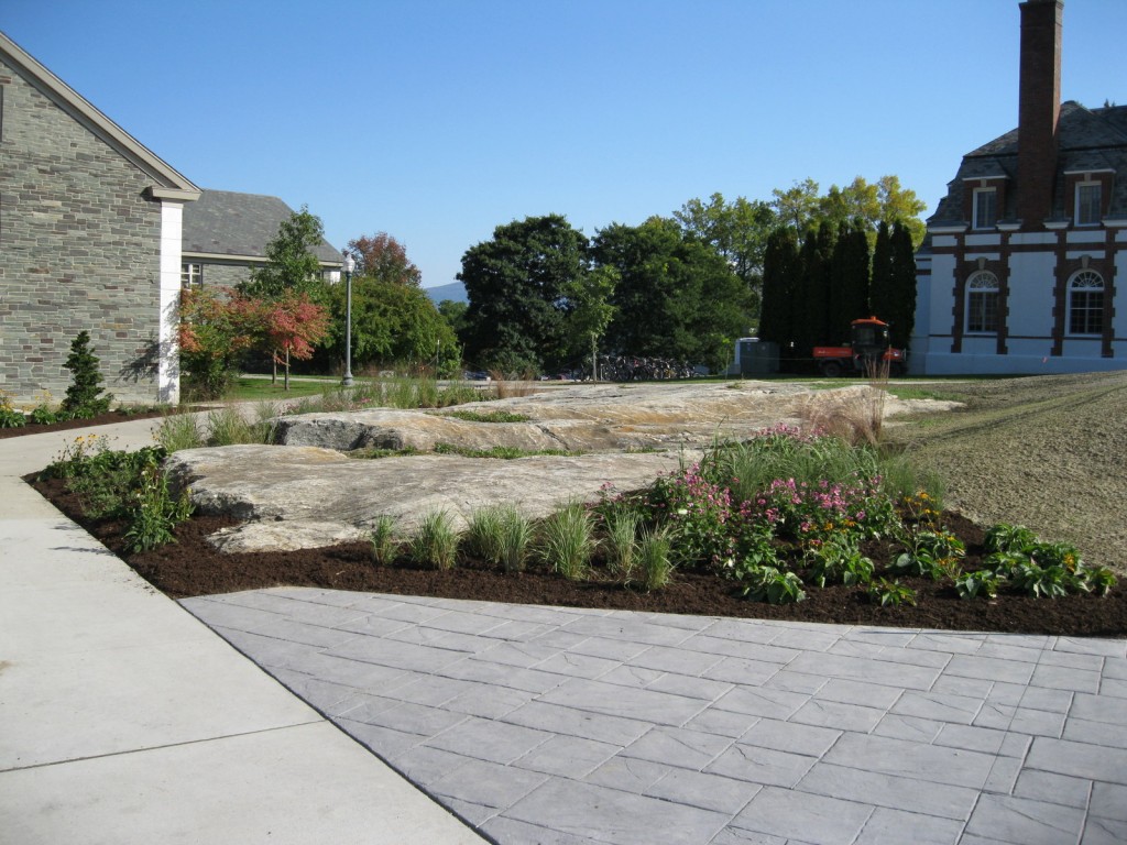
Here’s the view from the front of Allen, with that new sidewalk leading off to the right.The gardens in front of the ledge are to the left. We’re picking up on the same effect here as at the top of the Atwater Dining, with more gardens on the left subtly steering toward the dining hall.
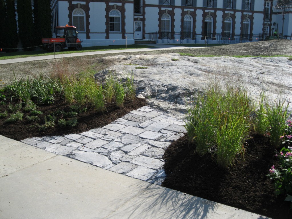
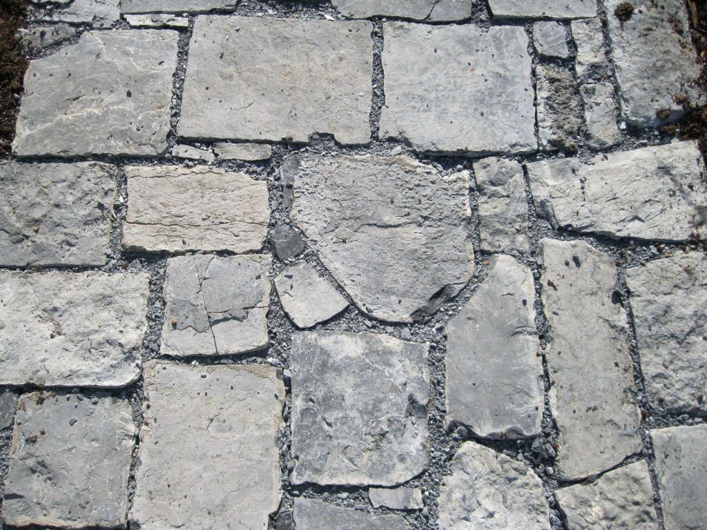
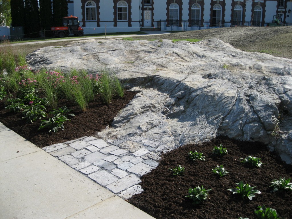
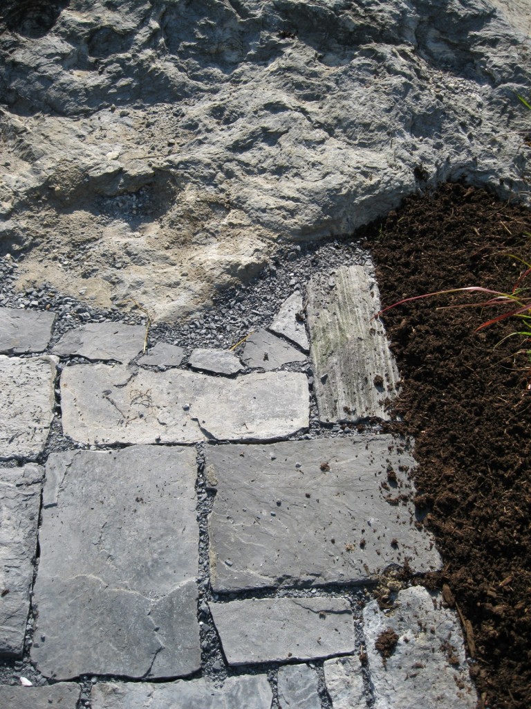
Looking toward Atwater dining, across the Panton stone ledge, so you can see the gardens around the ledge. And remember Brad Lambert? I forget the student that came up with the suggestion to have pathways through the garden to the ledge, but I roped Brad into making a couple. They look good on the photographs, but really should be seen in person. Once again, they are composed of recycled wall stone from Proctor.
Here’s a view toward Atwater Dining from the top of the ledge. The plants in the garden are mainly summer and fall flowers and grasses, including Black Eyed Susan, White and Pink Coneflower, Japanese Anemone, and several varities of grasses. The effect we’re looking for is to echo the roof planting, composed of wildflowers and grasses, with the gardens surrounding the ledge, joining two major landscape elements.
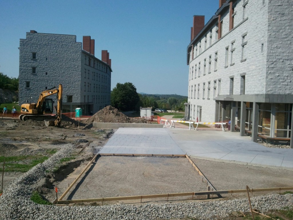
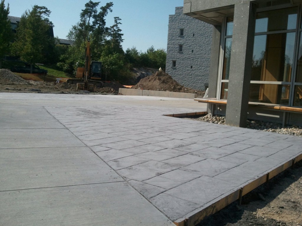
The gardens wrap around the stamped concrete patio next to Hall B. Like the Dining Hall plaza, we’re hoping for the feeling of being enclosed by the garden.
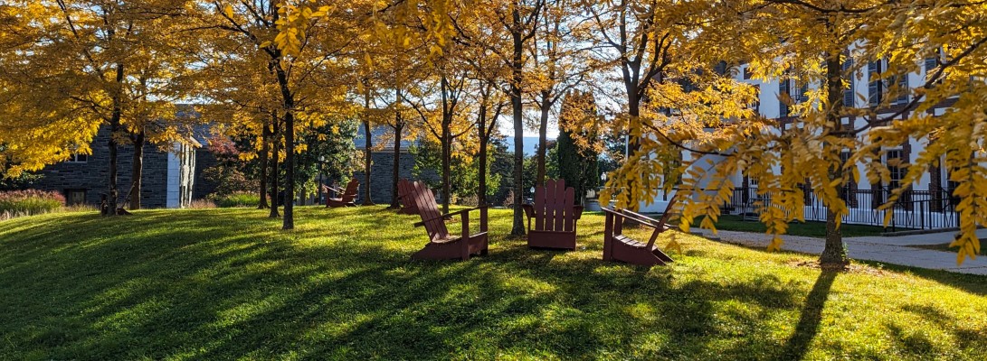
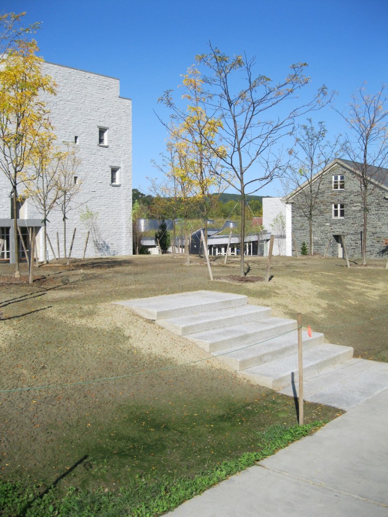
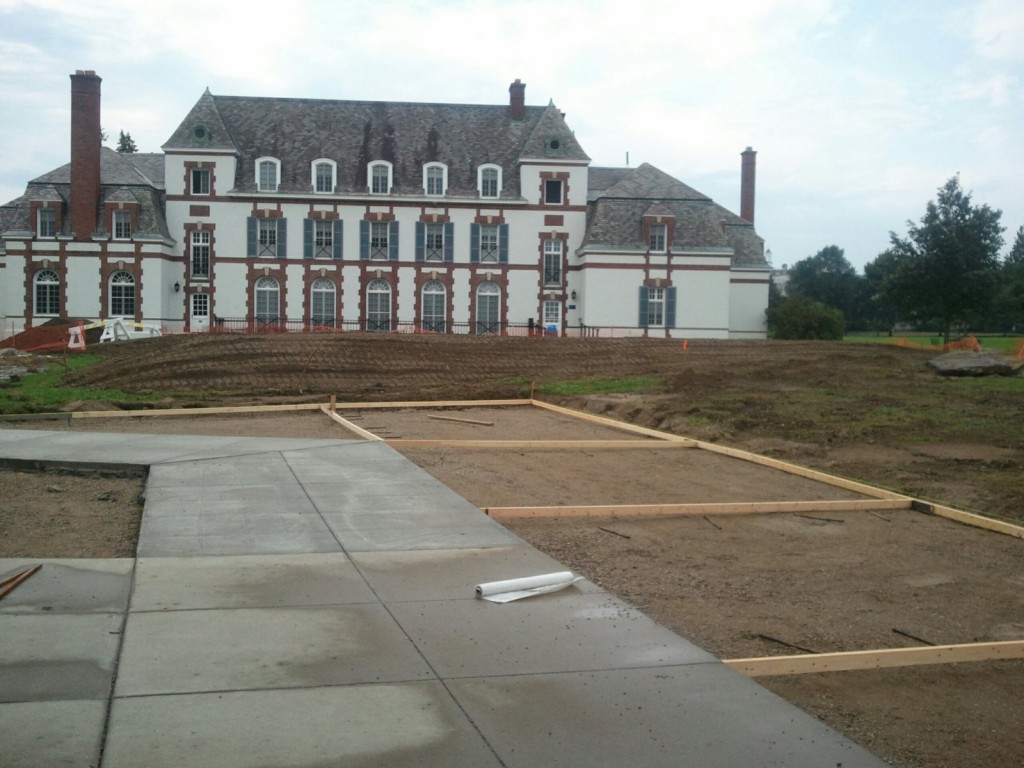
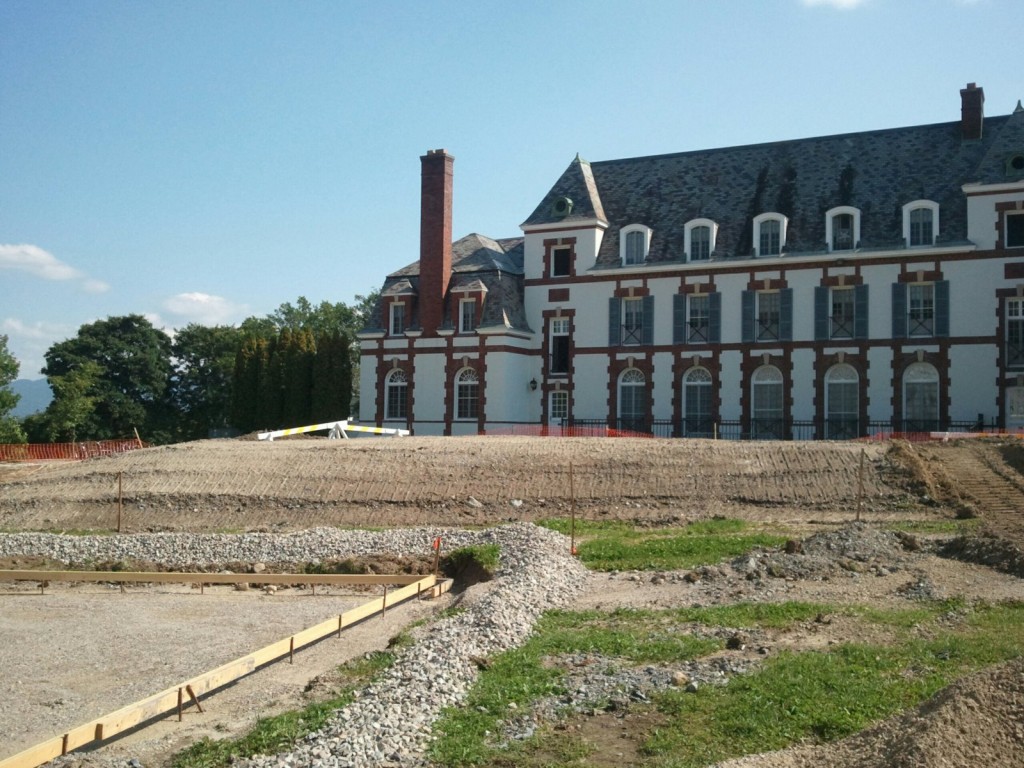
One of the most asked questions I’ve been getting on the project is the reason for the large berm behind Chateau. The long answer is that the hill breaks up the relativly flat topography in the area, and offers a new perspective for views in the landscape. Short answer? Needed some soil to grow a grove of trees. The plans called for a grove of single stem River birch, but we changed it to Honeylocust. The pH of the soil was too high for Birch, and we were also concerned about overplanting one species in the landscape. Honeylocust is one of my favorite shades-a dappled light dark enough to be cooling in the glare of summer, but bright enough so it doesn’t feel cave-like.
The Honeylocust were planted in lines specifically to preserve views of Chipman Hill. The stairs on the plan turned out to be recycled granite that facilities had in storage.
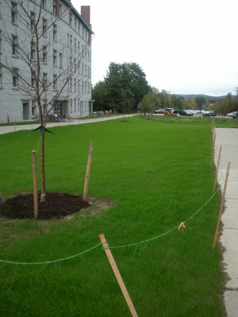
Top of the berm looking north, down toward the parking lot. Anyone with a history in Atwater are probably wondering what that foriegn green is between the halls-it’s grass. The trees shown below are Sycamore, a great fast growing shade tree. The wall, without the stone face, is visible to the right.
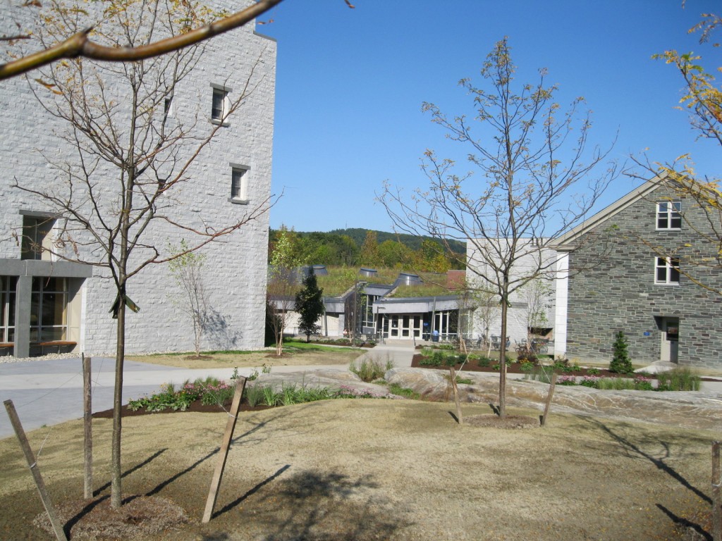
Standing on the sidewalk in the middle looking toward Battell Beach. Up at the top are more elms, also to the west of Chateau, to provide some screening between the Atwater area and the quidditch pitch.
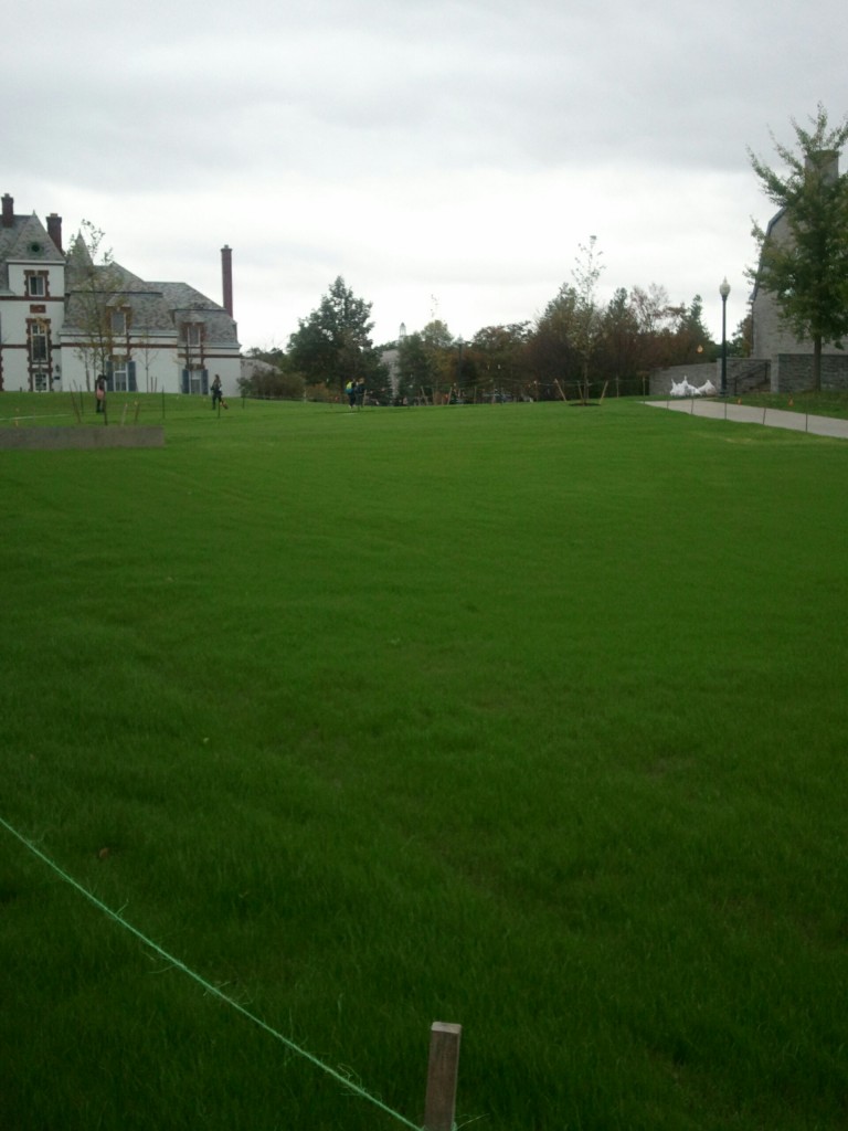
One final picture, more grass, and a view down towards the lower retention pond. We’re going to get to the planting around the pond next year.


You must be logged in to post a comment.