…By delineating a crisp edge, the map’s border defines a MAP WINDOW that shows a portion of the world at a certain SCALE OF DETAIL. Reference features in the map include WET BORDERS, such as lakes or straits.
Having to define the map window often creates tension between scale and layout size, especially if the map region has peninsulas or other pointy features. The shape of some regions may not lend themselves to fitting within rectangular frames without decreasing the scale, which then limits the amount of detail the map can show.
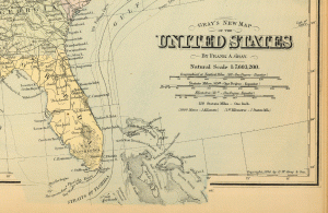
In two separate places, map features interrupt the frame of Frank Arnold Gray’s Map of the United States. The Florida Keys and Gulf Stream break through the bottom right, while the Strait of Juan de Fuca reaches through the upper left.
Why did Gray break the frame in these two places? It looks like he was trying to maximize the scale of the map given the constraints of the page size. By increasing the scale of the map, the mapmaker gained a little more room to work with when drawing the dense features and labels that appear on this map. Because he did most of this line work in black, he relied on white space (avoiding overlap) to make the line and text symbols legible.
The mapmaker appears to choose a scale that barely fits the southern tip of both Texas and Florida and the northern tip of Washington. Actually, Texas fits within the border index on the map, while both Washington and Florida break through the border index and the outer frame.
Why did Gray choose to break through the frame of the map in the vicinity of both Florida and Washington, but not Texas?
Perhaps, we can identify a technical reason for this. Cape Flattery of Washington and Cape Sable of Florida, along with the string of Keys, are surrounded by areal water features, while Texas is bounded by the linear Rio Grande. The areal features, along with their labels, required more room to be legible than the linear feature, so Gray may have broken the frame, in part, to accommodate the labels.
In both cases, the mapmaker chose to spill the blue ocean fill out of the frame. This is especially noticeable around Florida. This makes the decision to break the frame appear less accidental. It also helps draw attention to the water features and the forces that are related to them. Below Florida, the strong, undulating line representing the warm water of the Gulf Stream helps reinforce this dynamic feature of the map that connects the eastern states to the region outside of the map frame to their south. Similarly, the break in the frame by Juan de Fuca hints at the California Current bringing cold water from the north.
Maximize the scale of a map with points or peninsular features without making the features feel cramped along the map border by breaking through the map frame. Choose places where there are dynamic features that connect your region to the outside. Be conservative when applying this pattern. If you break the frame in all directions, you diminish the unexpected quality of the pattern and its narrative force.
Continue to develop features that leak from the frame so that the SYMBOL RESEMBLES REFERENT.

Home > About This Post
This was posted by Jeff Howarth on Thursday, January 15th, 2015 at 2:15 pm. Bookmark the permalink.
Subscribe to the RSS feed for all comments on this post.
Filed Under
Tagged
Hosted by sites.middlebury.edu RSS: Posts & Comments