Tag Archives: web makeover

New WordPress Themes Available

We’ve made several changes to the WordPress platform, known on-campus as sites.middlebury.edu. Hey! You’re there right now!

New Header

Soon, we will update the design of the header so that a small bar appears across every blog we host with some useful links. This design is modeled on blogger.com and its purpose is to foster a sense of community amongst the many blogs we host on the site. You can read more about this design in the original White Whale strategic recommendations document on the Web Redo blog, but here is the recommendation that led us to make this change:

Once some Midd-specific WordPress themes are created, Middlebury’s blogs should be linked together via a unifying header or title bar element of some kind. The bar across the top of most Blogger blogs is a good example; it doesn’t interfere with the branding or messaging of the blog itself, but provides quick and consistent links back to the Blogger homepage and other blogs. Once some Midd-specific WordPress themes are created, Middlebury’s blogs should be linked together via a unifying header or title bar element of some kind. The bar across the top of most Blogger blogs is a good example; it doesn’t interfere with the branding or messaging of the blogitself, but provides quick and consistent links back to the Blogger homepage and other blogs.

The logo at the top left will bring you to the home page of our blogging network. If you’d like posts from your blog to appear there, send an email to website@middlebury.edu and we’ll add you to the list.

New Themes

There are three new themes available on our blogging platform. These are based on designs we received from the people who put together our new site design. We put these together in a way that makes them each to set up. The catch is that there are very few configuration options for these themes. That means these are great for people who want to set up a blog quickly and aren’t interested in doing a lot of customization on the look-and-feel of their blog. Additionally, these themes do not work properly in Internet Explorer 6. As of today, only 3.06% of visitors to our blogs use this browser and we are going to recommend phasing out support.

For themes that offer you a massive variety of customization options, be sure to check out the many theme options Alex Chapin has created for our blogging network.

BLOGS DOT MIDDLEBURY Navy

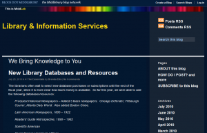
The new Navy (as in blue) theme offers a straight-forward, even minimalist, design for your blog. There is no background image on this theme, which offers two columns for you to add widgets. The left column only appears on pages with more than one post: the blog home page, search results, and archives. If you are viewing a single post or page on this theme, the left sidebar will disappear, giving the post more space on the page.

BLOGS DOT MIDDLEBURY Pastoral

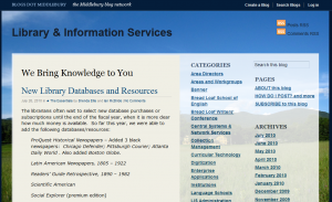
The Pastoral theme features an image of the Bread Loaf campus as its background. This theme uses the same two-column format as the Navy theme, with the left column only appearing when more than one post is being displayed. The big difference with this theme is that you can change the background image if you like (more on that later).

BLOGS DOT MIDDLEBURY Map

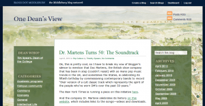
The Map theme uses a professionally done watercolor illustration of the campus as its default background. As with the “Pastoral” theme, you can change the background image if you like. The big difference with this theme is that the left column is on the left of the blog’s content. Because of this positioning, both columns appear on all views of the blog, even when viewing a single post. Use this theme if you really like columns!

MiddLab Blog Theme

We’ve also added a new theme that you can use for a research project that you would like us to feature in MiddLab. Remember to send your MiddLab project ideas to middlab@middlebury.edu and check out the site to discuss the ongoing research projects of your fellow faculty, staff and students.

Setting up one of these themes

To add one of these themes to your blog:

  1. Click the Log in link at the top right of the page and fill in your username and password.
  2. Click the Dashboard link at the top right of the page.
  3. In the Appearance box on the left, click the Themes link.
  4. Click Activate below the picture of the theme you want to use.
  5. In the Appearance box on the left, click the Widgets link.
  6. Drag the widgets you want to use from the boxes in the center to the Left Column or Right Column boxes on the right.
  7. You’re done!

Adding a custom background image

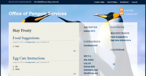
Middlebury’s status as a top school depends on offering the services our students require. Perhaps one day Middlebury will accept penguins as applicants and you’ll be asked to create a blog for the new Office of Penguin Services and you’ll realize that you need a background image that speaks to the students you’re helping. Our themes support this.

This can only be done on the Pastoral or Map themes.

  1. Click the Log in link at the top right of the page and fill in your username and password.
  2. Click the Dashboard link at the top right of the page.
  3. In the Appearance box on the left, click the Custom Header link.
  4. Click the Browse button, select the image you want to use and click OK.
  5. You’ll be asked to crop the image you chose. Select the part of the image to use as the background and click Crop Image.
  6. You’re done!

MiddLab

http://go.middlebury.edu/middlab

MiddLab is a new section of Middlebury’s website with no precedent: an academic network, uniting all of the… blah, blah blah.

Truth is, MiddLab has been hard for us to explain ever since we heard the idea. A research network featuring discussions and blogs, and linking together disciplinary themes? How does that work? Rather than write a manifesto, here is what we’re trying to accomplish with MiddLab.

Our Goals

  • Make research easy to discover. If you want to know what student and faculty research is going on in a department, you shouldn’t have to know where their papers are published or the address of the project’s web site. Instead, these should be one or two clicks from our home page.
  • Show connections between research. Whether researching the population growth of trees in Biology or the population density of people in Geography, projects share themes and people interested in the topic can easily explore both.
  • Start a discussion. We encourage and recommend that you add comments to the projects on this site. Ask questions, suggest new research, or explain why you disagree with the conclusions. You can add your thoughts to any project page on MiddLab, explore the individual blogs for some projects, or contact the researchers directly.
  • Provide space for research and the sciences on our site. We’ll be expanding this site to feature more presentations from the Spring Research Symposium and research projects in our science departments. Though MiddLab is open to any student, faculty or staff projects, these are areas where we know we’re not offering enough information on our site and would like to use MiddLab to expand.

Your Feedback

We aren’t sure these are the right goals for our site. We’d like to hear from people: what would you like to see in MiddLab? What parts of this site work toward these goals and which don’t? Leave your thoughts by commenting on this page.

Oh, and if you would like us to feature your project in MiddLab, send an email to middlab@middlebury.edu.

LIS Website – Student Survey Results & Recommendations

I’ve compiled the results from the LIS Website Team’s survey of LIS students workers where we asked about familiarity with areas of the LIS website and knowledge of web technologies. This was a shorter survey than the staff version with 20 students responding to the 2009 version and 17 completed 2010 surveys. Before I present the results of the student survey, I want to share my recommendations based on the results of both surveys. These are just my initial thoughts. The LIS Website Team will compile its recommendations based off this data, the comments included with both surveys, and usability testing we’re conducting this month.

[Reminder: If you want to participate in usability testing, reply to the all-campus email that was sent Wednesday, April 7 with the times when you would be available.]

Continue reading

LIS Website – Staff Survey Results

Thanks to all the LIS staff who responded to the LIS Website Team’s survey! There were 63 responses to our 2009 survey, prior to the redesign of the LIS Website, and 24 responses to our more recent survey, after the launch of the new site. In this post, I will share some of the results of these surveys and compare the feedback between the two surveys. I’ll discuss the student survey in another post.

Continue reading

Website Improvements #3: Better Performance

During the week since the new website has launched you many have noticed slow page-load times, especially when logged in and saving edits. For the past week the Web Application Development team and our colleagues in Central Systems & Network Services have been working to improve the performance of the site and prevent low performance from overwhelming the servers and causing intermittent outages. We have made several fixes over the past few days that bring us out of the slow-site woods and into sunny pastures of snappy responses.
Continue reading

Quick-Start Guide for new library web site

Our updated Quick-Start Guide to Library Research [pdf] provides:

  • a screenshot “map” of research resources in the new library web site
  • step-by-step instructions for finding journal articles

We often use this guide as a handout in research workshops.  It prints on one page, double-sided.  Please use it and distribute it widely!

Website Improvements #2: Custom Redirects

Our GO service has been and will continue to be our supported way for maintaining permalinks to resources. By publishing GO links to resources online and in print, you are able to move your resources to new homes (such as a different location in the new site, a blog, or a wiki) and update the go link with the self-service GO management screens.

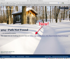
During the web-makeover project planning it was decided that we need to move forward with a new site architecture (where everything lives) and drop support for the old URLs from previous versions of the site that are 3-15+ years old. Most of the time links can and should be updated at their original locations, but if that is impossible (such as in a print mailing), you can now ensure that the correct link shows up on the main site’s 404 page.

404-with_link_annotated

Steps to add a link for a 404 page on the main site:

  1. Create a nice GO shortcut to the new destination if one doesn’t exist.
    Go to the GOtrol Panel and create a new go shortcut to the new destination URL.
    If a go shortcut for this destination already exists, then you can skip this step.
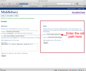
  2. In the GOtrol Panel, click on the ‘Create’ tab and add an alias for your shortcut from step one. The important thing here is that the alias ‘name’ is the path portion of the URL that is hitting the 404 page after the initial ‘/’.

    For example, if this URL is getting a 404 page:
    http://www.middlebury.edu/area/department/someimportantpage/default.htm
    then the alias name should be:
    area/department/someimportantpage/default.htm

    go_admin-alias

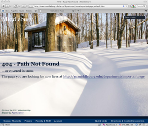
  3. Go back to the 404 page and verify that it now includes the GO link to your resource.
    404-with_link

We still recommend that you update the pages that link to the site to use their new URLs or GO links, but if that is impossible, you now have a work-around to direct users to the appropriate place.