I thought it was about time we shared some of the eye candy from White Whale that we’ve been working with here at MIIS over the last couple weeks. The homepage design is progressing nicely; we have also started work on the inside page designs and have seen a preliminary design for a themes landing page.
Many of these designs will continue to be perfected before the MIIS site launch on September 1.
Click on any of the images below to view a larger version.
Homepage Design Round 2
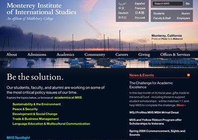
This homepage design attempts to incorporate the themes element into the original Horizon design. This design experiments with using a 2-column layout. We also chose a dark blue background over the original grey.
Homepage Design Round 3
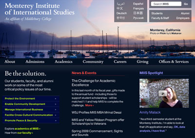
Back to the original 3-column design, but experimenting with some slightly different colors.
Inside Page Design 1
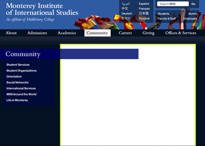
The first stab at an inside page design.
Inside Page Design 2
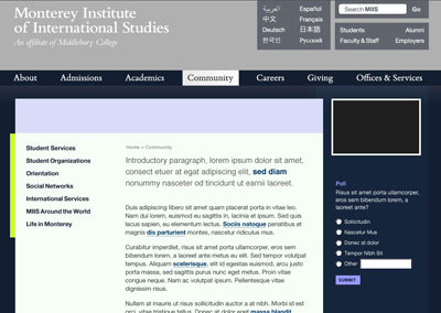
A slightly different take on an inside page design that includes space for an interactive sidebar.
Inside Page Design 3
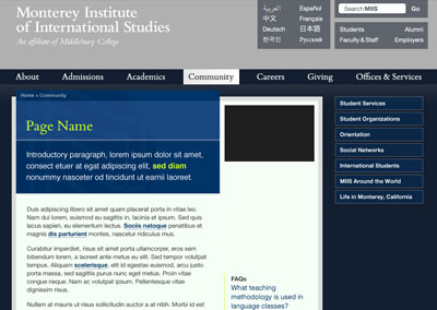
The current live version of an inside page design. In addition to the sidebar, it also includes a title card that displays the breadcrumbs, page title, and introductory paragraph.
Theme Landing Page

The first shot at what a theme landing page might look like.