
Imagine that you want to convey to your readers how a particular experiment was set up. Below we present two options:
- To the positive terminal of a power supply was attached a resistor and a voltmeter connected in parallel. To the other end of the resistor was attached an ammeter, which was also connected to a switch. The negative terminal of the battery was connected to the other end of the switch as well as to the ground.
- (See Figure 1, right)
Which of these two methods makes the experimental setup most clear? Sure, you can figure out what option 1 is saying, but only once we mentally draw an image something like Figure 1.
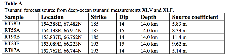
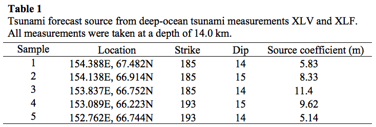
In another instance, perhaps you have 8 sets of data and calculations you want to report for each of 5 steps in a purification process. Here’s what it might look like written out:
The original lysate (50 mL) had an activity of 0.675 μM/min, resulting in a total activity of 6800 U. Protein content for the lysate was measured as 0.96 mg/mL, so total protein in the sample was 48 mg while Specific Activity was 141 U/mg. Once purified with 65% salt fractionation, the sample (33 mL) had a measured activity of 0.354 μM/min….
… Well, you get the idea. And that was only getting to the second of the 5 steps! This information would much more easily be communicated in a table, like this:
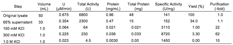
This method of data representation is far more concise. Plus, now, readers can absorb the information at their own pace and in their own way and easily compare values across columns and rows.
Clearly, in some cases, it is better to use a visual of some kind to present information. In other cases, it can be more concise to use words. For example, look at the following graph:
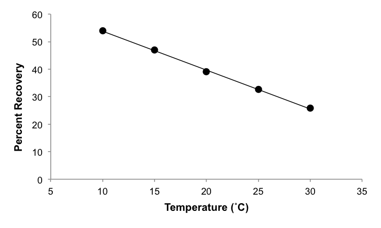
Could there be an easier way to present this data in words? One possibility is exactly what is stated in the caption: “Percent recovery of compound X decreases linearly with temperature.” Although it might seem like a graph is just as clear, since the words are far more concise, the words alone are actually preferred.
When should I use a visual?
First, remember that conciseness is a critical part of scientific writing. For that reason, visuals are used only when text is insufficient. Second, remember that when you write, you are telling a story; figures and tables are two ways in which you can add to your story and make it more compelling by giving evidence to back up your claims.
Figures are best used to show trends in or relationships between data as well as pictorial representations of experimental components. Tables are for showing purely qualitative data, such as a relationship between organisms and their optimal habitat type, as well as data between which you are not attempting to show any trend or relationship. In rare cases, you can use both a figure and a table, such as if you want to provide all of the data in a table but highlight an important relationship among some of these data in a graph; however, you must never simply repeat all of the same information in 2 formats. Schemes are used to show a progression of steps, such as a chemical reaction. Depending on the discipline and publication, the information in a scheme may be presented in a figure or as an equation, instead.
Figures make up a large category of visuals that includes graphs, diagrams, photos, maps, and more.
- Graphs are the most common type of figure found in the scientific literature because they can convey large amounts of information very clearly.
- Diagrams are useful any time you want to symbolically represent a potentially complicated idea to make it more easily understood. They are more common in posters, where even an experimental outline might be made into a diagram to make it more accessible to a given audience.
- Photos are uncommon in fields like chemistry and physics, since they study phenomena smaller than on the microscale, but may be useful in biology or geology to show something like a sample or sampling site.
- Maps are used almost exclusively in geology, where they can be useful for showing the location of a study or sampling, movement across an area, and other instances when knowledge of an exact location is useful.
Graphs and tables are most commonly used in the results section of a paper or poster, whereas diagrams and pictures are more likely to appear in your methods section. However, any table or type of figure can be used anywhere in a paper as long as it is relevant and useful to the reader.
[bg_faq_start]
Pro-3: Test yourself
In each of the following instances, decide if it would be most appropriate to present the data using a figure, a scheme, a table, or words alone.
[bg_faq_start] Solutions
[bg_faq_end] |
How do I use visuals in my text?
Numbering
Each figure, table, and/or scheme should be numbered separately from one another starting from “1” as they appear throughout your paper. That means that after Figure 1 and Figure 2 you might have Table 1 followed by Figure 3.
In a journal article, every figure, table, and scheme must be referred to in the text before the visual itself appears. Following are some examples of what this might look like:
This nucleotide was often a conserved G (Figure 1).
The symmetry varies gradually from a symmetric bar to an asymmetric oval (Fig. 3A).
Higher yields were obtained using compounds B and F (Table 1).
The general procedure for alkylating these products is shown in Scheme 4.
In general, it is better to parenthetically refer to a visual, such as in the first 3 examples, rather than use a whole sentence just to mention the visual. Notice that when referred to in the text, “Figure” is sometimes abbreviated to “Fig.”
Composition
After you’ve directed your reader to the visual, you have to make sure that the visual itself is properly constructed. Every figure and table in a paper must be understandable without your Results text or other supporting explanation. That means that it needs a legend and possibly footnotes, if it’s a table.
In addition to a good legend, be sure that your visual is as simple as possible while still conveying all the necessary information, which will help your reader avoid distractions and better understand your meaning. In general, this means that extra lines, symbols, colors, and words in your visual that don’t need to be there shouldn’t be there. For more information on how to achieve this, see the sections below on formatting figures and tables.
Content
If you have a complete visual, you don’t need to repeat everything from the figure or table in your text. In fact, its a waste of space! Tables should replace text, not duplicate it; figures should highlight trends in data, which can be summarized in your text.
The most common area for figures and tables is your results section, where you’ll be presenting brand new data to your reader. Data don’t tell their own story–that’s your job as the expert on your project. So, after you refer audience to your visual, highlight for your audience what is novel or particularly interesting or surprising about your data. But remember to steer clear of redundancy!
Below are some examples of figures and tables, accompanied by the text the authors used to describe them. The section of the paper from which the visual was taken is also provided for comparison.
[bg_faq_start]
Click to see examples
| Section | Visual | Text | Reference |
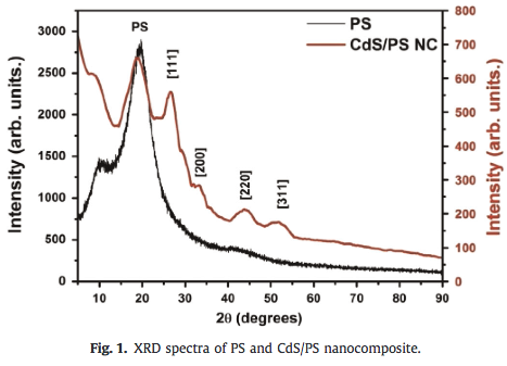
| Introduction | 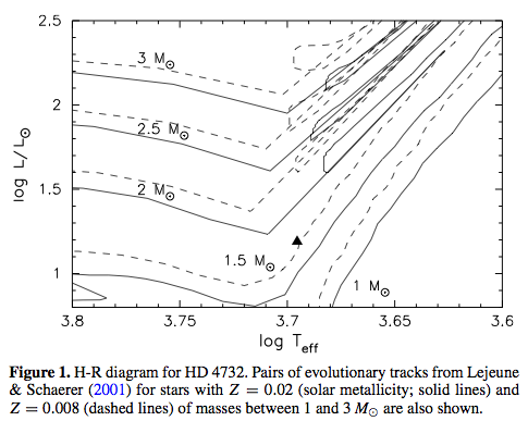 |
“Although the star is listed in the Hipparcos catalog as a giant star, the star is better regarded as a subgiant rather than giant based on the surface gravity and its position on the H-R diagram (Figure 1).”
|
Sato et al. (2013) |
| Introduction | 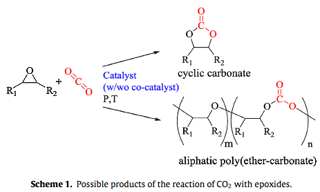 |
“The coupling of epoxides, reactive products per se, with carbon dioxide yields aliphatic polycarbonates and cyclic carbonates, the latter being the thermodynamic products (Scheme 1). This reaction is in the direct focus of academics as well as industry primarily due to a promising range of industrial applications [2].”
|
Adolph et al. (2015) |
| Methods | 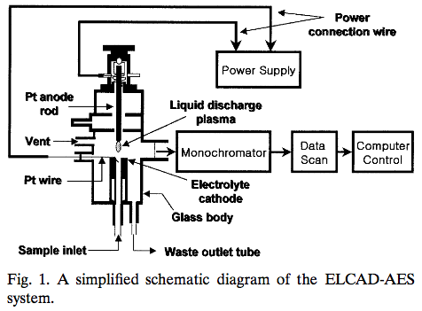 |
“A simplified schematic diagram of the ELCAD-AES system is shown in Fig. 1. The detailed description of a modified glow discharge cell was reported [10],” followed by a paragraph explaining the system in detail.”
|
Mottaleb, Woo, and Kim (2001) |
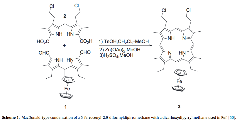
| Results | 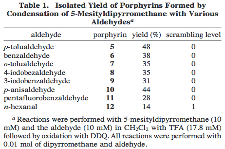 |
“The scope of this procedure for preparing gram batches of trans-porphyrins from 5-mesityldipyrromethane was examined by condensation with the eight aldehydes shown in Table 1. No scrambling was observed in the syntheses with aryl aldehydes, so this procedure offers a general and simple gram-scale preparation of 5,15-dimesityl-10,20-diarylporphyrins. The only modification to the procedure was required for the reaction with pentafluoro-benzaldehyde because the porphyrin was contaminated with non-porphyrin pigments, but these were readily removed by triturating with hexanes. Such pigments were also observed in the condensation with n-hexanal and were also easily removed by trituration with hexanes, however LD-MS showed a peak consistent with Level 1 scrambling in this condensation.”
|
Littler, Ciringh, and Lindsey (1999) |
| Results | 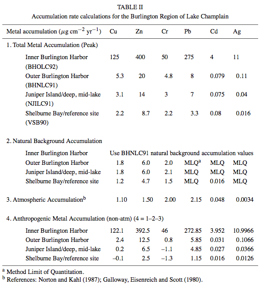 |
“Further estimation subtracted the average atmospheric contribution for each of the metals [51] to derive the relative metal accumulation from point sources (Table II). The results indicate that the relative accumulations of the metals decrease with distance from Burlington Harbor. The cores from the Burlington Harbor Oil Dock site had the highest concentration of each of the metals measured in this study. The cores from the Burlington (North) site recorded the second highest metal accumulation followed by Juniper Island and Shelburne Bay respectively. The magnitude of metal accumulation, corrected for natural and atmospheric deposition, indicates that the majority of the contaminants in the Burlington region are derived from local point sources. Accelerated metal accumulation from the 1950s, documented in the Burlington Harbor (North) core, corresponds to the local sewage treatment plant along with the effects of combined sewage overflows (CSOs), and runoff from the city of Burlington.”
|
Mecray et al. (2001) |
| Results | 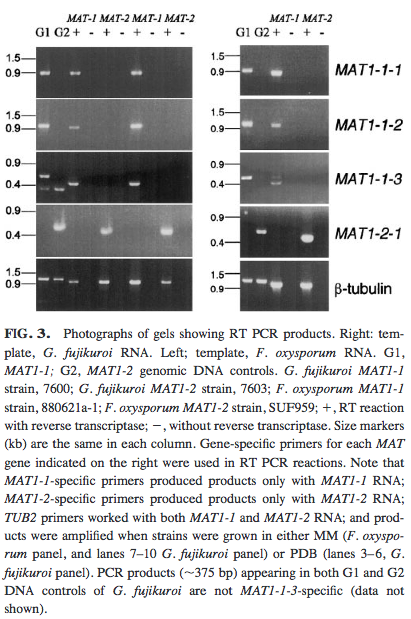 |
“Sequencing of RT-PCR products (Fig. 3) confirmed that all predicted introns in the four F. oxysporum MAT genes are removed, including the third intron in MAT1-1-3, which has an atypical 3′ splice signal (gag instead of cag or tag, Fig. 4). Note that RT-PCR confirms that the MAT genes from asexual F. oxysporum are transcribed.”
|
Yun et al. (2000) |
| Results | 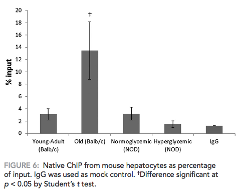 |
“Diabetic animals did not show any difference in DNA methylation in the 18S rDNA region as compared with normoglycemic animals (Figure 6). Old normoglycemic BALB/c mice, however, showed a significant increase in this epigenetic mark in comparison to young-adult normoglycemic mice.”
|
Ghiraldini, Crispim, and Mello (2013) |
| Results & Discussion | 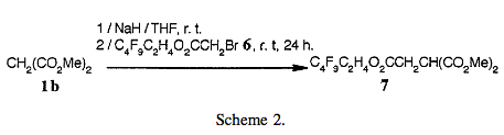 |
“Thus, the mono-alkylated compound 7 is prepared under the same conditions in good yield (85%) (Scheme 2).”
|
Trabelsi, Szönyi, and Geribaldi (2001) |
| Results & Discussion | 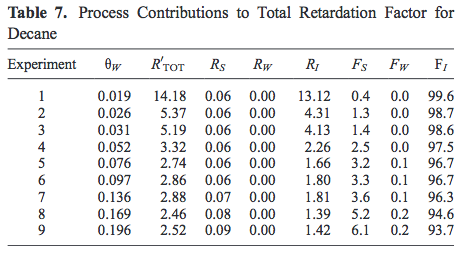 |
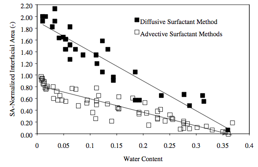
“Contrary to the arguments against the use of heptane as an interfacial tracer, data provided in Table 7 lend support for the viability of decane as an interfacial tracer. Adsorption at the air-water interface is shown to contribute no less than 92% of the total retardation. Sorption to the solid phase contributes secondarily to retention, but at levels of no more than 7% of the total. In addition, aqueous dissolution is shown to be of little importance. Thus, decane shows promise as an interfacial tracer, and its potential to yield information regarding air-water interfacial areas will be further examined.”
|
Costanza-Robinson and Brusseau (2002) |
| Results & Discussion | 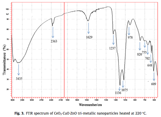 |
“The bands in the low wave number region, 400–850 cm-1 correspond to the vibration modes of M–O and O–M–O (M = Ce, Cu, Zn) (Fig. 3). The broad absorption band at 3435 cm-1 is due to the presence of O–H stretching mode of the hydroxyl group. The band at 1629 cm-1 may be due to H–O–H bending vibration of water. The bands appearing at 1237 cm-1 is due to antisymmetric stretching vibrations of CO2-3 in the hydrotalcite structure of as synthesized sample. The IR band at around 1136 cm-1 may be due to C–O single bond stretching mode. The translation vibrations of Zn–OH observed at 609 cm-1 and 648 cm-1. IR band at around 820 cm-1 may be due to Ce–O stretching vibration.”
|
Subhan et al. (2015) |
[bg_faq_end]
[bg_faq_start]
How to construct figures
Whether you choose to use a diagram, graph, spectrum, photo, map, or other type of figure to present information, there are a few general principles of formatting that you should keep in mind.
A figure should always include a legend underneath, which tells your reader about your figure and explains any symbols, acronyms, abbreviations, or other details that your audience may need to know to fully understand it. At the very least, your legend must include:
- an identifier, such as “Figure 1.” The identifier might be in bold or end with a period to separate it from the rest of the legend. In some cases, the identifier might be abbreviated (“Fig. 1”).
- a short descriptive sentence following the identifier, which acts as the title of your figure.
The amount of detail included in the full legend will depend on the preferences of your instructor or journal in addition to the content of your figure itself. Compare the following three examples and notice what kinds of details each includes in its legend.
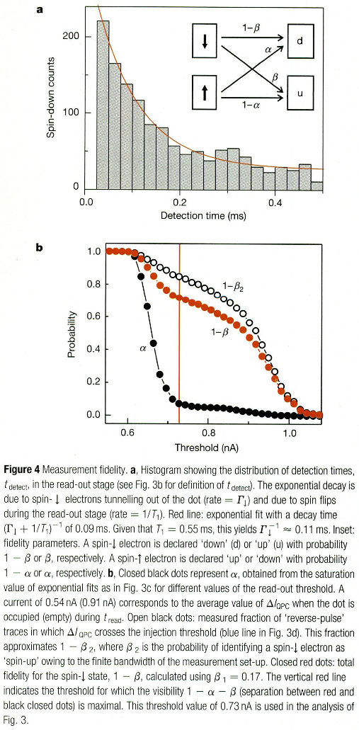
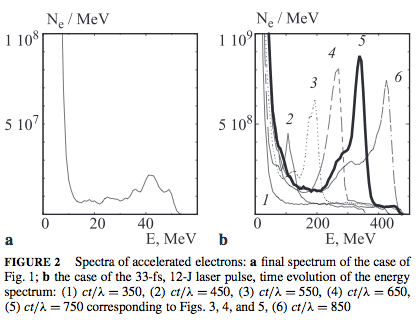
“Figure 1,” above, gives you an identifier and a title but no other details about the spectrum–presumably, the author went into greater detail about its meaning in the text. “Figure 2” gives a little more information and refers the reader to other figures for more information. “Figure 4,” however, does not provide a particularly descriptive title (“Measurement fidelity,” only), and instead goes into great detail to explain symbols, variables, decay times and equations.
Legends are often the most descriptive in biology journals; it is generally preferred to include (if applicable):
Legends in chemistry range from a single sentence fragment to legends as descriptive as those in biology. It is best to refer to a journal in your sub-discipline (e.g. organic, inorganic, biochemistry) to best determine the amount of explanation that is appropriate. In physics, legends are often moderately detailed and more descriptive of diagrams than of data, which are more thoroughly discussed in the text. Geology legends are generally fairly descriptive in order to make clear different aspects of a more complex figure. However, methodology and discussion of data are almost entirely left to the text. |
Some publications have traditionally recommended avoiding the use of color in figures. The reasoning behind this is that photocopying will muddle any meaning you intended through the colors and therefore make the image harder to interpret. But as technology progresses and black/white copies are becoming uncommon, this is becoming less of an issue. Regardless, color should always be meaningful, not just pretty. It is also still important to ensure that colors are distinguishable when printed in grayscale and that your figures are understandable by those with colorblindness whenever possible.
Finally, remember that figure titles are part of the legend. Therefore, do not include an additional title above the image itself, such as in the following graph:
The exception to this in in posters, where the more obvious title can be valuable to readers who are looking at your figures at a glance or may not be able to see the legend as closely. Inclusion of the secondary title is optional.
Graphs
Graphs come in numerous varieties, many of which you are probably familiar with, including line, bar, pie, box, and scatter plots. Most graphs share the same general features, as diagrammed below:
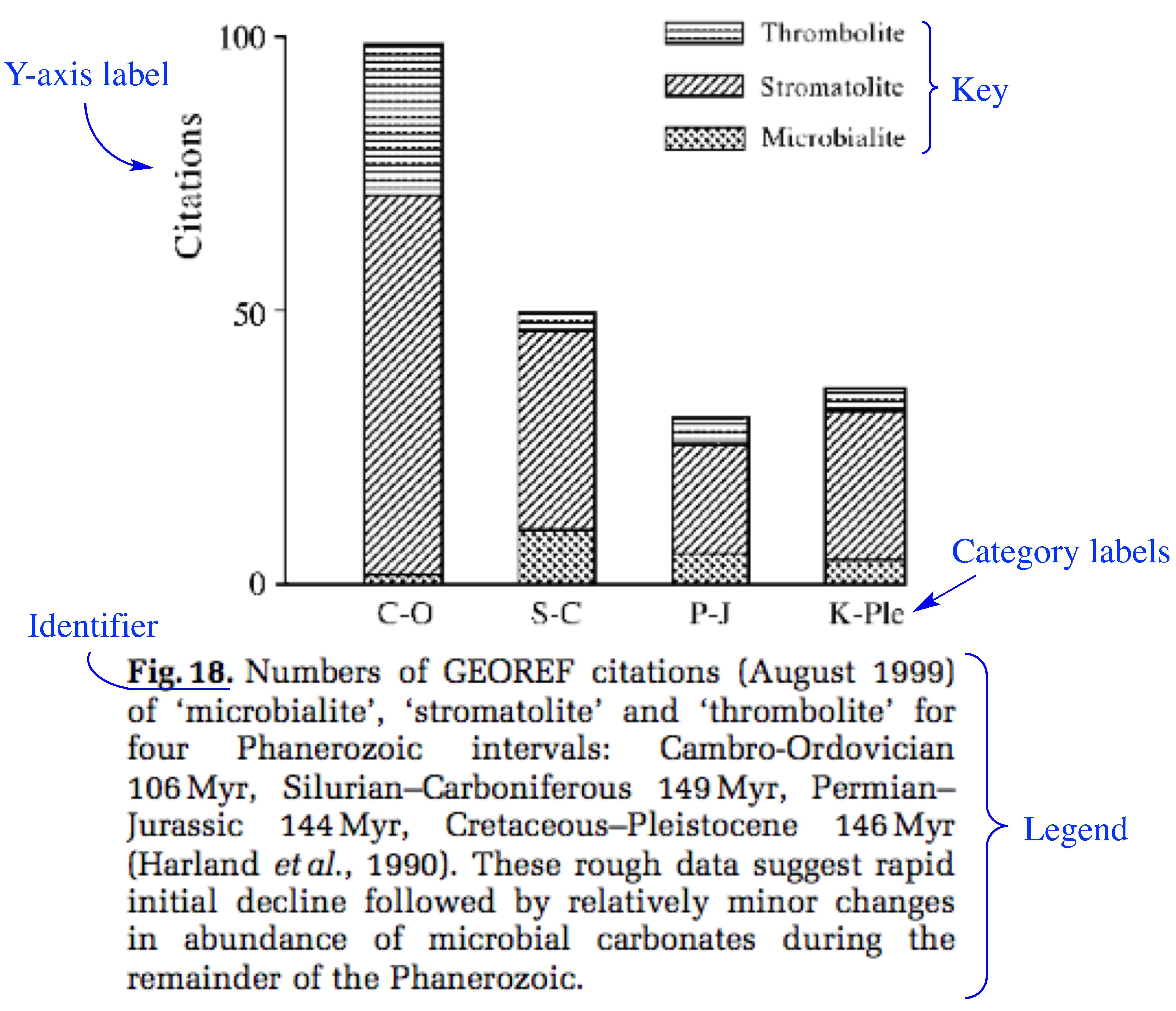
Notice that in the figure above, the author chose not to include an X-axis label (which would probably have read: “Phanerozoic Intervals). Most graphs have both X- and Y-axis labels, so why not this one? The reason is that the author instead chose to give us this information in the legend, while identifying each of the category labels that fall under this larger subject. If he had used an X-axis label, it likely would have been overly redundant.
Graphs are evidence to support claims you make in your discussion. It is therefore extremely important that you show trends clearly, in order to be convincing. Also be sure to always use error bars when plotting means so that the significance of your data is clear from looking at the graph.
Following are a few other formatting guidelines that are good to keep in mind while making a graph.
- Some journals prefer that the key to your graph be in the legend (e.g. “♦ = spotted owl”); others prefer it in the graph itself.
- When applicable, you should plot the dependent variable on the y-axis and the independent variable on the x-axis.
- Always include any units next to axis labels, often in parentheses (e.g. “Frequency (%)” or “Dose (μg/mL)”).
- Keep your figure as clear and simple as possible, avoiding all unnecessary lines, colors, words, and symbols.
[bg_faq_start]
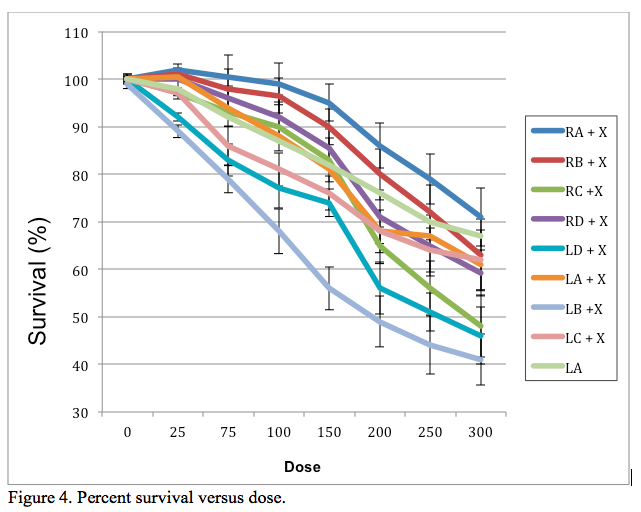
Pro-4: Practice exerciseStudy the figure below and identify as many formatting errors in it as you can. How might you correct these to make a more informative and visually appealing graph?
[bg_faq_start]
Possible solutionThere are a few key things very wrong with the above figure:
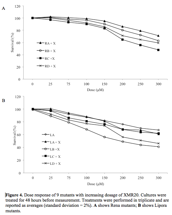
One possible alternative we devised is:
Note: In the original graph, all of the formatting (except for the axis labels, legend, and box around the key) was generated automatically by Excel. So be careful! When Excel creates a chart for you, you will always need to do a fair bit of formatting yourself before it is of publishable quality. [bg_faq_end] |
As you may know, there are many different types of graphs that can be used for a variety of purposes. Below is a summary of some common graph types and their common uses in the scientific literature.
| Type of graph | Best Use | Example |
| Bar graph |
To compare one measured variable across a number of different groups Data will often be presented as averages of numerous trials |
 adapted from Burrows, Pearson, and Scott (2015) |
| Scatterplot |
For showing whether or not there is a correlation between the two plotted variables The data should not be connected by a line; instead, a trendline is often calculated that can give the mathematical relationship between the variables |
 |
| Line graph |
For when changes to the y-axis variable are dependent on changes to the x-axis variable Connect the dots when each measurement is dependent on the previous measurement (e.g. the height of a plant over time) but NOT when measurements are made independently. |
adapted from Clark et al. (2009) |
| Histogram | To show a distribution of a population across a variable, such the number students who scored a certain grade on an exam. Frequency is given on the y-axis and can be on an absolute (i.e. number) or relative (i.e. percent or proportion) scale. |
Diagrams
There are a nearly infinite number of diagram types that you could utilize in a paper, so we won’t go over how to construct a diagram here. However, always be sure that you aren’t using a diagram just to add an appealing visual to your paper, when words would suffice. In addition, because diagrams are used for clarity and simplicity, it is important to keep as uncluttered as possible–only include the details you need to convey information.
Diagrams can be used with more freedom in posters, since visuals are easier to understand quickly and from a distance. In a poster, but not a journal article or a research proposal, you might consider using a diagram to outline your experimental approach or to summarize a conclusion that could also be communicated fairly easily in words.
Photos
Ensure that photos are of the highest quality possible and are cropped from any unnecessary surroundings. It is also a good idea to enhance the contrast of a photo so that it will still be clear after photocopying and without color. In many instances it is also recommended that, if possible and appropriate, you replace a photo with an illustration, in order to make it more simple and direct.
Like any visual or information in your paper, a photo that you did not take yourself must be attributed to the original artist in the legend.
Maps
Maps should almost always include:
- A north arrow
- A metric scale
- A contour interval, if appropriate
- Indications of latitude and longitude
If needed, be sure to also include an index map of locations.
Spectra
Don’t include a spectrum to simply verify the identity of a compound, since that can easily be achieved through an in-text statement like, “The identity of compound X was verified by NMR analysis.”
If they are appropriate to include, however, spectra should be developed using appropriate software and simplified to the same extent as recommended for graphs. Be sure to identify and explain important peaks or trends shown by your figure in its legend or in the text. An example of well-developed spectra along with their descriptions are shown below.
[bg_faq_end]
[bg_faq_start]
How to construct schemes
Schemes can be used to depict steps in a series, such as a chemical reaction.
In general, schemes should:
- Include labels for all compounds and structures referred to in the text, but not for auxiliary compounds.
- Have a title of at least an identifier, such as “Scheme 1,” that is numbered separately from all figures and tables.
- Use abbreviations where possible.
Schemes can be relatively simple, involving only one complete reaction, like the following example from Vecchi et al. (2015):
Or, they can involve numerous steps, like this example from Nonn et al. (2015):
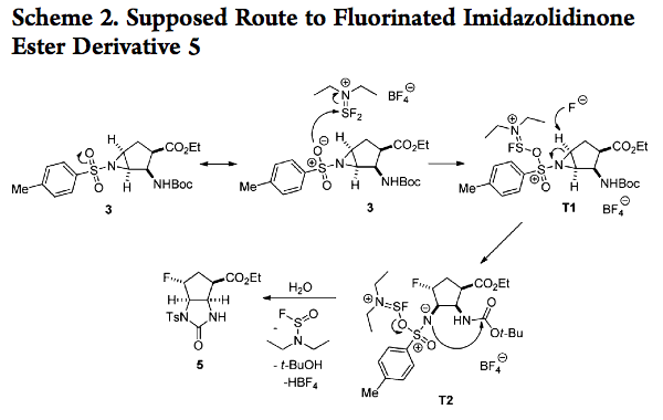
If they are unnecessary, the drawings of the chemical structures shoulb be left out. In this example from Trabelsi, Szönyi, and Geribaldi (2001), the authors decided that illustrations were unnecessary to convey the meaning of their reaction:

Notice how the schemes above use various levels of detail after the scheme identifier (e.g. “Scheme 1.”). A lengthy legend shouldn’t be used with a scheme since chemical reactions themselves are descriptive. Like most formatting details, whether the scheme title goes above or below the scheme also depends on the journal you’re publishing in.
And remember–consistency is what matters in formatting! If you use multiple schemes in a paper, poster, or proposal, make sure to format all of them in the same way.
The hardest part about creating a scheme is properly drawing the chemical structures and reactions themselves. Software tools such as ChemDraw can make this process infinitely easier. Members of the Middlebury community can download ChemDraw for free by following this link.
Finally, remember that depending on the discipline and publisher, it might be preferred to convey the same information using a figure or an equation rather than a scheme format. Schemes are most common in organic chemistry contexts. Check with your instructor for his or her preference if you plan to use a scheme in a paper.
[bg_faq_end]
[bg_faq_start]
How to construct tables
First, you’ll need to know what the different parts of a table are called. Here is a diagram (adapted from a table in Upadhyayula et al. 2009) to illustrate:
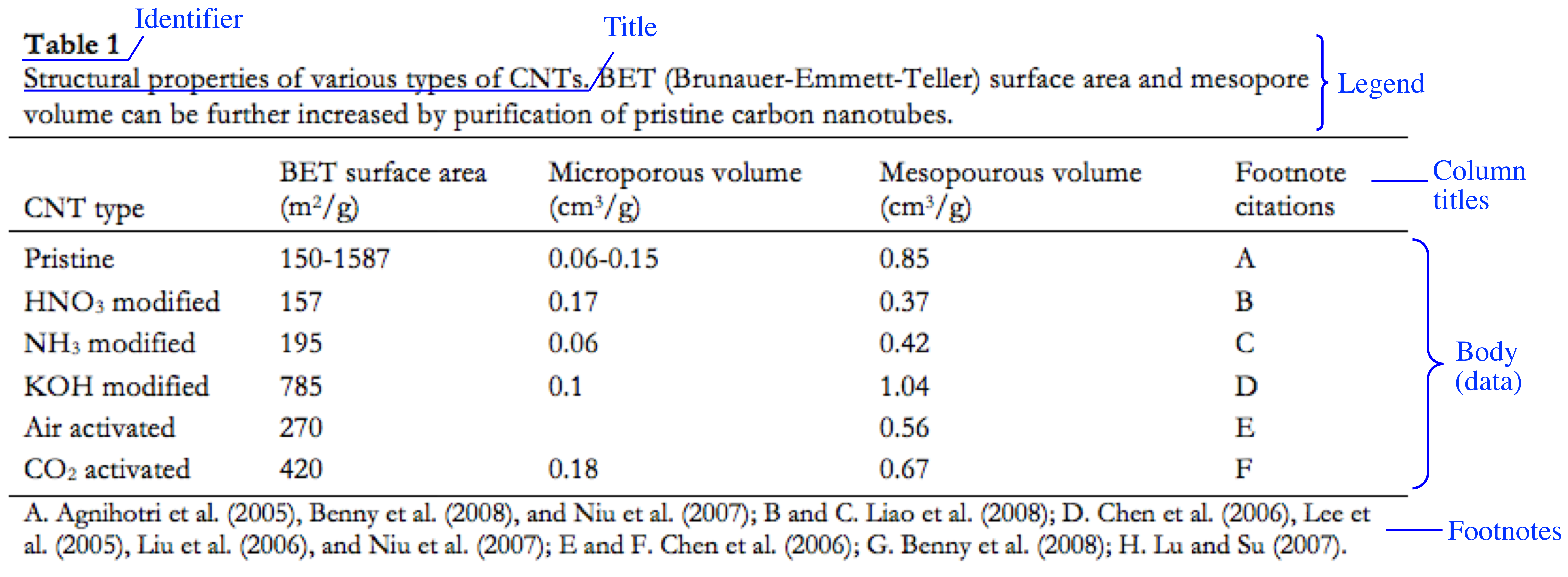
The identifier, title, column titles, and data are pretty self-explanatory. But what about the legend and footnotes? In most journals, the table legend doesn’t contain more than the identifier and title. In some cases, however, it contains additional information about the table that the reader may need to understand it, such as explanations of symbols and acronyms. Footnotes can often convey similar types of information, but are usually more detailed; for example, footnotes might give the exact significance value of numbers labeled with an * (asterisk). Because the kinds of information that can go in a legend or footnotes can be redundant, tables rarely have both an explanatory legend and footnotes.
Although it might be tempting to use tables whenever possible, conciseness means that you shouldn’t use a table to present only a few pieces of information. For example, the following table is unnecessary:
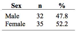 Instead, you could easily tell your audience:
Participants were 48% male (n=32) and 53% female (n=35).
Which takes up only one line of text instead of more than three. In general, you should only use tables when you have at least 3 rows and 3 columns of data.
Formatting
Look at the following four examples, each taken from a different scientific discipline. What is the same among the tables? What aspects are different?
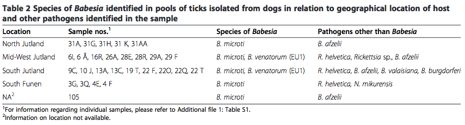
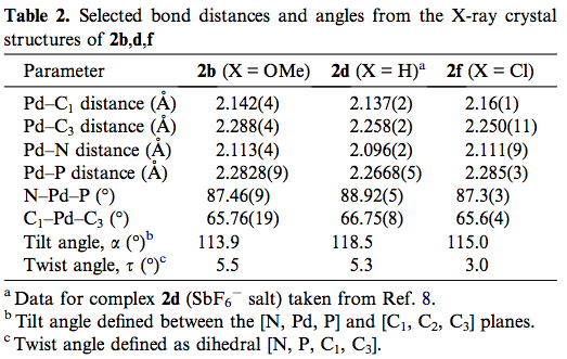
From top to bottom, examples are adapted from: Stensvold et al. (2015), Armstrong et al. (2005), Sato et al. (2013), and Loreto et al. (2013).
Here’s what we came up with:
| Same | Different |
|
|
If you were able to identify more similarities or differences, that’s great!
All of the differences between the tables are details that are specifically defined differently by most journals. Note that in almost all cases, table titles and legends go on top, as shown in the examples–but in a few journals, these go on the bottom. You might have also noticed that all the table titles are printed in bold; however, this, too, depends on a journal’s specifications. As you read through articles on similar subjects to the one you might be writing, notice how they tend to format their tables. In general, certain disciplines adopt similar formatting styles despite small differences between publications.
***
| As you’ll find in all of the formatting guidelines we provide on this site, the key is consistency. If you choose to align your numbers by their decimal points, do it in every column of every table in your paper. The same goes for font type and size, how you use footnotes, which parts of your table you choose to bold or italicize, and all of the other minutia of formatting. |
***
[bg_faq_start]
Pro-5: Practice exerciseBelow is a poorly-formatted table. Propose some revisions to this table to improve it.
[bg_faq_start] Possible solutionHere is one way to re-format the example above:
Although there are many ways to format this table correctly, the critical changes we made were to:
In addition, we also chose to:
[bg_faq_end] |
Remember, specific formatting rules in journals are strict and differ from one publication to another. But we can give you a few general guidelines that will apply to most of the journal articles, posters, and research proposals you might write in your coursework.
Summary of general table formatting guidelines
|