by Jeff Howarth, Middlebury College
“Each year about 60% of the junior class at Middlebury studies abroad in more than 40 countries at more than 90 different programs and universities.”
When I read this sentence on the Middlebury College Web site, I thought to myself: that’s a dataset that my students ought to map. I knew that there had to be a dataset behind that sentence, something that the author could summarize by counting the number of different countries, programs and students. But I imagined this dataset could show us much more if we represented it spatially and visually rather than just verbally. I didn’t know exactly what it might show, but I knew that my cartography students could figure that out as long as I taught them the technical skills for handing the data and the general concepts for visualizing multivariate data. What they decided to make with this knowledge was up to them.
Increasingly, teaching cartography involves training students on specific software platforms while communicating more general principles of the craft. This presents the need to design instructional materials that connect technical skills with thematic concepts while allowing students to creatively achieve the broader educational objectives of a liberal education. As an instructor of cartography at Middlebury College, I have largely followed a project-based learning approach focused on the process of cartographic design. My learning objectives seek to link techniques and concepts in an extended creative procedure that involves data management, problem setting, problem solving and reflection. At different steps along the way, the students must make their own design decisions, applying the available means to their chosen ends. Here, I describe the case of mapping the study abroad program in order to illustrate the general approach of integrating technical and conceptual teaching through design problems.
The Project
I gave the students a very simple prompt: Design a layout for the Web that explores how the Study Abroad Program connects Middlebury students to the rest of the world. The students also received a spreadsheet, supplied by Stacey Thebodo of the Study Abroad Program, listing all students who had studied abroad between 2006 and 2010. In addition, the students received some geographic data, including country boundaries, in a common GIS format. Like all the projects in the course, this assignment provided students with an opportunity to apply topical and theoretical concepts that had been introduced in lecture and readings. For that week, the topic concerned spatial representations of multivariate data based largely on the Jacques Bertin’s theory of graphics.1 The three learning objectives of this assignment each connected theory to technique at different steps of the creative procedure: 1. demonstrate data management skills for cartography, specifically how to transform a list of nominal data into a statistical map; 2. identify the components of information to visualize in order to satisfy a purpose for an intended audience; 3. solve the problem given real-world constraints (available data, software, time and knowledge).
Data Management
The dataset came packaged as a spreadsheet with columns for semester, year, student name, major, minor, gender, program name, city, and country. The first problem was to reformat this dataset into something that could be mapped, which could be completed with two technical operations–linking the country or city names to geographic coordinates that could be plotted on a map and transforming nominal data into quantitative data.
The students were familiar with both the purpose and procedure of the first operation as it had been introduced in a previous assignment. They knew that descriptions of locations in an attribute table, like country names, could be joined to a separate file with corresponding geographic coordinates of each location in order to plot them on a map. But that alone would not get them much closer to visualizing the dataset, as they would wind up with a lot of overlapping geographic features, one for every row in the database. It would be far more preferable to format the dataset so that each row represented a different geographic feature (e.g. country) and each feature had attributes like the total number of students or the total number of programs. Then the students could make a map that showed spatial variation in these quantities.
To do this, the students needed to transform nominal data into quantitative data, which was a new problem. It introduced a new technical procedure with a theoretical concept that had been introduced in lecture that week. Technically, it involved using spreadsheet functions to ‘pivot’ data, summarizing instances of one category by instances of another category (e.g. counting the number of students per country). Conceptually, however, it involved defining the core theme that the students wanted to map, or what Bertin called the ‘invariant’ of information: the base concept that does not vary across spatial, temporal or thematic dimensions and by its invariability allows us to recognize the components of information that do vary. And this conceptual side of the problem made the task a bit more difficult than simply repeating the technical steps that I had demonstrated for ‘pivoting’ data.
The intuitive unit of the study abroad dataset was ‘student who studies abroad,’ but the dataset did not necessarily come structured in a way that let us map this. It was essentially organized by semester: for every semester between 2006 and 2010, it recorded each student studying abroad. This meant that if a student studied abroad for an entire year (two semesters) then they would be listed in the dataset twice and simply counting the number of students during the pivot operation would generate error. There were a number of possible fixes for this but they all required the student to think about balancing what they could do given the dataset and what they should do to achieve their purpose and help the reader interpret their map.
Setting the Problem
Once the students had seen the dataset and were shown how they could manipulate it so that it could be mapped, their next problem was to decide what they wanted to show on their map. In general, the students had to consider how to apply the means available to them (the dataset and their technical skills) to one or more ends, but these ends–the goals they sought to achieve by making their map–were decisions that they had to make on their own.
Throughout the course, I asked the students to consider their audience, media and theme when deciding what kind of map they would make. What kinds of questions would the people using this map with this kind of media want to answer about this theme? In this case, what would visitors to the study abroad Web site want to know about the program that a map could help them understand?
This tested students’ understanding of how relationships between variables help a reader make inferences from a graphic. This, of course, is the underlying principle of simple graphics, like scatterplots and charts, but in this case the students had more than just two variables that they could let the reader visually compare. The dataset included attributes for region, country, program, year, semester, gender and major. In addition, the students could generate new attributes from these, such as changes in number of students over time. What combination of variables would allow the reader to answer questions they might have? Or better yet, what might provide answers to questions that the reader might not even have thought of?
Problem Solving
As students begin the process of making a map layout, the workflow becomes less linear as the student must coordinate high levels of interacting elements. During this phase, students will not be able to work through the problem one step at a time, but rather must shift into a mode of reflective action, as they evaluate how each decision interacts with other decisions that they have made or will make, constantly adapting these pieces of the design to improve the quality of the whole.2 Their work during this phase thus reflects conceptual understanding at two levels: the individual components of the map and their interaction as a whole.
In this case, students demonstrated their comprehension of lower-level concepts in two ways. First, the students needed to choose one or more visual variables (e.g. shape, size, hue, value, texture) to represent each component of the dataset, evidencing both their conceptual understanding of Bertin’s theory of visual variables and their technical ability to implement these concepts with graphic design software. Second, the students needed to provide geographic context for the symbolized data by making a base layer. This evidenced their conceptual understanding of cartographic principles, such as projection and generalization, and their technical ability to implement these concepts.
As students implement these lower-level concepts and begin to produce a design, they confront conceptual problems of design that result from the interaction of their lower-level decisions. These include concepts like figure-ground, contrast, balance, as well as knowing when to use an inset or when to use small multiples because a single graphic is simply trying to say too much. These concepts are difficult to master by following simple rules but rather mature through thoughtful reflection during the process of design.
Reflection
In addition to the map layout itself, I also required students to submit a written discussion of their design process. My objective was to provide another means to distinguish between a student’s comprehension of a concept and their ability to implement the concept with technical operations. I asked students to describe the decisions that they made during the design process and to relate these decisions to concepts that were introduced in lecture and readings. The short reflective write-up provided students with an opportunity to communicate their understanding of theoretical content even if the could not apply this understanding in their layout due to technical shortcomings.
Evaluation
Throughout the course, my joy of receiving thirty uniquely creative expressions of student work at the end of each week was countered by the dilemma of pegging each to a standard evaluation scale. My main objective when grading was to recognize both the student’s conceptual and technical understanding during each phase of the project–data management, problem setting and problem solving–using both their map layout and written discussion. For this assignment, I focused on the following:
- Is the thematic unit clearly defined and intuitive for the intended audience?
- How many components are visualized and what kinds of inferences can the reader make by relating these components?
- Do the visual variables help the audience interpret the components?
- Does the base map demonstrate comprehension of cartographic principles?
- Does the map composition demonstrate comprehension of higher-level graphic design principles?
Each of these questions relates an aspect of the work to one or more concepts from the course.
Examples
This map designed by Marty Schnure ’11 map shows a simple message well.

Figure 1. Map by Marty Schnure ’11
Marty has simplified the information content of her layout by removing the time component and aggregating by region. She uses intuitive visual variables (width of lines to represent magnitudes, hues of polygons to represent regions). She also uses a projection that is appropriate for this spatial extent. Her map is especially pleasing because she also demonstrates higher-level concepts of graphic design: her color scheme draws from the palette of the Middlebury Web site, her layout expresses symmetrical balance and she’s using contrast to effectively distinguish figure from ground.
Like Marty, Jue Yang ’12 also used flow-lines to represent numbers of students traveling abroad, but she added another component to this information and shows this data at two levels of spatial aggregation. Her flow lines originate from Middlebury aggregated by region and then branch midway to quantify the proportion of students studying in each country.
 Figure 2. Map by Jue Yang ’12.
By designing her origin as a pie chart, which she repeats at a larger scale in the upper corner, she quietly urges her readers to compare the regional pattern while also providing a very subtle legend to her color scheme. She’s also made several decisions that evidence good cartographic principles. For one thing, she’s removed Antarctica, which makes sense for a lot of reasons: no students study there, the projection distorts the poles and would have made the continent funny-looking, and it frees up space for her flow lines to Oceanic countries. She’s also hidden an artifact that can be seen on most of the other student maps. The country boundary data has more detail than necessary for mapping at this scale. This makes some coastlines, like the west coast of Canada, accumulate line weights and appear as distracting blobs rather than crisp boundaries. Jue’s creative solution to this problem was to use white boundaries for countries and white fill for her oceans. This visually simplified coastlines without any laborious data transformations.
Several students increased the information content of their graphics by representing temporal components. Thom Corrado ’11 visualized the number of students studying in each country for each year of the dataset. 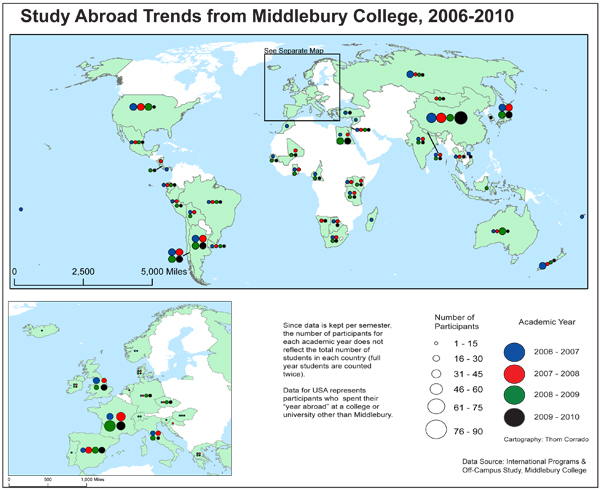
Figure 3. Map by Thom Corrado ’11.
Thom developed an original scheme that used size to represent the number of students and color to represent the year. This allows the reader to infer changes in the study over time with any single country and also to compare the numbers of students studying in different countries for any single year. His insertion of an inset map evidences his awareness of a higher-level design problem resulting from the popularity of Europe, where circles representing number of students each year would overlap and obscure the underlying country boundaries.
The layout developed by Katie Panhorst ’10 layout was one of the most ambitious efforts due to the number of components that she included. She shows two temporal components (year and semester), two spatial components (country and region), and one thematic component (program sponsor). Her design uses small multiples arranged in a grid to reveal temporal components. Her thematic component allows the reader to interpret the quantitative data in a new way by correlating the number of students to the presence of Middlebury-sponsored programs.

Figure 4. Map by Katie Panhorst ’10.
Some students chose to represent change rather than time. This involved calculating the difference between the number of students studying in different countries or regions over two consecutive years and then representing the change symbolically. Jordan Valen ’10 offered one creative solution that used proportionally-sized arrows to represent change. This allows the reader to recognize patterns of change: Latin America, Europe and Asia seem to be largely consistent over time, Africa and Oceania fluctuate from one year to the next, while the popularity of the Middle East appears to be on the rise.

Figure 5. Map by Jordan Valen ’10.
Lessons Learned
There are four key lessons that I’ve gained from this project-based approach to teaching cartographic design:
- Show students how to solve problems, but allow students to set the problems to be solved. While some liberal arts students may appreciate that a course allows them to list commercial software names under the skills section of their resume, simply training students how to use software falls outside the traditional scope of a liberal education. Providing students with the technical skills to solve problems while allowing them to set the problem to solve will foster student creativity and a learning environment characterized by exploration and discovery.
- Integrate your teaching of technique and theory, but separate your evaluation of technical skills and conceptual knowledge. The disparity of technical skills in a classroom can challenge both the evaluation of student work and the motivation of students to work. Some students will feel disadvantaged if their peers have had prior experience with a particular software, while those that enter the classroom with experience won’t be challenged if they are simply being shown how to push buttons that they have already learned to push. Additionally, a student will feel frustrated if their mastery of a complicated tool constrains their opportunity to demonstrate their comprehension of concepts. The reflective write-up describing design process is one strategy to tease apart these two kinds of knowledge, but I found that some students, even those with much to gain from a verbal description of their thinking, seemed to treat this part of the assignment with less effort than the map product itself. This may have been due a failure on my part to clearly communicate the importance of this part of the assignment or it may reflect a more intrinsic bias on the part of some students to focus on the product of design rather than the process.
- Design is reflective action and reflection takes time. This assignment required the students to commit a significant amount of time. In part, this stems directly from my expectation that students set their own problems. Problem-setting requires students to take the time to explore the dataset in order to discover its possibilities. Also, because the students decide what to make, they also have to decide when they’re done. Any student who has learned how to efficiently meet a professor’s expectations will find it difficult, if not frustrating, to decide when to stop working on their own. But independently of having students set problems, the complex nature of cartographic design, where elements interact with each other, and one decision influences both past and future decisions, translates into time needed to reflect and adapt. In particular, high-level design concepts, such as contrast and balance, are not dependent on a correspondingly high-level of technical knowledge that is difficult to master. Rather, they rely on students taking the time to consider and resolve them. As such, these gestalt concepts underlie the most common design flaws in student projects.
- Provide project topics that engage students.
This last point is by no means novel in a liberal education but it should not be ignored when developing topics for student projects. The study abroad project provides an example of a dataset that students were drawn to explore. Many had studied abroad, so many started by looking themselves up in the dataset. This provided an opportunity to discuss key cartographic concepts, like data integrity and abstraction, as the row of fields attached to the dot on the monitor didn’t quite map to the richness of their memory. They became curious about how popular their program was and what places were less traveled. And they became interested in sharing this with other students and promoting the college program. It’s a useful case in the larger pedagogy of teaching techniques at a liberal arts college: give students problems that connect to their experience and involve both problem setting and solving. Many will recognize that visualizing quantitative data is a creative act.
References
1. Jacques Bertin, Semiology of Graphics (Madison, WI: The University of Wisconsin Press, 1983). [return to text]
2. Donald A. Schön, The Reflective Practitioner: How Professionals Think in Action (New York: Basic Books, 1983). [return to text]